Obviously, travel demand in cities is in turmoil just at the moment, but leaving the 2020-2022 blip aside for a minute, and looking again at pre-COVID travel in cities…
As a follow-up to comparing Melbourne’s public transport patronage to Sydney’s, I thought I’d look at all the big capital cities. The five biggest are also the only cities in Australia with more than a million people each.

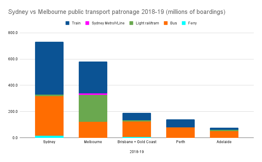
As previously noted, Sydney’s patronage outstrips Melbourne by a considerable margin, mostly thanks to Sydney’s rail network.
A previous blog post looked at this in more detail, noting that Sydney’s rail network reaches more major destinations, and provides a more comprehensive frequent service offering than Melbourne’s, with most stations getting a train at least every 15 minutes, most of the time.
Sydney bus patronage is about equal to Melbourne’s trams and buses combined. Remember that Sydney’s vast old tram network was replaced entirely by buses in the 1950s and 60s – today many of the inner-suburban buses run very frequently, even by Melbourne tram standards.
The new Sydney trams have had some problems, but for only a handful of routes, patronage was looking strong until COVID hit.
Brisbane and the Gold Coast (together run as the Translink network) is a long way behind Melbourne, though of course the population is smaller. Train patronage in particular is only about a quarter of Melbourne’s – the poor mostly half-hourly frequencies outside peak hour probably aren’t helping.
Another factor is the emphasis on Brisbane’s buses for medium distance journeys that in many cities might be covered by trains. In fact Translink’s bus patronage is nearly as high as Melbourne’s.
Perth, with a smaller population than Brisbane, is fast catching up on PT patronage. Perth train patronage (with a mostly 15 minute frequency in daytime, every day) is already higher than Brisbane’s.
Adelaide trails the others, but again, the population is smaller. Bus route reform attempted in 2020 might have helped grow patronage (it’s worked well in many other cities), but it was badly handled, and stopped at the last minute.
Trips per person
Of course patronage will be higher in bigger cities.
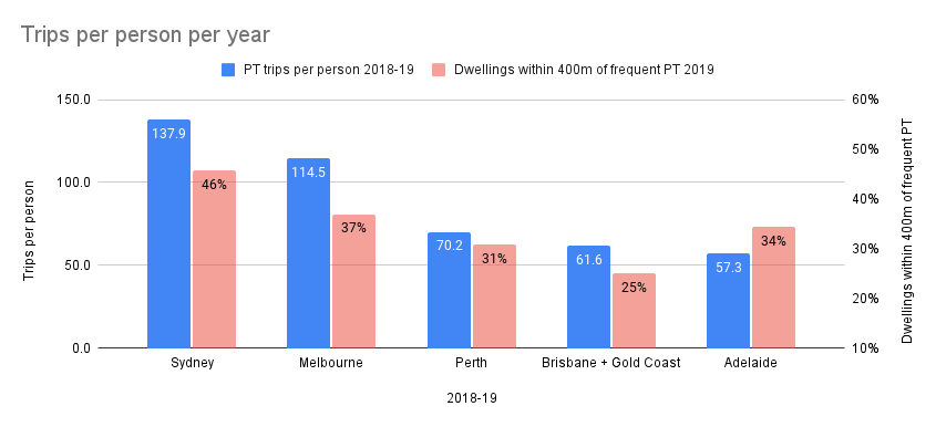
A simple way of taking population into account is to divide the total patronage by the number of people – giving you an average number of trips per person per year.
I’ve added another number into this chart – it’s from the Bureau of Infrastructure and Transport Research Economics’ National Cities Performance Framework – a set of metrics for cities – potentially very useful, but about to be phased out, unfortunately. Anyway, it’s a measurement of the number of households within 400 metres of frequent public transport. “Frequent” is defined as running every 20 minutes, a somewhat arbitrary measure, but how does it compare?

On this measure, Sydney still out-performs Melbourne. But Perth betters Brisbane/Gold Coast. (Note: the frequent PT access number I’ve used is for Brisbane specifically. Gold Coast is about 2% higher.)
Overall there’s a broad correlation between patronage and proximity to frequent public transport.
The outlier is Adelaide, whose quite good number on frequent PT access arguably underperforms – perhaps reminding us that there are also other factors – such as the ease or difficulty of driving and parking – which also contribute to PT usage.
Does any of this matter anymore?
Obviously all of this is up in the air due to COVID-19. It’ll be interesting to see how things recover in coming years.
My sense is still that long term CBD patronage will eventually come back to an extent, but a lot lower than it has been in the past, thanks to likely widespread part time Work From Home for a many white-collar workers.
But travel demand is likely to hold up for suburban (non-CBD) and non-peak travel. We’ve already seen this in what little data has been released for Melbourne – bus routes (which mostly don’t serve the CBD) have maintained patronage closer to normal than trams and trains (which mostly do).
The opportunity is for public transport networks to better invest in non-CBD and non-peak hour trip provision to capture that travel demand. And the good news is that this is often cheaper than huge infrastructure investment needed to keep feeding the peak CBD beast.
Will governments seize this opportunity? We’ll see.


13 replies on “PT patronage in our biggest cities”
Hopefully, once the state election is over with, the government will bite the bullet and radically revise public transport frequencies.
For instance, they could well abolish train timetables and simply declare that services will henceforth be every 10 minutes throughout the day. Set an acceptable range (eg between 8 and 12 minutes) and let Metro run with it. You could do the same with trams, too.
Perth has been taking a worrying dive in patronage. Chris Loader’s chart:
https://chartingtransport.files.wordpress.com/2021/01/image-29.png
Excellent charts that tell an interesting story – thanks
I think the State Government is caught in a Catch-22. If they lower frequency of service due to low patronage then passengers will face crowding so abandon PT altogether.
Sydney has been moving towards improved service quality throughout the day. The new light rail lines run to consistently high frequencies (10-12 mins at worst), new bus timetables have a good mix of frequent (every 10 mins all week) trunk routes with decent (every 20 mins all week) local routes.
Upgrades accompanying the Metro are also focused on improving frequency and service quality across both the Metro and heavy rail network – simplifying operations and providing the capacity to run consistent frequent service patterns.
It feels like a ‘service-led’ philosophy, whereas Melbourne has very much an ‘infrastructure-led’ focus – with opportunities for service improvement coming after the fact (and not followed through).
These figures (with a 20 min threshold) arguably favour Melbourne. Melbourne is alone in having a lot of train and bus routes every 20 min. Most other cities have a 15 or 30 min base frequency for their main routes or corridors. So if the threshold was moved to 15 min the percentage within 400m of frequent service would drop greatly for Melbourne but much less for the other cities (Perth for instance has few if any routes running every 20 min). On a 15 min threshold Melbourne may be hardly better than Perth. But if the threshold was a (ooor) 40 min Melbourne would far beat Perth and Brisbane since both the latter have huge numbers of hourly routes. Peak frequency would change again with Perth being near the top as few Perth bus routes are worse than 20 min in the peaks whereas a lot of Melbourne, Brisbane and Adelaide’s are.
I’m pretty sure the 20 min threshold only applies on weekdays. Adelaide roughly halves its bus services on weekends with a 30 min service even on the main ‘Go Zones’ and a 60 min service on nearly everything else. Melbourne trains and trams hold up better on weekends as do a lot of Sydney buses and a few premium corridors in Perth and Brisbane. Part of Adelaide’s loss may be its weekend fall-off. Another contributor may be its trains also drop in service a lot on weekends and off-peak which makes them less suitable for trips involving connections unlike Perth and Sydney’s more frequent rail network. Perth’s main enemy is its fast outer suburban growth (much more than Adelaide) and (typically) only hourly buses in these areas. Its frequent radial corridors are also more widely spaced than Adelaide’s bus Go Zones. Some of the latter are quite close in inner areas so may overlap each other’s coverage. Adelaide like Brisbane is also poor in relation to having buses that parallel trains rather than buses that provide orbital trips or feed trains (both of which Perth’s network has thanks go good train frequencies and good planning).
Brisbane is the one that is a serial underperformer due to it having (effectively) two half networks rather than a single (admittedly imperfect) integrated network like Perth.
@Chris, there seems to be a lot of people who no longer look at tram timetables. High frequency (most of the time) plus good real-time info means they’re more interested in wait time, not scheduled time.
That’s probably the case for trains at locations and times of high frequency too.
@Tony P, I think Perth is an interesting one to watch. Patronage there may be a pointer to long-term patronage in the other cities.
@Peter, yeah 20 minutes is a bit arbitrary. Arguably it’s a service offering that’s useful but not great – or passable as one old PTUA document described it.
I’m surprised the light rail in Sydney doesn’t take up more of their numbers. That being said, here in Melbourne, from my personal observation, the trains hasn’t recovered as much but the trams seems almost as busy as it was pre-covid.
@Arfman, remember this is 2018-19 data. L2 only opened in December 2019, and L3 a few months later, so Sydney tram patronage was pretty small then. It grew, but obviously COVID has caused it to slow.
400m radius is not really a good measure of proximity to frequency to public tramsport. Leaving out delays for road crossings etc., it’s only a 5 minute walk. I can’t remember where I saw the figure, but I think it’s something like 2/3 of residences in Melbourne are within 800m of a train station, which is much more respectable. Yet 400m is quoted again and again. Perhaps it is a figure suited for a congested inner city, where it can be slow going, or for one of those 1980s housing estates where the roads go around and around in circles. But large parts of middle Melbourne have a nice grid layout and an 800m walk is just a pleasant start to the day.
(What the 400m is like to walk matters. The house prices are much higher on one side of the North Shore line in Sydney because one side is flat and the other hilly!)
A 1km walk is about 12 minutes at a reasonable 5km/h. I am quite happy to do that, because it’s only at the home end. Melbourne tends to have much closer coverage in destinatlons like the city. That’s why the relatively low density and larger distances in the residential parts of Melbourne doesn’t matter as much, at least for trips that aren’t between two residences.
I think PTV have come around to the same point of view as me, because I am about 1km from a station and 200m from a Smartbus route that also goes to that station. I would never walk to the main road, cross it, wait for the Smartbus, and then cross the main road again at the other end to the station, yet for a long time the PTV app’s journey planner would have me do that instead of actually showing the station as in my “Nearby” list. I just checked it now, and it’s offering a 12 minute 960m walk to the station as the first plan. I don’t know whether it’s because the station moved 100m closer after the level crossing removal or whether they had a change of heart.
@Francis, completely agree that 800m is a more appropriate number.
In fact I wonder where the 400m comes from originally. It’s suspiciously close to 1/4 of a mile, which makes me wonder if it originates in the USA (perhaps not the best model for transport policy) or from pre-metric times.
I’d love to see a source for the number of homes within 800m of a railway station. I suspect the number isn’t as high as 2/3, though once upon a time it would have been.
I did find a Victoria Walks study that concluded that the median distance walked to stations is 721m, vs 390m to bus stops, and 360m to tram stops. https://www.victoriawalks.org.au/Assets/Files/Walking%20%20transport%20FINAL.pdf
The 400m number comes from the fact that at an average walking speed it should take roughly 5min to travel 400m
People’s willingness to walk will I think mostly relate to the service quality. You’re more likely to walk 1000m to a turn up and go service with a fast average travel time than 500m to a service that comes only twice an hour and crawls along in traffic, because the TUAG service will be reliable, but if you just miss the 30 minute service, you’ve walked 500m for nothing except a 29 minute wait then a meander through the suburbs.
The Victoria Walks study will reflect that, as trains (on average) have better frequency and travel speed, compared to buses/trams. If you broke down the buses into SmartBuses you’d probably find people walk further to those, for example.
Both 400m & 800m distances have their place. Especially if you want public transport to be suitable for a wide range of trips by a wide range of people. Including those less mobile or unfortunate enough to live in neighbourhoods with poor walkability (which in the long term need to be re-engineered for greater permeability).
It is probably better to have a dual performance measure when designing a network. Eg proportion of population within 800m of a frequent/all day service and proportion of population within 400m of a basic/less frequent 7 day service. Also calculations need to be based on actual walking distance, not ‘crow flies’ since the latter is so midleading in unwalkable neighbourhoods due to severance caused by wide roads and even railways.