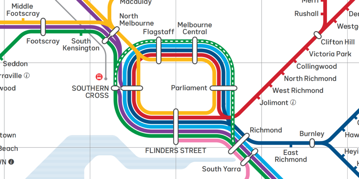
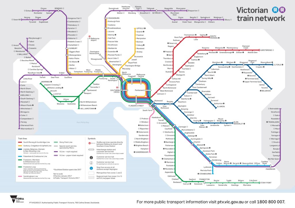
As flagged earlier in the month, the long-awaited new rail map, in the works since at least 2014, has finally been officially launched.
It’ll show up around the network in 2017.
There seem to be at least two versions: the plain one above, and a version with a grid and station index.
It’s over two years since we saw the drafts — in fact this was a process started under the previous government. What took them so long to get it out? I really don’t know.
But it’s great to see it launched at last.
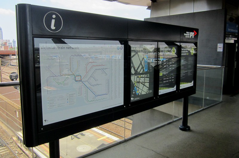
Thanks to Tim H for the tip-off: it is “in the wild” on the concourse at North Melbourne.
At one stage there were also plans to start using the colours on major interchange station platforms and concourses, to help people navigate more easily to their platform. It remains to be seen whether this will still eventuate — in some cases operations are still too inconsistent for it.
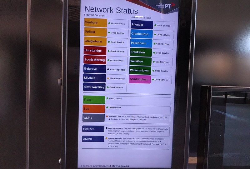
The colours are intended to match the rainbow status boards and the PTV Live Updates web site. (At the time of writing, V/Line is still appearing there in grey… hopefully it will go purple soon.)
Some comments I’ve seen around the place:
Skybus shouldn’t be on the map. It isn’t a train!
True… but I look at it this way: it’s going to be a constant reminder that Melbourne should have a train to the airport.
You can’t actually walk from Belgrave to Bairnsdale!
Well of course you can’t. It’s not to scale. Melbourne/Victorian rail maps haven’t been to scale for decades.
Where’s the line to (proposed destination) ?
There have been so many fantasy rail maps over the years that it’s important to remember this is a new map for the current network, though it includes stations about to open (Caroline Springs) and opening in the next 12 months (Southland).
Of course it doesn’t show rail to Doncaster or Rowville, or even the Metro rail tunnel or Mernda. That’d just be confusing for people trying to navigate their way somewhere. The map can be updated when (and if!) these are built.
What happened to the zones?
Zones aren’t as important as they used to be. Firstly, for trips covered by Myki (which is the majority of them), the smartcard automatically calculates the fare. (There are sometimes problems with this on buses and trams, thanks to on-vehicle readers and poor GPS and other factors, but train calculations have never had major issues.)
Secondly, changes to Melbourne fares in 2015 mean we basically have a flat-fare system. A trip in zone 1 costs the same as a trip across zones 1 and 2. (There is an exception: trips entirely and only in Zone 2 are charged at a cheaper rate.)
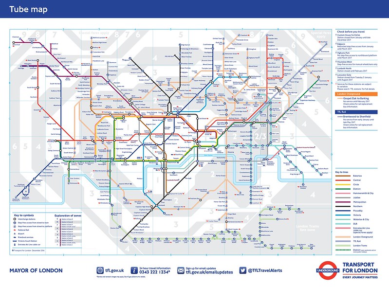
You could add zones to the map, perhaps in the style of some of the London Tube maps (above), but it’s messy, so I can understand why they left them off.
It would be especially difficult to show it for the V/Line area in a way that didn’t make the map unreadable — once you leave zone 2, practically each station is in its own zone.
Note they have indicated where you can use Myki and where you need a V/Line paper ticket.
What happened to the bus/tram interchange icons?
It’s true, they’ve gone. But in many ways they weren’t very useful. Most stations have bus and/or tram connections, but the icons alone didn’t tell you anything about where those routes go, or how often.
For instance, the old map showed tram and bus connections at Hawthorn. The tram is route 75, with almost 100 services each weekday (slightly fewer on weekends)… the bus is route 609, which serves the station just once per weekday.
Interchange information is better conveyed via the Journey Planner (or Google Maps) in such a way that includes the information travelling passengers actually need to make that connection.
What about the interstate trains?
There’s probably an argument for including them, though the XPT to Sydney follows the line to Albury, so effectively its route already on there.
The Overland follows quite a different route (via North Shore, Ararat, Stawell, Horsham, Dimboola, Nhill). But it only runs twice a week (every other train service on the map runs multiple times per day), and its long-term future is far from certain. That said, you can book a V/Line ticket on it for trips within Victoria, and it is shown on the V/Line timetable.
Some staffed stations don’t have the (i) info icon
All the interchange stations are staffed fulltime. There are some exceptions on the V/Line network; here they have the interchange bubble and the part-time info icon.
But I’m inclined to agree; it would have been clearer, and more consistent, to give the fully-staffed interchange stations an info icon.
I’m not sure why Essendon is marked one way, and Berwick is marked differently. Both get a handful of V/Line services stopping there each day.
Oh yeah, I’m not fond of the term “Customer service hub”, especially as there are numerous over-the-counter services available at Metro full-time staffed stations and V/Line part-time staffed stations which are not available at Metro part-time staffed stations.
So, what are the benefits of the new map?
Maps have to be replaced from time to time anyway, as new stations open.
This design is a huge improvement on the old one — and it’s about time we had a map that shows where the trains actually run, not just where there are tracks.
In other words, it’s going to be far more useful for passengers.
19 replies on “The new map has arrived”
As I mentioned via Twitter, I do think it’s a mistake not including the interstate trains.
Particularly the Overland – even though it only runs twice-weekly, you can buy V/Line tickets to its Victorian destinations. If this map is supposed to be a planning guide, the prospective traveller would have no idea by glancing at it that you can catch a train to Horsham, for example. Or that it’s possible from Ararat to catch trains in three directions: to Ballarat, Geelong (North Shore) and Adelaide. The lower frequency could be indicated by a dotted line, perhaps, and a note in the key.
The same applies to the XPT; though it follows the Albury line, it’s effectively an express service to the Victorian destinations it serves. I’d have it on there as well, in a different colour.
It’s good that they decided to include the Bay in the end.
I don’t agree with some people who are saying the interstate trains should be shown.
1- I doubt they’re highly patronised
2- if V/line always used to be shown seperate despite it SERVING VICTORIA and hasn’t been an issue, why do we all of a sudden worry that interstate isn’t shown?
3- I think some people are having “bracket creep” wishes where they’re wanting more and more shown on the map which only works to clutter it more
4-most people fly or drive interstate. If I wanted to travel on a train interstate (which has long been a desire) I would know to google it and plan the journey seperate.
This map should be limited to the metropolitan area, personally I’m not a fan of V/Line being shown on there especially in a purple colour (prefer it have stayed grey) however they have made V/line not clutter it too much so it’s ok.
I wonder if they’ll include letters to designate lines at some point in the future, in addition to colours. I have found the combination of letter and colour very handy for navigating the Tokyo subway.
Although it has some imperfections (i.e. showing stations like Tarneit as not having customer service hubs when in actual fact it was staffed on the two or three weekend days I’ve gone in that direction). I do like it overall and it is a massive improvement on the previous map because as I’ve pointed out previously, I think its about time that they clearly show where rail lines go and where Zones 1 & 2 cut out, which this map does.
Previously the old maps created potential misconceptions such as leading one to believe that Zone 1/2 fare coverage cuts out at Wyndham Vale when in actual fact it covers up to Lara and suggested it cut out at Melton when it also covers Bacchus Marsh. I still wonder why they didn’t show said V/Line stations on the Metropolitan Train Maps at the start of 2013 as the old Metcard boundaries effectively became redundant on 29/12/2012.
On person on this page: facebook.com/PeninsulaRailLink/ pointed out that “Werribee isn’t further north than Williamstown” to which my response was “Although it has imperfections (i.e. yes, a bit misleading geography wise), it does say ‘Not to scale’ in all fairness”.
So the highlights for me are clearly indicating where Z1/2 fare coverage cuts out and clearly showing where trains go. Although it’s not the first time a Melbourne train map has shown where trains go, here’s one from 1987 or slightly earlier (can’t have been newer than 87 as the St Kilda and Port Melbourne lines are shown):
http://railgallery.wongm.com/albums/melbourne-stations/D181_8122.jpg
It’s very hard to be objective about something you know well but I suppose the map is tested by strangers to the system. I agree with the comment about line name. Either number or letter them, or give them permanent names.
I would include more info about loop direction, or just leave it out entirely. Why does Frankston get a green dotted line, but Sandringham doesn’t get a pink dotted line? It seems to imply that loop services terminate at Southern Cross. “All other services are direct” – direct to where?
If Berwick and Essendon can have V/line status mentioned for a handful of services, surely MATH can for the not insignificant number of early morning / late night Dandenong trains that stop there.
Don’t see much point in including the XPT, since express/stopper patterns aren’t shown for the other V/Line express services. The Overland is different, since V/Line paper tickets apply to (IIRC) Nhill, and there’s the stop at North Geelong as well. There’s a few options – for example, a text entry in the legend under V/Line noting that it exists, or a purple outline for the route indicating that it both a) requires paper tickets and b) does not run daily.
As for the customer service hubs, perhaps the black (i) logo should’ve been used for part-time, and all full-time locations could have had the full circle system?
Having the whole map with no angled text is very impressive. I wouldn’t have thought it possible; though I also hadn’t considered a landscape option in lieu of portrait.
I wonder whether there should be a note in the legend that V/line trains can’t be used between metropolitan stations.
Otherwise, most of the issues are very minor. As mentioned above, Essendon v Berwick (and does V/line still stop at Ginifer occasionally?); implying Flemington trains stop at Newmarket and Kensington, though that can be mostly solved with announcements at those two stations (or actually stopping at them, which might allow closer headways? I need to check the circuits…) Newport South junction looks slightly off to me, but it’s just shy of being irritating so I’ll live with it. Mangalore (Seymour) junction and North Ballarat junction are also a bit strange. No note about East Richmond, or shuttles on Cranbourne and Alamein is a shame, but if that’s what the market research indicated was the best option then I’ll live with it. One of the few good things in the old map was that the Craigieburn, Upfield and South Morang line stations were marked with the correct latitude relative to the street grid. This is cleaner, and reasonably accurate so it passes. I would have suggested removing the green dashed line around the loop and adding a note like with Sandringham; possibly add green dash S-bends between South Yarra and Richmond, and between South Kensington and North Melbourne?
I still think there’s an argument for showing Stony Point in solid purple – the trains are marked V/Line, the service frequency better matches that, and nobody really needs to know that it’s operated by Metro since all communication is supposed to be fielded by PTV anyway.
The legend references Heyington as the only non-step-free station; on the plain map that’s fine, but on the grid map I’d have called it Heyington H6. Also, the word “Heyington” might’ve been better in dark blue text?
Overall, excellent job Adrian & team.
As someone who is partially colourblind, I find it very difficult to read the map. It’s a real shame to see that no efforts were made to distinguish lines with letters/numbers.
The purple line should appear to bypass North MEL station – by going over the green line twice.
Otherwise a lot of people will think the Geelong line will stop at North Melbourne.
I can’t understand why the V/Line purple line is split at Southern Cross.
I mean, yeah the eastern lines are separate from the northern lines and all, but then why is the Seymour-bound lines bound to the Western lines?
#10 #11 there are 2 purple lines through North Melbourne, with the white bubble indicating only Seymour trains stop there.
There are some inconsistencies with the i icon on vline stations:
-Sunbury, Watergardens, Sunshine have no i icon, even though they are staffed from first-last train. The note says these are interchange stations and are staffed first-last. OK, then:
-Traralgon has a solid black i indicating staffed from first – last train, even though it is already marked as an interchange station. Hmm…
-Bendigo, Ballarat, Geelong have a outline i, even though they are staffed from first-last train and are marked as interchange stations! They should either have no icon, or have a solid black one.
-Seymour presents a problem: it’s an interchange station that *isn’t* staffed from first-last train (and is probably the reason why they put incorrect i icons on the other stations above).
They should just show the i icons on all interchange stations as well, don’t treat them separately.
Why couldn’t they have done two maps – one regional, one metro? What other rail network in the world puts both on one map?
Depending on your attitude, it’s either a lie or a work of aspiration.
A quick look at this week’s timetable shows that the Green line waits at Flinders St. for up to 7 minutes in the morning peak. This is not what one normally expects when reading a conventional Beck-style map like this.
Caulfield is marked as an interchange between the Frankston and Dandenong lines, but in fact it is necessary to touch out your Myki, exit onto the public footpath, re-enter the station via a different entrance and touch in with Myki again. Although it is possible to change trains, it is not an interchange as normally implied by this notation on a Beck-style map. (Nor is it undercover, and sometimes I’ve missed my change due to Myki delays.)
I’ll add my voice to the many wanting to see a version without the intercity/rural trains. Why not produce different variants using layers in Adobe Ilustrator? That’s how London does it. I’d be happy with a PDF; there needn’t be any extra printing costs.
RE the customer service at V/Line stations, I don’t think V/Line is giving PTV the right information. There’s quite a few stops there there that should have their staffing listed differently, and most also have either no or the wrong information on the PTV website. I think Customer Service information would be better suited in the Station Index (which should also list the station zone). Just make sure every version of the map has the index attached.
The Werribee line turning back North kind of irks me, but it’s to make it closer to Wyndham Vale. Of course, if the Geelong line turned 45 degrees after Sunshine and the Werribee Line directly south at Footscray, it might fit, but then where would you put the big box? There’s so many things to consider. Ultimately, it would look much better leaving V/Line off all together, but then you miss out on so much of the state’s (especially the west’s) public transport.
“Leaving V/Line off” is a pretty arbitrary decision. South Geelong station currently gets a V/Line train every 20 minutes off-peak on weekdays, the same frequency as metro trains to Upfield. Ardeer station is closer to the CBD than the ‘suburban’ lines through Dandenong and Ringwood. The only difference between them is that some of the trains are diesels powered, and others are electric – does that distinction really need to appear on a network map?
One thing I’ve just noticed that bothers me with this map is that on the Werribee – Frankston green line, there’s a dashed line going around the City Loop from Frankston, but not from Werribee. I believe in most cases (unless there are works), the city-bound services from Werribee go through the City Loop towards Flinders Street.
@Arfman, no Werribee line trains use the Loop on weekdays.
[…] The line map showing all the stations on the line/s is severely broken. These are presumably inspired by the new(ish) network map: […]