I’m going to go out on a limb here and say that fewer people use paper train timetables than used to.
The proliferation of departure information via the official web sites, Google Maps and the official Journey Planner, as well as the official app (with its real time information) and many other apps, means people can get that information far more readily than they used to.
Some stations also have frequent services all day, so why would you even bother checking?
Here’s my totally unscientific Twitter poll the other day:
How do you check #MetroTrains train times? 🚇
Or are your usual trains frequent enough that you don't bother?— Daniel Bowen (@danielbowen) August 31, 2017
— It’s doubly unscientific because a poll online will get responses from people who are online. Many of the people who do use paper timetables are unlikely to see it and respond.
But it’s still interesting to see how many respondents never look at paper timetables, preferring online — 85% total — options that didn’t exist a generation ago.
It’s also interesting that quite a few people just go to the station — with or without assistance from apps — thanks to high-frequency services.
Anyway… some people still use paper timetables, so they need to be produced, and should be up to a high standard.
Which brings me to the current timetables. A new Metro timetable started on Monday, and Metro has duly published paper timetables, as well as pushing the information via all the other media.
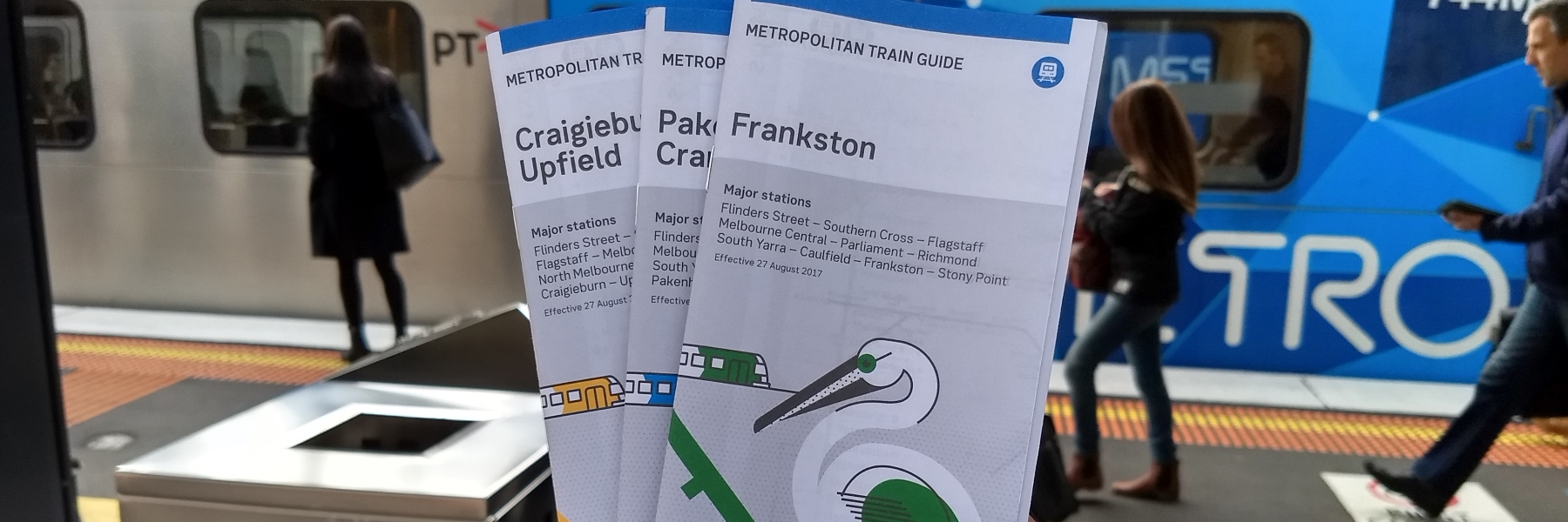
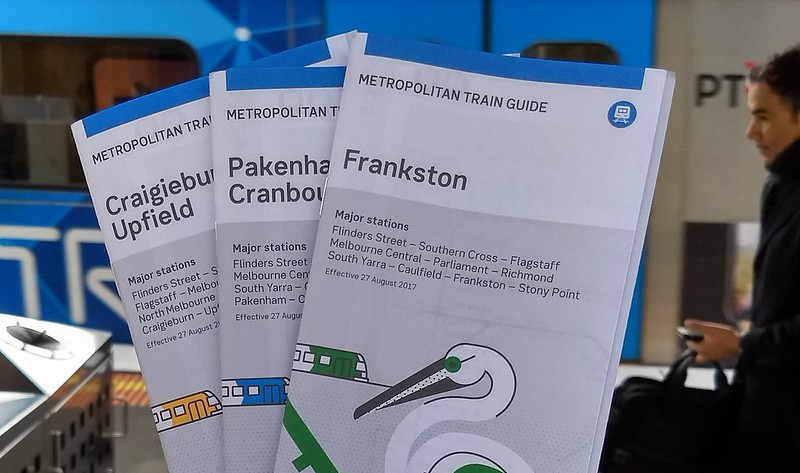
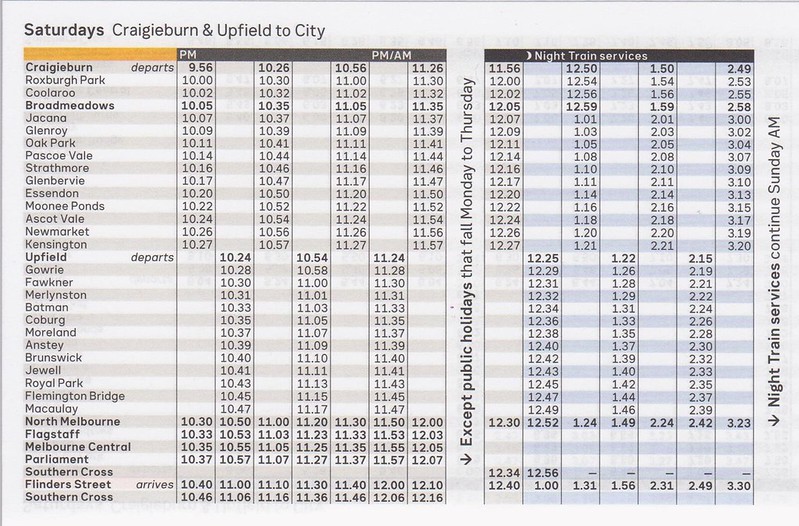
But flicking through the paper timetables, I found a number of issues. Here’s a few scans from the Craigieburn and Upfield line timetable booklet.
Actually apparently they’re not a timetable anymore, they’re “Train guides”. But no matter.
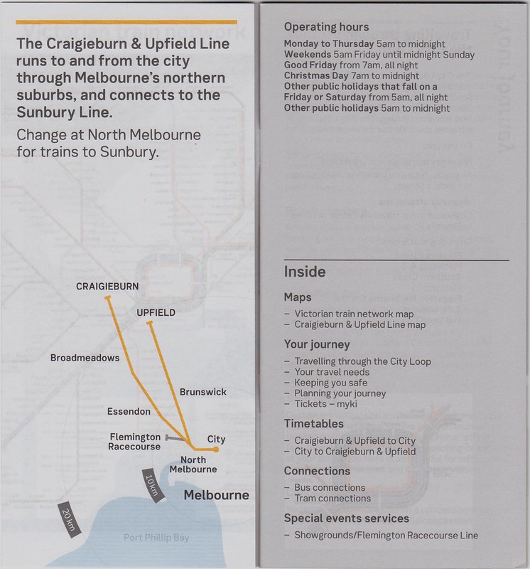
Here’s the abstract map in the front of the booklet. I suppose these are trying to give you a context for where in Melbourne each line runs. But they over-simplify the line’s direction (the Upfield line runs almost due north), they only list a station or two, and the kilometre distances (a bit hard to see in the scan) are inaccurate in some of the other line booklets.
Why are these two lines in the same booklet anyway? Despite the description, they are not part of the same line. They share no stations outside the central area (if you include North Melbourne). Online, neither PTV nor Metro treat them as one.
Do local train users treat them as one line? Judging from the number of peak services (Craigieburn has three times as many as Upfield), it seems the demand in peak is totally different, so I’d guess not.
Listing Craigieburn and Upfield together makes the timetables harder to read. I seem to recall these lines have been lumped together since at least The Met days. It appears to be for operator convenience, not for the benefit of passengers.
And why only mention interchange to the Sunbury line? What about Werribee and Williamstown?
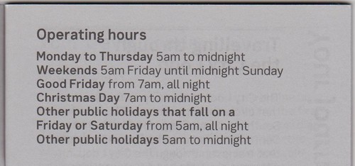
The text describing the operating hours appears to be correct, but overly-complicated. I wonder if a better way of presenting this could have been found:
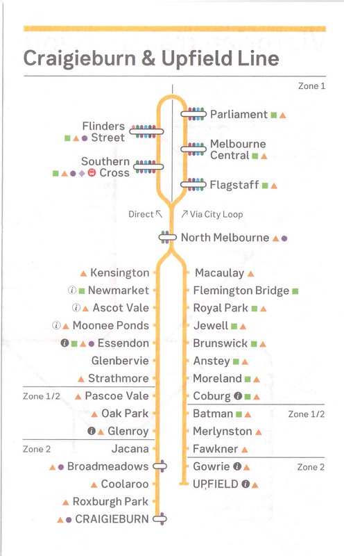
The line map showing all the stations on the line/s is severely broken. These are presumably inspired by the new(ish) network map:
Let’s leave aside the tiny coloured train interchange dots, which I doubt are very useful to people.
The problem is the map itself. In reality, travelling citybound, if you turn left from North Melbourne, you’ll head into Flagstaff, not Southern Cross.
If you’re going outbound and turn left from North Melbourne, you’ll be headed towards Craigieburn, not Upfield.
The whole thing is backwards. If you flipped it horizontally, it’d be accurate!
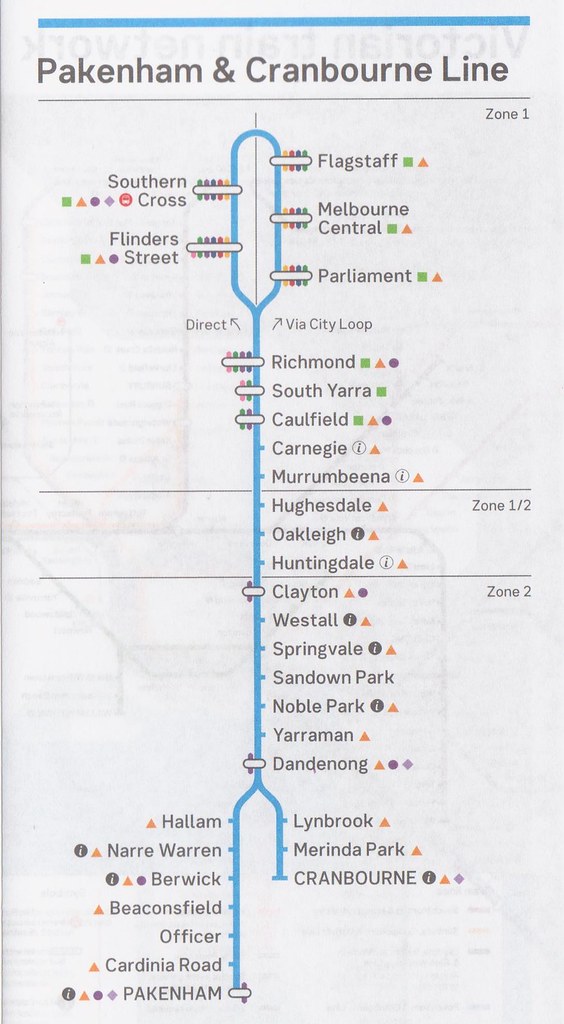
It turns out that many of the booklets have things muddled up. Here’s Cranbourne/Pakenham. The City Loop is right, but the outer branches are the wrong way around:
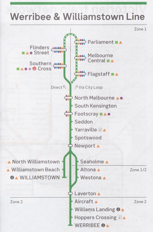
All the booklets for lines through North Melbourne have the City Loop oriented the wrong way around. And the Werribee/Williamstown booklet has shuffled its branches around too:
Train maps are often abstract, and not to scale. But they should at least present the stations in the correct order, and reflecting actual geographic directions, not getting them backwards or back-to-front.
The Werribee/Williamstown issue has at least been acknowledged, but how do these things get into print?
The map certainly does have those lines the wrong way around. We're passing the feedback on.
— Metro Trains (@metrotrains) August 29, 2017
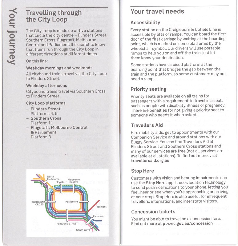
Moving on… This description of the City Loop tells you how the trains on this line run when Citybound, but not Outbound. Until the Loop runs in a consistent manner, this will be confusing. Would a diagram with arrows have been better?
I know that Night Train services (introduced 2016) are technically different to the Midnight to 1am services (introduced 2006), but they operate on exactly the same nights, so to reduce passenger confusion, it’d make sense to brand them the same, and show them the same way in the timetables. For now however, only the services introduced in 2016 are shaded blue.
They do get marks for indicating that Night Train services continue over the page.
I’ll just mention again that putting Craigieburn and Upfield train times in one booklet makes it harder to read.
In my skimming, I haven’t found errors in the train times themselves, but they usually do a good job on this bit.
However bus timetables are another matter. Craig Halsall on Twitter is logging scores of errors in timetables and maps around the network. PTV should offer him a job.
Many may be getting their train timetable information elsewhere, but print train timetables will be with us for a while yet.
And no matter what the medium, authorities need to clearly and accurately convey service information. The colours and fonts chosen mean the booklets look nice. But there are so many little issues — they really need to do better.
25 replies on “Metro’s paper timetables mess”
*I* treat Craigieburn and Upfield as one line. But my house is equidistant between Flemington Bridge and Newmarket.
Daniel, I think you are exposing (again) the fact that the people who maintain our PT services don’t actually use them (they drive their own cars).
My local station, Brighton Beach, had lots of big signs warning that there would be no loop trains on the weekend. Less prominent were signs stating that there would be NO trains at all on the weekend (with replacement buses). So who designed the “no loop train” signs and who instructed to put them up at BB station? Answer: someone who doesn’t use public transport!
Among all the other errors, the Pakenham/Cranbourne map is also missing MATH stations. There’s a sizeable number of off-peak services that stop there.
It’s great having real time train info, I consult it virtually every time before I’m about to catch a train. If I know a train is delayed, I can take my time making it to the station, or choose another option that may get me from A to B sooner. It also makes it feasible to catch delayed services that you would otherwise not consider catching because you assume it has left on time.
It also means that you don’t have to rely on somebody at MetroNotify to report a delayed / cancelled train. Sometimes these are missed, especially annoying when frequency is every 20 minutes or worse. Not only would you waste your time unnecessarily waiting at the station when you could be doing something else, it also didn’t help you feeling that nobody cared, or wondering if it would be counted in the statistics.
An example from the weekend, Frankston line trains departed Flinders St at night 4 minutes later than the standard timetable (presumably due to Dandenong line train shuttles between Flinders St and Caulfield). Often during works, these minor timetable modifications are not reported explicitly on planned works pages (ptv or metro). 4 minutes by itself is not much, but it counts when making a connection with another service. Those relying on paper timetables and service disruption info are left in the dark.
“When the sun rises in the west and sets in the east,” she said sadly. “When the seas go dry and mountains blow in the wind like leaves. Until the Loop runs in a consistent manner. When my womb quickens again, and I bear a living child. Then you will return, my sun-and-stars, and not before.”
@Roger, that’s like some kind of bad joke.
@Nick, isn’t it only early mornings and evenings that Cran/Pak trains stop at MATH stations? Something like weekdays before 6am and after 10pm… slightly longer hours on weekends.
On timetables in general why doesn’t each service have an unique identifier like they do in some other cities? If I read or hear a story that, say the 7:05 from Frankston is cancelled, then I without looking up the timetable I’ve got no idea if that was a train that I would normally be expecting to take when it passed through Glen Huntly. However if they said it was service 1234, for example, then if your regularly took that service #, then you would know and change your plans accordingly.
As you have pointed out though, when high frequency services then this is less of an issue as there is less consulting of the timetable anyway.
Craigieburn and Upfield have always been together for this purpose. The book specifies Sunbury as together the three make up one line on the map. Of course, this isn’t how passengers actually see them.
Until very recently, perhaps last year even, Werribee, Williamstown and Sunbury shared a timetable too.
Also, for Nick above. The Frankston line timetable has changed, and trains on weekends now generally depart FSS 4-5 minutes later than they used to.
Another problem is that these new guides continue to pay lip service to people with disabilties. The Craigieburn/Upfield guide says “Every station on the Craigieburn & Upfield line is accessible by lifts or ramps.” On the face of it, that sounds like people with mobility or neurological disabilities have nothing to worry about.
But “lifts or ramps” is not a category. There are lifts, and there are ramps. They suit people with different needs, and they are not interchangeable. Some people can use one, but not the other.
Some people with autism, for instance, cannot bear to use lifts. (Curiously, other people with autism find lifts fascinating.)
My elderly mother is frail, and uses a walking stick. Her preferred way of getting from one level to another is via a lift. She can also use escalators provided they’re not set at too fast a speed. I’d never take her on one of those fast city loop escalators during peak hour, because she cannot step off quickly enough without losing her balance. She can just manage the escalators at North Melbourne and Footscray, but prefers the lifts. I can foresee a time when she won’t be able to use those escalators either, and all I can do is hope the lifts are never out of order.
Most importantly, she can only use ramps if the gradient is not too steep. Essendon Station, on the Craigieburn line, is an island station, and is now totally inaccessible for her because there is no lift. The only way to the platforms is via a ramp down into the subway and two more ramps up to the island platforms. She could manage these ramps up until about five years ago, but they are now much too steep for her.
But you’d never know that from looking at the printed guide. Just “lifts or ramps”. It does not say which stations have lifts, which stations have ramps and what gradient they are, and which stations have neither because the platforms are at street level and do not need them.
The result of all this is that whenever Mum needs me to plan a journey for her, and it’s via a station she hasn’t been to before, I’m often forced to do a trial run beforehand, to make sure it’s accessible. I shouldn’t need to – this information should be clearly stated in the guide.
Oh, and to answer one of the central questions of this blog post:
I lived near the Craigieburn line for many years, and near the Upfield line for many years. And I have never once considered them to be one train line, nor found that combining the Craigieburn / Upfield train times into a single timetable adds any value whatsoever.
That might be the way people think of them if they live in the Kensington / Flemington / North Melbourne area – but in that case, there’s no reason not to think of South Kensington as part of the same line too.
For anyone beyond Flemington Bridge / Newmarket – and that’s most people who use those trains – they’re two lines, and combining them into one timetable does nothing more than create a nuisance. As Daniel rightly states, it’s for administrative convenience, not passenger convenience.
@Steven, I think I’d prefer if the apps did what the old SMS alerts used to do, and tell you the time of the cancelled train at your nominated station.
@Karen, you can find more details about the specifics of each station on the PTV web site, Getting Around, Stations and Stops.
Essendon: no lifts https://www.ptv.vic.gov.au/stop/view/20037/
Footscray: lifts and escalators https://www.ptv.vic.gov.au/stop/view/20025/
The catch is there’s not enough to tell you which options are available for which platforms.
And stations with ramps don’t get that information – so you can’t tell the difference between say Bentleigh (with new, DDA-compliant ramps) and Patterson (with old, non-DDA compliant, steep ramps).
This would seem to be an obvious gap in the provision of accessibility information.
Maybe the reason why the timetable for Upfield and Craigieburn is combined is because Metro is preparing people for when Upfield services are extended to Wallan, then people from Craigieburn and Roxburgh Park will have a choice of whether they catch trains to the City via Upfield or Broadmeadows!
Ross
I find it a bit irritating that in the Sunbury line timetable, both in the printed and electronic versions, that it shows every single service on the Werribee and Williamstown line between Flinders Street and Footscray.
Why not just issue a combined timetable for passengers who travel between Footscray and FSS? Now that there are 9 trains per hour to Newport during the off-peak, these services take up triple the amount of space in the “Sunbury line” timetable that trains actually going to Watergardens or Sunbury do.
For some reason they’ve also titled the new timetable posters on the line as being the “Sunbury, Craigieburn & Upfield line”, as if the three lines are all branches of the one line. It reminds me of how they try to market common operational sectors as the one line in Sydney, like the “T2 Airport & Inner West Line”.
I wouldn’t have to rely on printed timetables if I could trust the technology but I can’t. MetroNotify just told me there are trains to the city from Ormond at 8:20, 8:24, 8.30, 8:40 & 8:43am. That would be brilliant if it was true! Instead I just missed an 8:19 and am waiting for the 8:31…
@Driver I stand corrected on this example, though I’ve seen others during planned works which haven’t been publicised.
@Daniel And night network services. If Berwick can have a purple dot to indicate a couple of V/Line services stop there each day, then MATH can be there too.
My guess is that the Upfield/Craigieburn timetable, like many of Melbourne’s bus routes that don’t make sense, have just been that way forever and there is no process internally to ask “is this the best way to do things?” and no incentive to change it.
When the Arden-Macauley precinct gets a population, there will be far more people in the 2 line area, however the frequency on each line is likely to have increased on both lines by then.
Duplication and electrification of Upfield-Roxborough Park is long overdue an would further increase choice of line patronage.
I got given a new Geelong line timetable on the train before the new timetables came in. Wouldn’t normally pick one up at the station, though. It’s still the traditional foldout version, with only train times on both sides. Interestingly, it’s titled a Geelong Melbourne timetable, but ‘includes Waurn Ponds, Marshall, South Geelong & Wyndham Vale’. Presumably because of the Geelong stations beyond Geelong, and presumably because some trains originate at Wyndham Vale. And on the back is the 24 hour clock conversion.
And on the train times themselves – while services to Geelong depart Southern Cross every 20 minutes exactly, services from Geelong alternate between 19 and 21 minutes apart – e.g. 2.49, 3.10, 3.29, 3.50. This seems to be so that the trains arrive at Southern Cross exactly 20 minutes apart – the difference maybe being because of the alternate stopping patterns – it takes a minute longer if stopping at Corio compared to North Shore, and apparently stopping at Little River doesn’t add any time.
I miss how the map used to show how long from a particular station to the city.
All they need to do is add a number next to each station name.
Tourists and infrequent travelers alike would just like to look at their station on a map and get an idea of how far it is from the city. I find the colour coded interchange symbols confusing.
Several commenters have expressed their views why the Craigieburn and Upfield lines are combined. I tend to agree with them, with some qualifications. Craigieburn, Upfield and Sunbury have been grouped together for as long as I can remember, so there’s the historical/ traditional/ habitual reason for continuing with it.
There’s also the future possible extension of the Upfield line. (Though I still don’t understand why it is said to be the Upfield line that is getting extended to Wallan and not Craigieburn *and/or* Upfield.)
Together, these issues show that the railway tracks are major physical barriers. The current difficulty in travelling, by any mode, between one to the other station could explain why Craigieburn and Roxburgh Park travellers might consider Upfield a totally different line.
Regarding the maps being backward and turning left or right to the City Loop, I haven’t seen many of the maps at all but could it be that the map designers wanted “direct” services on the left side of the map due to us reading left -to-right across the page?
I really liked how in 1994 my Japanese speaking friend translated the printed all of Japan timetable entires for suburban lines in Tokyo that are not printed for the 6am to 10pm bit but instead have text of “the trains are frequent you really don’t need to know when, trust us”. With frequent (3-5 minutes max through the day, every day) you don’t need a timetable. There are (ladder style) timetables at the station but you really only need them for two things – when is the next express with a suitable stopping pattern coming and optimising through running where you catch the train the full length of the line and then it goes somewhere else and you may as well wait a couple of trains and get one that saves changing trains.
Now we have mobile phones with apps and you still don’t need a timetable but you do need – a decent route planner, to know about accidents and disruptions on the line and if you can be bothered or wish to justify the front car to your travelling party how full each carriage is on the next line to optimise where you stand on the platform, (hint generic solution, the front or rear car is generally less crowded). Thats it.
[…] As I found recently in my non-scientific poll, increasing numbers of people use real-time information to check departure times, not static timetables… or don’t bother at all, because their service is frequent. […]
[…] A few weeks ago I looked at problems with Metro’s paper timetables. […]
Also in the Frankston timetable why would they need a route map of phillip island and French island ferry it would be pretty useless since the places it goes is in tthe name!