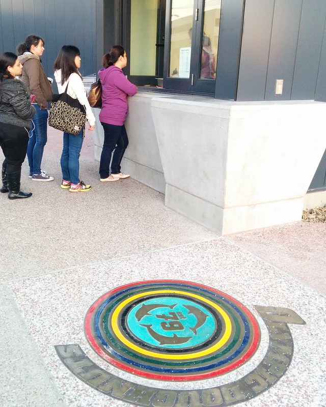
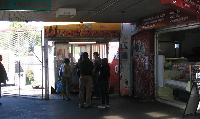
As has been noted before, Olympic Doughnuts survived the rebuild of Footscray station.
This was apparently so important that the Premier made special mention of it when the new facility opened:
The other area that I’ll make a brief comment on is I was out at Footscray this morning as part of the Regional Rail project. And one of the feedbacks we got from the Footscray community and the people who use Footscray Station was the enormous popularity of a local institution there: Olympic Doughnuts. And the feedback was, ‘Make changes to the station, but make sure you keep the Olympic Doughnuts and the man with the Olympic Doughnuts.’ So the Regional Rail team facilitated a new and more appropriate facility for Olympic Doughnuts to stay on the forecourt of the Footscray Station.
I finally got to partake in one of their jammy delights on Friday.
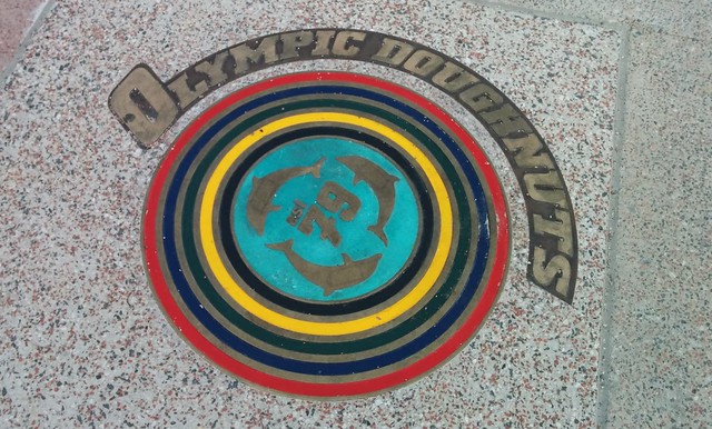
Somebody must have decided (possibly because government was involved in providing the new booth) that the old trademark-defying logo (the Olympic rings, upside-down) had to be adapted into something else. They came up with something quite neat.
The new logo incorporates the Olympic rings, but in a less trademark-infringing way. The iconic dolphin, still used as the jam dispenser, is featured prominently. The date of establishment, 1979, is also worked into it.
Well done, whoever came up with this!
Shame the rest of the area is currently so windswept and desolate. Perhaps there is more development coming.
(Eagle-eyed customers may note that in the rear of the shop, behind a half-open door, the old sign is still sitting at the back.)


2 replies on “Olympic Doughnuts: new sign hopefully less trademark-infringing”
What a great story with a good result! Looking at the original photo of the outlet, I’m not sure I find the location particularly attractive (scribbles all over the brick work). But I guess it had character.
As much as I’m happy the man and his institution remains, I’m always a little saddened when iconic older food establishments get revamped/renovated. It is a good sign of a quality product when there is a long cue pouring out of a run down old establishment. Much like Dinkum Pies before it’s major, and utterly bland, facelift about five or six years back; the place had so much more charm looking like a timewarp to the Melbourne of the 1960s. Alas, I fear the pies are not quite what they used to be either (although compared the the ubiquitous and awful Pie Face’s, they’re still incredible).