Last Christmas in our extended family we did Kris Kringle gifts – one bought, one home made. And it was random, and anonymous. (I managed to distribute the names, then forget who gave to whom.)
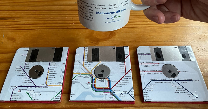
The handmade gift given to me was coasters – a masterful design combining my interests of public transport and retro computing. Fantastic.
The coloured line rail map was rolled out in 2017, and has had revisions since then as new stations have opened and been renamed.
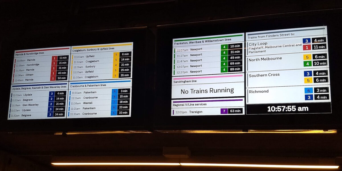
And now the rail line colours are getting more prominent. Recently the displays around Caulfield station were upgraded to show the colours on the screens, continuing the gradual rollout that started at CBD stations.

Colours are good, but they can’t do the job on their own. Some people (myself included) have varying degrees of colour-blindness, and light conditions aren’t always ideal for differentiating colours.
Can the naming be clearer?
Back in 2015 I wrote about the idea of lines having letters instead of using the termini names – which can be confusing especially with many trains terminating short.
I thought I’d revisit it, because the situation has changed a bit.
Why?
Simplification of routes and wayfinding can help a lot for people unfamiliar with the network avoid a confusing experience, and encourage new users to become regular ones.
Bold simple identifiers like colours and letters or numbers are simpler for many people to use, and can be displayed prominently on maps, station signs, and where possible on the trains themselves.
Names of terminus stations might be meaningful to some people, but meaningless to others who are unfamiliar with Melbourne’s geography, and may be difficult for some people from non-English speaking backgrounds.

What’s new?
Since the appearance of the map, there’s been a welcome further separation of lines and more consistency of operation. The Sandringham, Werribee/Williamstown and Frankston lines now run direct to Flinders Street all the time rather than via the Loop some of the time.
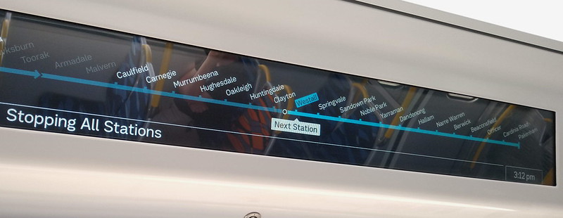
Train fleets are increasingly becoming more dedicated to specific groups of lines, making it possible to install line group-specific signage and maps on and inside them. Even better, new trains have screens inside that can show line maps.
And finally, the Metro Tunnel is nearing completion, which will mean a shake-up of operations, and which lines connect to which and where.
There’ll be a greater emphasis on changing trains, because fewer lines will serve some CBD stations such as Parliament, Flagstaff and Southern Cross. So easy familiarity with lines other than just your own local service will be a real help.
It’ll be even more so once the Suburban Rail Loop starts to open next decade.
What do other cities do?
From a quick scan of some of the world’s biggest metros (via this article – which may or may not be strictly accurate), almost all of them avoid using line names.
- New York City – numbers and letters
- Shanghai – numbers
- Beijing – numbers
- Seoul – numbers
- Paris – numbers
- Madrid – numbers
- London – names
- Guangzhou – numbers
- Moscow – numbers
- Delhi – colours and numbers
What about around Australia? It’s all line names, except Sydney which has grouped lines together and numbered them. Adelaide sometimes throws in line abbreviations, but doesn’t consistently use them – I’m not sure I see the point.

A concept
The aim here should be to keep it simple. Last time I pondered differing letters to indicate termination points, branches or stopping patterns, but on reflection I think that makes it too noisy.
Simplicity means you’d stick to one letter, with the colours still used, and also show the destination on the trains alongside the letter – which means basically you’re not losing anything off the current system.
I still prefer letters to numbers, as numbers would clash with platform numbers and with the tram network. (Tram route numbers are already designed not to clash with bus route numbers.)
Letters, if chosen carefully, can also ease the transition from line names.
Plus the widespread rollout of Passenger Information Displays showing destination and stopping patterns on platforms means this is no longer as important externally on the trains themselves.
A – Anzac line – the new connection from Sunbury to Cranbourne/Pakenham via Anzac station.
“A” is also a befitting moniker for the newest line with the newest trains, signalling and platform screen doors. As a bonus it also goes through Arden, and one branch will eventually (hopefully) go to the Airport.
B – Bayside line – Sandringham to Werribee & Williamstown line via Flinders Street
C – Craigieburn line via Loop
F – Frankston line via Loop
G – Glen Waverley line
H – Hurstbridge line via Loop
M – Mernda line via Loop
R – Ringwood lines to Belgrave/Lilydale via Loop
S – Showgrounds/Flemington Racecourse, special events line
U – Upfield line via Loop
That just leaves the (mostly) shuttles: Alamein and the very infrequent Stony Point line. I’m open to suggestions.
- Alamein should possibly be R, given that in peak hour it also serves Ringwood line stations
- Arguably Stony Point should be treated like a V/Line service and not have a letter, even though technically it’s Metro. (V/Line’s own line naming is far more consistent than Metro’s.)
L could be used later for the Suburban Rail Loop.
Remember, the letters are meant to help the transition, and also to outlast the old names if there are network extensions later. So if for example the Upfield line is extended later to Craigieburn and Wallan, it can stay as the U line.
Anything like this isn’t an excuse to skimp on other forms of information, of course. Good indicators around stations and on trains showing the destination and stopping pattern are still important.
And it certainly doesn’t mean they can skimp on high frequency services, which are vital.
But letters could work well. In coming years it’ll be a lot easier to direct people entering the Melbourne Central/State Library station complex to the new lower platforms to catch an “A line” train than for the “Sunbury/Airport/Cranbourne/Pakenham line”.
Whatever scheme is used going forward – names, letters, or something else – authorities are going to need to carefully plan out wayfinding and information as the Metro tunnel opens.
Changing trains will be a lot more common soon, and everybody will need to be able to easily navigate their way between lines and around the network.
21 replies on “Letters and numbers”
Shanghai has numbers and colours, but since most Chinese seem to be more sensitive with route numbers in public transport, they reference the line number in most scenarios.
It’s a difficult one.
I think the London tube naming generally doesn’t refer to place names, e.g. “metropolitan line”, whereas Melbourne’s train lines usually refer to the last station, e.g. Sandringham.
I guess I’ve used the same system all my life and don’t want another layer to confuse me.
Excellent suggestions
Tokyo uses letter and numbers for their English version
https://www.tokyometro.jp/station/pdf/202305/202305_number_en.pdf
Technically, Melbourne’s lines already have letters – for the automatic signals. W is Williamstown, G is Geelong (beyond Newport via Werribee), M is Main line (ok, not so obvious), A is Adelaide (beyond Sunshine), E is Essendon, C is Coburg, T is Thomastown, S is Hurstbridge (they were running out of letters), H is Healesville, D is Dandenong, F is Frankston, and B is Brighton. Guess where Q went to…
I think letters would be a great idea, but not all of them will be meaningful.
@Roger, the London names are often more geographical than you’d think. The ‘Bakerloo’ line, for example, is the ‘Baker St and Waterloo’ – from the original formal name of the line reflecting its extent.
Completely agree about naming conventions on the rail network. I like your suggestions of letters. It would be good to genuinely consult with international visitors to Melbourne, particularly from Asia and South Asia, whether letters or numbers would be more helpful.
I quite like the NSW system of a letter for the mode and a number for the route
M – Metro(politan)
V – Vline or R – Regional
T – Tram
B – Bus
C – Coach
M1 – Sunshine to Dandenong
M2 – Craigieburn
M3 – Upfield
M4 – Mernda
M5 – Hurstbridge
M6 – Camberwell
M7 – Glen Waverley
M8 – Frankston
M9 – Bayside
Tokyo uses letters – https://www.tokyometro.jp/en/subwaymap/. One of the world’s biggest metros, but not included.
The gunzel in me would prefer that we use the letters already established for signals and other infrastructure, per http://www.victorianrailways.net/signaling/autopre.html
I agree. Even for experienced locals like myself, I struggle to connect old train line names to what is now used. What is the Watergardens line? What is the St Albans line? Epping is now South Morang or something else. It was on the tip of my fingers but I can’t remember now. Ah, Mernda.
Something needs to be done about the Werribee train line to make its operation clearer. There needs to be an online timetable for the Laverton train. It is a recognised train destination, so why isn’t it on the timetable as such. The online Werribee timetable is laborious to use for weekdays. I think it was last Sunday we caught a train to Altona and to my surprise I learnt that Werribee trains use the Altona Loop on Sundays. With only a twenty minute service, it was less busy than I expected.
I think Singapore’s end destination number scheme works the best. I used to think it inferior to NYC’s approach, but that’s more because NY has so many different service patterns.
Taking the Sunbury to Dandenong line, you’d assign say 4 to Sunbury, 3 to Pakenham, and 5 to Cranbourne. Reserve 6 for Melton or Airport. And keep the blue colour.
Then you have a number that indicates not only the line, but the actual direction as well. Short workings would keep the final number, so a Dandenong train would show 3 still.
I don’t think clashing with the tram network is really a concern if we use numbers in coloured circles.
Like the little girl in the tex-Mex ad, why don’t we have both? That is, letters to convey the main idea, numbers the nuance.
To borrow from Daniel’s example, every line would have an even end and an odd end (and let’s be honest, most lines already have one end that’s a little bit odd).
A1 = Airport, A3 = Sunbury, A2 = Pakenham, A4 = Cranbourne.
You could use numbers to signify stopping patterns.
B1 = Werribee (express), B3 = Werribee (via Altona Loop), B5 = Laverton (via Altona), B2 = Sandringham, B7 = Williamstown.
Timetabled short stops would also have their own number.
R1 = Lilydale, R3 = Belgrave, R5 = Ringwood, R7= Box Hill.
The station index would show the line service for each stop.
Want to go to Union? Take any of R1, R3, R5 or R7.
Want to go to Mooroolbark? You need an R1.
Looking for Westona? That’s a B3 or B5.
Hoppers Crossing? B1 only.
South Kensington? B3 or B5, but NEVER THE A LINE!
Much prefer Singapore’s north east line or circle line style/format over just numbers.
As James suggested, the Paris RER uses letters to refer to lines (A, B, C) and numbers to refer to the destinations on that line (A1, A2, A3). Odd numbers are at one end of the line, even numbers at the other. Interestingly services are given four letter names (starting with the line letter) to indicate stopping pattern (CARL, stops all stations to the C3 end of line).
London’s names have only a loose connection to the train route, and can be more memorable than a single letter.
Hi Daniel
Bayside line really should be Cross City so (CC) or X
I like the idea of letters and numbers for stopping patterns ie
CC or X1 Williamstown
CC or X3 Laverton via Altona
CC or X5 Werribee
CC or X5 Sandringham
Or if the network development plan stage 4 Cross City is not dead
CC X6 Alamein
CC X8 Glen Waverley
Swanston line (not Anzac)
S1 West Footscray
S2 Wyndham Vale
S3 Melton
S4 Watergardens
S5 Sunbury
S5 Airport or just A for Airport
S7 Dandenong
S8 Pakenham
S9 Cranbourne/Clyde
Or odds on one side of the city and evens the other
Hurstbridge Mernda Line HM possibly various numbers for stopping patterns
Frankston Upfield/Wallan could not be the FU line for obvious reasons.. UF OR FW I would prefer P line as it would pass through Parliament Station
Belgrave and lillydale R for Ringwood
Not sure if any of the line names, letters and/or numbers is any more confusing
Also is Network development plan gone the way of the dodo?
Sorry E Or C for Craigieburn line
Why not just use the map colours like Chicago
Not sure what the point is of naming lines after stations are, that’s what we currently do and is part of the problem.
I like the idea of using a Letter (or letters) to represent the line and the number to represent the stopping pattern, although this could be confusing when compared to the tram/bus network so needs to bed one delicately.
For example (assuming post city loop reconfiguration):
Cross-City Line (CC): Werribee/Williamstown to Box Hill/Glen Waverley. Different from the PTV plan but makes more sense to me.
North-South Line (NS): Metro 1 from Sunbury/Melton to Cranbourne/Pakenham. Do think Anzac Line could work well here, key interchange station in the middle of the line.
City-West Line (CW): Craigieburn to Frankston via Flinders St (I know the PTV plan has this going via the loop but makes little sense to me. You want the line going via the loop to have spare capacity to take transfers).
City-East Line (CE): Wallan to Sandringham via City Loop (ie East of the CBD).
Burnley Loop Line (BL): Ringwood services into the city.
Jolimont Loop Line (JL): Initially Mernda/Hurstbridge services into the city, but would become Hurstbridge/Doncaster after Metro 2 is built
East-West Line (EW): This name is reserved for a future Metro 2 when built.
For example on the stopping patterns, the screen shows BL3 so you know that means a train which goes to Lilydale running express Burnley-Camberwell-Box Hill-Ringwood and then stopping all from there. The codes help people quickly see more than just the last stop of the train. The generic limited express (due to skipping East Richmond) currently shown for the next 3 services on the displays are useless.
I don’t really think letters or numbers help anyone from out of town. What you need to know is where you are and where you are going, and you need a map or an app for that. I have no idea where the T2 in Sydney goes, any more than the A train in NYC, Paris Metro line 12 or the Bakerloo line, unless I look at a map. Colour coding makes a difference though.
Back when the line that terminated at Watergardens was known as the Sydenham line you would get either on the front of the train.
I’m not sure the existing colours do it – grouping the Sunbury, Craigieburn & Upfield lines together in yellow makes no sense, as the only common station is North Melbourne, although I guess they all share the same platform in the City Loop. Until the Metro Tunnel opens, of course (and the Sunbury line turns blue?).
I think it makes sense to name the two cross-city lines something other than the terminating stations – I think either the Anzac or Swanston line works for the Metro Tunnel, and the Bayside line works for the direct line via Flinders Street. And if other lines are joined up in the same way they can get a name too. Otherwise I think the current geographical names are fine – unless you wanted to give them compass points but that doesn’t work because which of Craigieburn, Upfield or Mernda is the Northern line?
Interesting! The numbers (T1 etc) were introduced in Sydney…10 years ago? I know that new arrivals and visitors find them really helpful but (unsurprisingly) I don’t think they have penetrated particularly well into Sydneysider vocab/conception of the city.