Below you can see the current rail network map. As maps go, it’s pretty useless, because it tells you where the tracks go, but not where the trains go.
Looking at it, you might assume that trains run from Sunbury to Upfield — but you’d be wrong, of course. (The latest version does at least have Wyndham Vale and Tarneit added.)
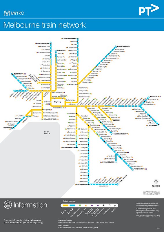
Back when there were three zones in Melbourne, and you had to buy your ticket in advance to cover the zone(s) you wanted, it might have made sense to emphasise this at the expense of route information, but with changes meaning most trips are a flat fare, zones are much less useful now.
You’d recall that during 2014 there were several drafts of a new rail map.
It’s a huge improvement, because it does a much better job at showing where the trains actually run.
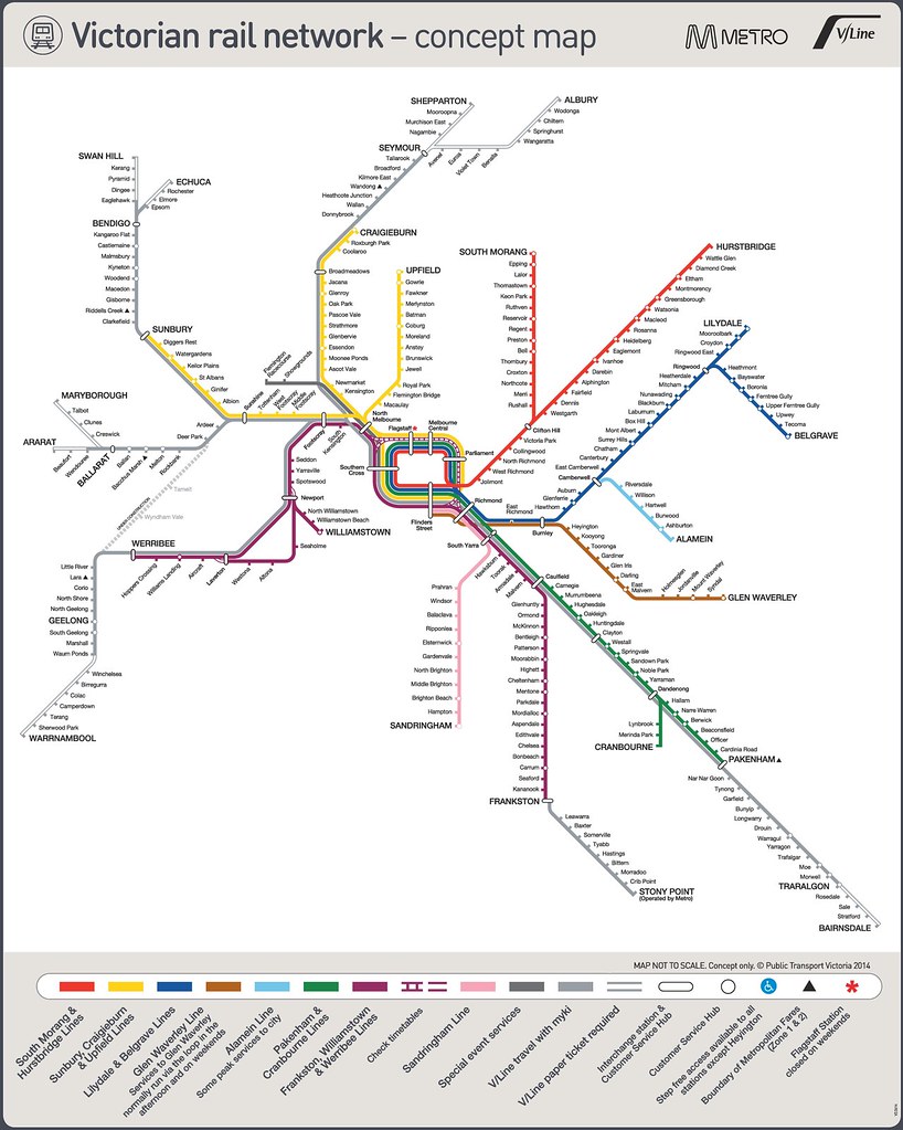
(Click to see it larger, and uncropped)
But apart from a handful of locations which got them temporarily for the purpose of soliciting comments, it’s never been rolled out.
It’s expensive to do that of course… to replace every single map on every single station and every carriage…
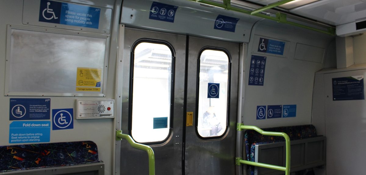
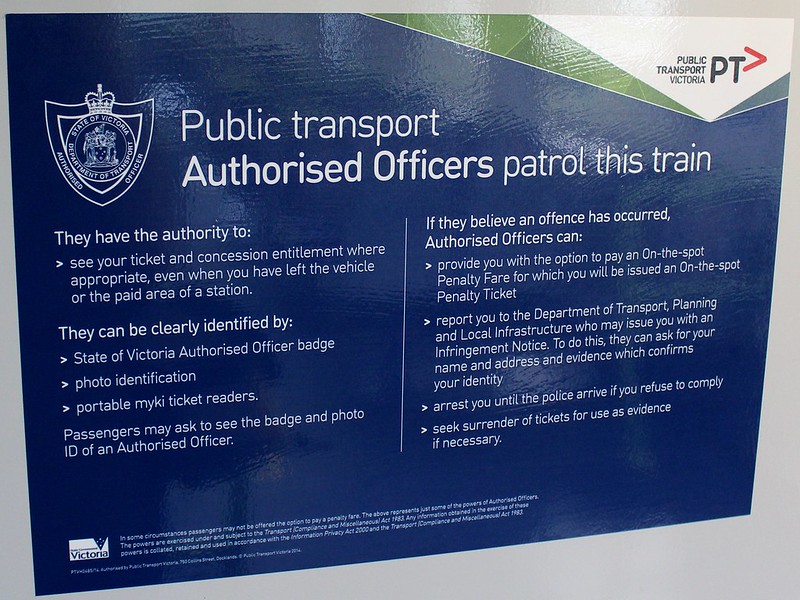
And yet, they’ve managed to replace all the signs on the trains about Authorised Officers. See, they have the new name of the government department that oversees them, the Department of Transport, Planning and Local Infrastructure. Edit: This has since been replaced by the Department of Economic Development, Jobs, Transport and Resources.
So why not distribute the new map?
Possibly they were waiting on other developments: the opening of new stations such as Caroline Springs (coming in January), the timetable changes that were to reduce variations in operating patterns (originally planned for 2015 when Regional Rail Link opened, but postponed), and even a proposal to colour-code platforms at big stations such as Flinders Street.
It’s unclear how the latter points are progressing, but there’s good news. I’m told the new map starts rolling out in January.
It’s no doubt had tweaks since we last saw it in 2014, but it really will be a vast improvement, and it’ll be great to see it replace the old one.
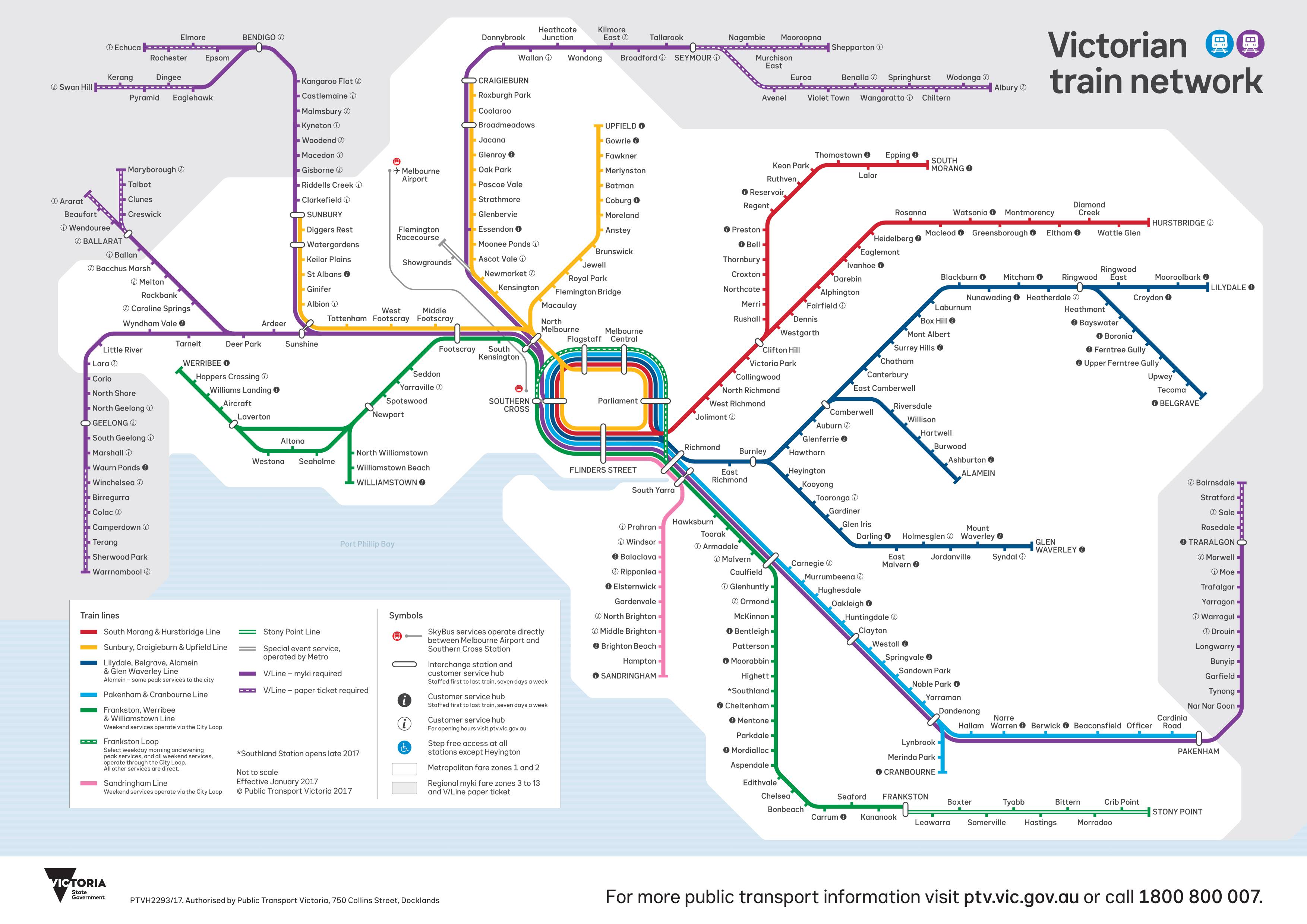
Update 28/12/2016: The government has confirmed the new map is to be rolled out during 2017, and shown off the latest design:
17 replies on “The new rail map is finally coming”
I feel they’ve missed a big opportunity to put the Smartbus routes and some tram links like routes 82 and 96, on the map, to show people that the system isn’t entirely radial.
Much improved, and a good go at showing a summary of where the trains go and how they are connected. As always, there could be tweaks – perhaps add zonal information in shading, but I wouldn’t want to complicate the map too much more.
@Paul There’s probably a need for a ‘simple’ metropolitan map that is multi-modal, but you’d do that with a simplified rail map to start.
Another idea for a multi-modal map could be one that shows all modes that come to the city – including the buses.
And on the topic of signage I’ve noticed recently that the station departure signs on the Sunbury line now spell out South Kensington (I.e. the train doesn’t stop there) rather than just using SKN.
@
That’s good news. Hopefully they will no longer state Flagstaff is closed on the weekends as they currently do :)
One positive I must express is, the fact that I do like this new map. As expressed above, it is important to show where trains go.
So, will Metro trains now start showing the V/Line network too?
I take it that, the Glen Waverly line no longer runs via the loop?
Why not turn that into a cross city line. say, to Essondon, boosting capacity on that section of the Craigiburn line. Just like route #12 overlaps with tram route #109 to Victoria Gardens.
Interesting. I had assumed they were waiting for Caroline Springs, but what about Southland? – and then you’ve got the Melbourne Metro in a few-ish years. And the Mernda extension.
The Department of Transport, Planning and Local Infrastructure no longer exists… it’s transport functions are now found at the Department of Economic Development, Jobs, Transport and Resources (DEDJTR) and has been this way for at least 18 months, so they’ve not been so quick to change the signs as you suggest.
Your point still stands, however.
There were two previous discussions here about the draft map concept.
From memory, the zones and tram/bus connections weren’t shown because people generally either didn’t need the information or used their phones to get it.
I think the main thing that bugs me about the map now is that it isn’t a rail map – it’s a map of myki-compatible, daily trains. The “daily” bit explains why the Overland isn’t shown (at least to Nhill), and the “Myki” bit explains why Puffing Billy and the XPT aren’t shown.
Urgh, stop the press!
The Cranbourne line should actually “meet” the Pakenham line at Dandenong. Looking at the map the Dandenong station side of the Cranbourne line is not touching the white interchange icon…whereas at Burnley it is. I also notice it doesn’t at Ringwood.
A bit OCD I know, but it would make it clearer for infrequent travellers.
TrainGuy – not really sure what you’re referring to? Looks the same to me on all three interchange points you refer to.
Trainguy – How it’s presented looks fine to me.
Especially since at most times both Cranbourne and Pakenham trains stop at the same stations inwards from Dandenong. Therefore they can be regarded as one line with a 10 min 7 day/week daytime frequency for those stations.
Whereas the lines in from Burnley are separate and lack common frequency or stopping patterns. Belgrave and Lilydale are fine on weekends but have odd interpeak weekday stopping patterns that require more than a map change to make legible.
The Cranbourne line should be “coming out” from the white icon at Dandenong. Based on the proposed new map it spurs out from in between Dandenong and Hallam.
It should branch out from Dandenong. The map suggests Dandenong is used to transfer between Pakenham (green line) and the grey line (Traralgon).
If I recall, the London tube map illustrates this perfectly by having the white icons touch other white icons on the connecting lines where you can interchange.
I don’t see why they can’t make the Cranbourne line branch out from Dandenong. Space constraints on the map isn’t an issue…
@David Stosser: Albury, Shepparton, Echuca, Swan Hill, Maryborough, Ararat, Warrnambool, Bairnsdale all use V/Line tickets, not myki.
So I guess it’s just a map of train services operated by either Metro or VLine. No real reason why XPT or Overland don’t make the cut.
@TrainGuy – branches on the London tube map are presented in exactly the same way as they are with the new Metro map. Look for example at the Northern Line: the High Barnet and Edgware branches divide north of (rather than at) Camden Town station. Same for all other branches on Central, Metropolitan, DLR…
Paul – some years ago I obtained a fold-up multi-modal map of transport in the outer eastern suburbs where I live (around Wantirna, Bayswater, Ringwood, Croydon). You’re right – a full map would be useful, even if it wasn’t a hard version.
I assume when the new map is going to be rolled out, it’ll look similar to the concept map? i.e. Have all rail corridors both electrified and non-electrified regardless of whether they fall within Metropolitan zones.
Even if it doesn’t go that far and they still go with rail maps specific to zone 1 & 2 coverage, they should at least show places like Lara, Bacchus Marsh, Riddells Creek and Wandong, rather than potentially creating misconceptions that zone 1/2 fare coverage cuts out at Wyndham Vale, Melton, Sunbury and Craigieburn.
Sure said maps had relevance in 2012 and prior as those places were not covered by Metcard, but they’ve effectively been obsolete since December 29 2012, so one wonders why they haven’t shown those areas on every metropolitan rail map produced since then.
It’s been up at North Melb for a week or so.
[…] flagged earlier in the month, the long-awaited new rail map, in the works since at least 2014, has finally been officially […]