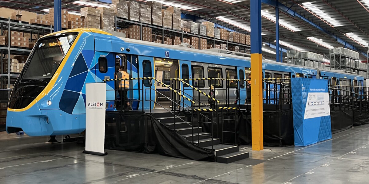
Yesterday I was part of a group that inspected a mock-up of the X’Trapolis 2.0 train – which is set to rollout on the Upfield and Craigieburn lines in coming years, and potentially the Frankston line in the future, replacing the Comeng fleet.
They also did this kind of stakeholder engagement with the HCMT fleet back in 2017-18. It’s valuable – it means the project team can get perspectives that wouldn’t otherwise have been considered.
At this stage they’re not sure if the mock-up will be publicly displayed. Hopefully.
Here are some photos and comments.
I know some people don’t love the external cab design. It’s not beautiful, but I think it’s fine.
One distinctive part of this train’s external design is the pelmet along the side – the section at the top that the doors are attached to, and that the external cameras are mounted on.
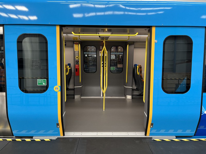
The doors are external, so they don’t take up space within the carriage when opened, as they do on the HCMT fleet. They also apparently work well with Platform Screen Doors, reducing the gap between the train door and the platform door.
We did have a discussion about exactly how the door buttons work with the project team. The HCMT design needs improvement (they confusingly lock for a short time if a passenger dares to press the button just before the light goes on), and at the moment we’ve still got a situation where buttons on the older X’Trapolis 1 and Siemens trains behave differently. Needs more consistency.
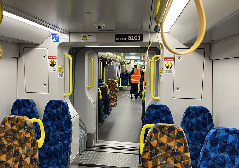
As with the HCMT and Siemens fleet, there is continuous space along the train, so you can easily move between carriages. They seem to be trying out whether the seats nearest the carriage ends need handles or not – I think they should have them.
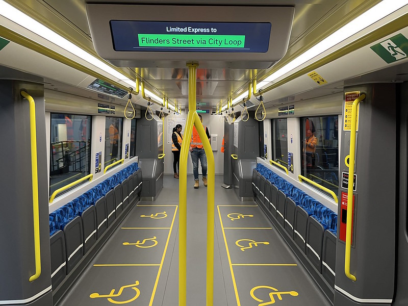
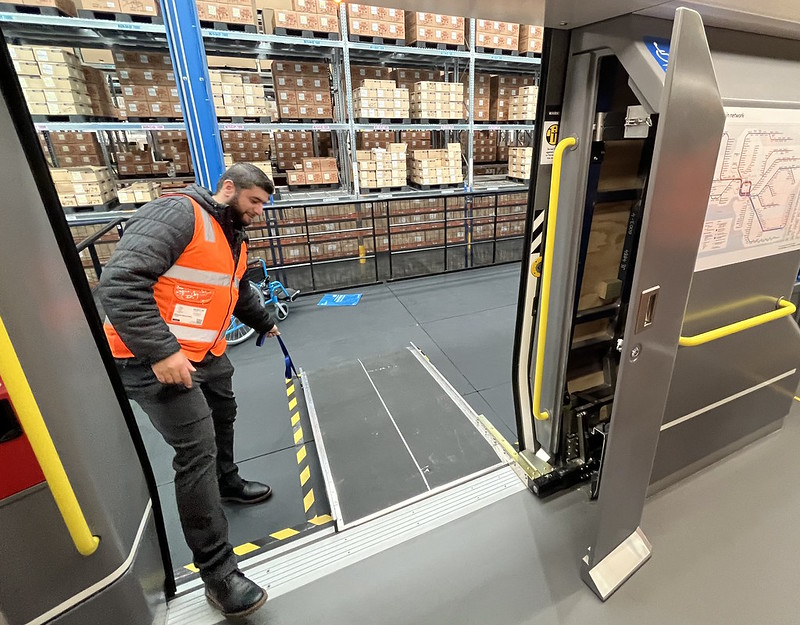
The front section of the front carriage has plenty of room for mobility aids, eg wheelchairs. The vertical pole in the foreground of this photo is present in most doorways, but not at the front of the train. These are very handy (pardon the pun) for most passengers, but difficult to manoeuvre around for users with mobility difficulties.
Assuming there are at least some older platforms with a gap, mobility aids can be loaded using a ramp, which is stored in a compartment next to the door, and can be deployed quickly by the driver.
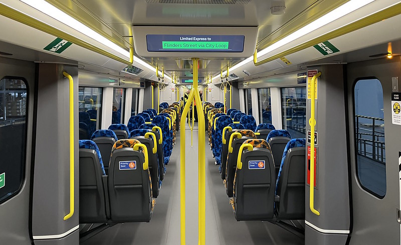
In other sections of the train, there are a lot more seats. The doorways have displays indicating the next station.
The high-backed seats in most sections of the train seem comfortable enough; similar to VLocity train seats. Leg space isn’t too bad, even where seats face each other. While each seat is not super roomy, having 2×2 seating means you’ll never sit next to more than one person.
The longitudinal (wall) seats are slightly less comfortable… they seem quite cosy when you’re sitting between other people. There was some talk from the project team that they might space them out a bit more – I hope this is the case. Some designs in other cities include intermediate arm rests or bars to help separate the seats.
Further back there’s space for bikes. Note the strap to secure the bike. Obviously the emphasis should be on bike parking at stations – government needs to do a lot more on this. But some cyclists may sometimes need to bring their bikes on trains, so it makes sense to have some space for them.
I don’t quite understand why they don’t allocate the big front section for wheelchairs (where the driver can easily access the ramps), and reuse that space for bikes at the back of the train, with dynamic displays showing that’s in use – changing it when the train reverses at a terminus. Especially as it’s very common for the middle of the train to be busier with other passengers than either end.
There are dynamic route displays along the insides of the carriages. We did notice a lack of network maps, apart from 3 near the driver’s cab. These are still useful for people making connections to other lines.
There are quite a few places to hold on – most seat backs have handles, there are bars in the doorways, and hand holds like this – though arguably not enough of them.
The driver controls. Wisely the horn button was not operative. I won’t pretend to know what all the controls do, but they’ve had drivers review the design. It’s also adaptable to in-cab signalling in the future if required – the speed limit panel can come out and be adapted for that.
Overall it looks like a pretty good design. Internally it very much has a similar feel to the HCMT fleet, with the passenger features one would expect in 2023.
It’s good to see plenty of places to hold on, though there are still some sections where a few more could be provided.
Being able to walk right through the carriages helps make the train feel quite spacious.
There won’t be intermediate cabs – it’ll be a permanent 6 car formation. They’re expecting the first of them to roll out around 2025.
They should be a nice upgrade from the Comeng fleet.
More views, photos and commentary:





30 replies on “X’Trapolis 2.0 mock-up”
Well done on scoring a preview visit! Thanks for the photos.
As an ordinary commuter, I probably wouldn’t even notice any difference if I stepped aboard one of those trains.
Fixing that issue with the door button (locking if you press too early) is a priority. So unnecessary and, as you say, inconsistent across train-types.
Lucky they put all those rail-approved non-red vests on you so that you didn’t get run over by the mock-up train.
No dedicated space for bikes/wheelchairs/standing only and instead having fold down bench seats probably isn’t a great move. It reduces the amount of space available during crush load, and while people will likely move out of the way for a wheelchair/mobility scooter, bike users will most likely be stuck against a door or forced to balance in the middle of the carriage when the bench seats are in use! The current X-Traps do it best with the dedicated open space at the end of each 3 car set.
Looks like the displays aren’t annoyingly obscured by loads of yellow metalwork hanging from the ceiling.
So many longtitudal seats.
Wondering why they’re still rolling out a second train type post HCMT? I thought the HCMT would become the single standard class. What will be the capacity of these trains compared to the HCMT?
Thanks for the comprehensive assessment of the new trains. I agree with you about the need to dynamically change the wheelchair and bike spaces, so that the two sections flip in their use depending on the direction of travel. With electronic signs this should not be difficult at all.
Tony P for the HCMT to be used on all lines significant work needs to be done, the Xtrapolis is designed so it provides an upgrade without requiring tons of retrofitting.
Regarding the door controls, I like the Adelaide arrangement where the buttons can be pressed at any time (even between stations), and the doors open when released by the driver.
David Stosser, I believe that you may be thinking of the C-Series trains in Perth which are part of the XTrapolis family of trains and is similiar to the XTrapolis 2.0 here in Melbourne, unless you are speaking about the ACity 4000 trains, which are based on the Vlocity trains in regional areas.
Melbourne traveller’s persistence in holding the door button before the driver releases doors amazes me.
This might not be relevant only to the new models, but is there a reason the horns on trains in Melbourne are necessary and so loud? Standing next to one in the loop tunnels is deafening. Other systems like the London Underground don’t seem to use them at all?
At the same time there are so many members of the public who lack track safety awareness and do stupid things in front of trains.
About the door buttons, similar to what David Stosser said, in most European cities you can do the same thing. Press the button as you enter the station, the green light turns on. When the train stops at the station, the doors open if they buttons have been pressed. If the button is pressed after the train stops, then the doors open.
Why does it have to be so hard. Some UX needed I think.
They’ve opened thd viweing up to every man and his dog, yet Drivers (who actually interact with the machinery) have yet to have any “formal” say over the placement of controls and their functionality. Considering the history of recent projects which require Driver input, I’m far from surprised.
Another vote for making those annoying door buttons easier to use.
I am well aware that these trains will eventually see the retirement of the Comeng trains, but my question is this: When the Xtrapolis 2.0 is rolled out, will this result in the Siemens Nexas trains being displaced from the Craigieburn, Upfield and Frankston lines and limiting the Siemens Nexas trains to Sandingham, Werribee and Williamstown lines, or will the Siemens trains continue to operate on the Craigieburn, Upfield and Frankston lines in conjunction with the Xtrapolis 2.0?
A couple of things I’d like to see
One would be to have the seats moved away from the walls by two or even five centimetres. There’s no reason to mount them hard against the side of the train. Not going to make any real difference to the amount of standing space but will give extra shoulder room at no cost
The other would be somewhere to lean against the seats when you’re standing. A lot of people tend to lean against the side of the seats and rest their bum on the shoulder of the passenger sitting in the seat which is somewhat uncomfortable. So having a dedicated, leaning post or something similar would be of great use. This would allow standing passenger to lean against the seats making that journey much more bearable without resting their ass on someone’s shoulder
The nose looks alright in your shots, although I feel like they’ve raised the whole set since the earlier ones.
It used to look like it was drooping onto the ground.
Being a daily wheelchair user I do think next stop button is vital
The track display is clear, but the next stop display at the doors is a primitive green LED which is hard to read even in these clear photos. The driver dashboard looks like someone cobbled it together in their garage from spare parts from the 1990s.
They need to work on the announcements for each stop — Australian rail announcements are incredibly pedestrian compared to overseas networks, and should be able to be updated regularly.
As for the door buttons — on trams and buses, press the button, a light goes on, the vehicle stops, the doors open. On Melbourne trains, the button press does nothing until the train stops — this is contradictory and like a door close button on elevators, it’s confusing for the millions of users, and serves no purpose to have it this way.
Actually Kryzstoff, the train stops at all stations regardless (and it is quite rare to see no one get on or off a train at a station) unlike buses and trams which doesn’t stop at stops when there is no one to pick up or drop off. A long time ago though, there was request stops on regional lines, but it is no longer the case, although in NSW, there is a request stop at Wondabyne.
It would be better to buy more CRRC HCMT trains or other trains by CRRC
Probably one of the biggest changes that has been overlooked is the the X’Trapolis 2.0 will use air suspension like the Comengs rather then the coils used for the original X’Trapolis (or X’trampolines). You couldn’t obviously see this in the mock-up but it should be a good benefit in ride quality.
Will the carriage numbers be 80xx-81xx-82xx-87xx-88xx-89xx?
It looks like the designer combined images of the first Xtraps, a Siemens and the HCMT into an AI image generator.
Why should we need door buttons at all in normal circumstances? What’s wrong with “train stops at station, driver presses button, all (platform-side) doors open”? That would make things a lot easier for all, especially those with limited mobility or pushing strollers.
[…] G Class mock-up, like the train mock-ups recently built, represents the front section of the tram up to the first articulation. Apparently they’re […]
[…] The Upfield and Craigieburn lines will continue running Comeng trains, but these will be replaced in due course by X’Trapolis 2 trains. […]
[…] Opposition decided to make a big fuss about the new X’Trapolis 2.0 trains not being able to use the Metro tunnel, as if this was a huge problem due to poor […]