Back at uni, in one of my subjects we read a great book called The Design Of Everyday Things. In it, author Donald Norman highlights bad designs, often noting: “It probably won a prize”.
One of the hallmarks of good design at railway stations is being able to see the information that you need to find your platform and find your train.
For instance, information screens on the platform should be visible as you approach, meaning if a train is approaching you can quickly see if it’s yours. This is mostly the case.
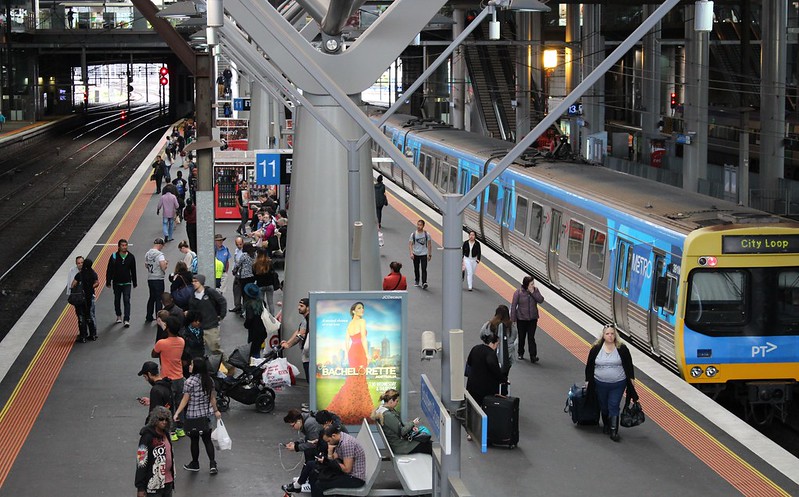
At Southern Cross Station, this greets you as you come down the escalators to platforms 11/12 from the Collins Street entrance:
It’s no better from the Bourke Street entrance.
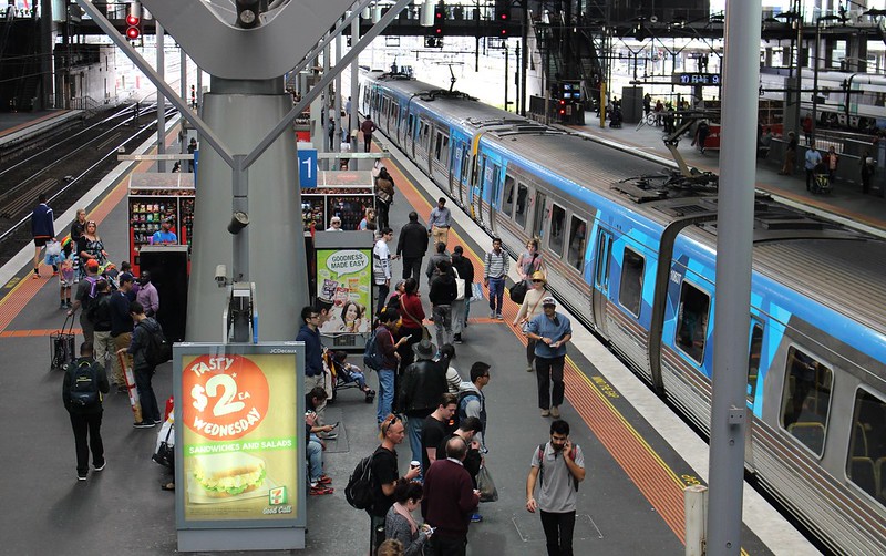
Being behind the pillars also means the screens aren’t visible from substantial sections of the platform.
Thankfully other platforms aren’t as bad — the differing roof support structures mean that the screens are generally visible.
But did it win a prize? Yes.
The Age 24/6/2007: Southern Cross wins prestigious architecture award
As Donald Norman’s book says: prizes tend to be given for some aspects of design, to the neglect of all others—usually including usability.
Sad but true.
The station has numerous faults, including diesel fumes, seats that are ice cold in winter, the loss of the convenient subways, the name change, and lights way up high that are difficult to maintain — possibly why diesel generators are currently powering lights on some platforms.
For all that, Southern Cross was a huge improvement over the dingy dark toilet block of a station that was an aging Spencer Street. But with a little thought, it could have been so much better.


5 replies on “Design: It probably won a prize #SoCross”
Yes, always thought this was a bit of a “dumb oversight” – but to be fair, there are PIDs at concourse level as well, so you can look before you step onto the escalators.
It’s easy to see from your photos where their priorities lie (revenue from advertising)
Yes, I am with you there.
It may have been ideal to place the train information displays on the sides of that big support pole.
Those display screens at Southern Cross bug the hell out of me. On the escalator is the perfect time to read a screen because you don’t need to watch where you are walking. And if it is the train you are after, you can run down and get it.
[…] At the time the rebuild of the station was relatively new. This bloke seemed to be setting up the platform screens (since replaced by something more beautiful, though many of the screens are now located behind pillars!) […]