Some interesting data updates recently from the Victorian government:
They recently added train platform details to GTFS, as well as replacement bus stop data, which makes it easier to navigate around using online journey planners. Good stuff.
There’s also a recent open data portal that was enabled, along with improvements to “in seat transfer” (eg through-routing) data. This has resulted in some quirks, for instance Google Maps will sometimes send you around the Loop instead of waiting ages for a train connection that will be the same physical train. But it’s still useful to have.
Last week they also updated the monthly patronage data, which I’ll look at below. Unfortunately the patronage by day type hasn’t been refreshed in a while – the latest data is from 2023.
There are still issues with real time data not correctly showing disruptions (even planned disruptions) on automated signage and on the PTV app.
But anyway, let’s look at the patronage data.
Patronage 2018-2024
The monthly patronage data gives boardings by mode by month. Here’s how it looks on a chart:
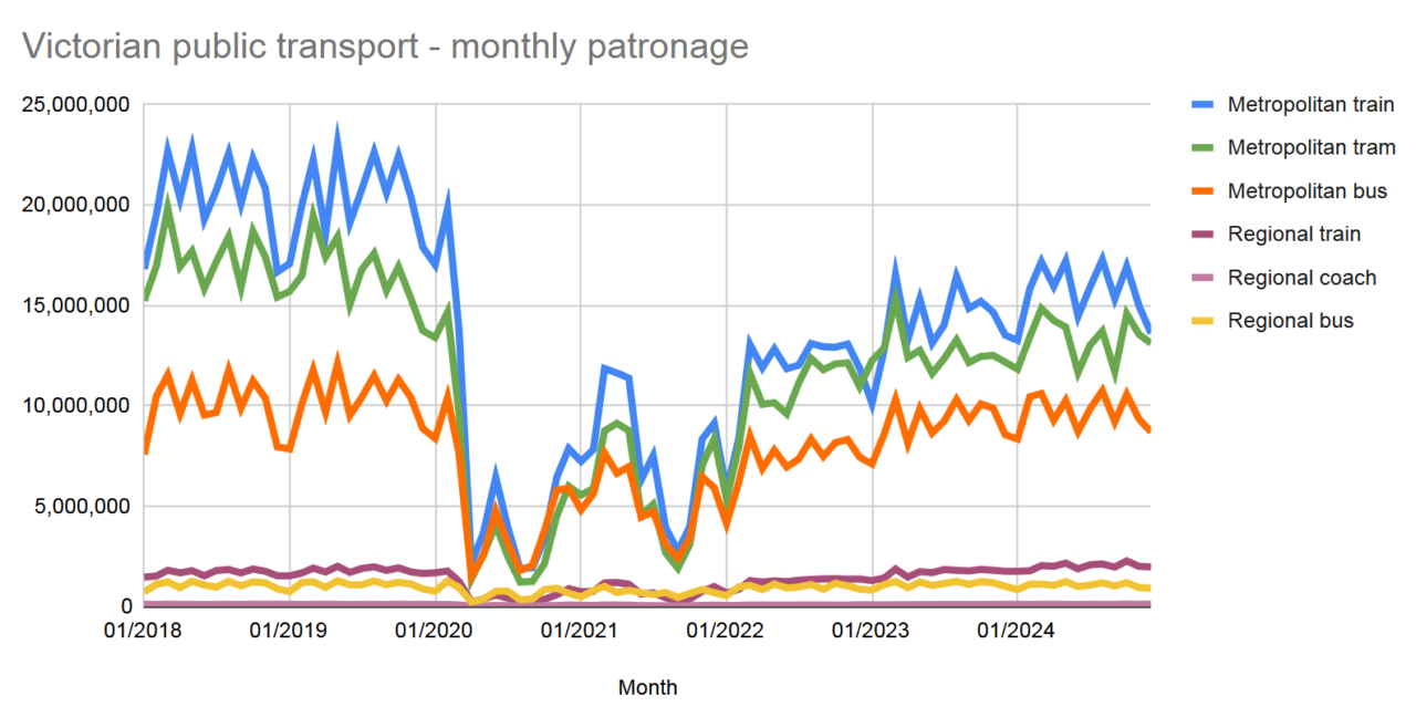
If you’ve seen similar data before, this is pretty familiar. Metropolitan modes dominate, and patronage continues to slowly grow back towards pre-COVID levels.
The jaggy lines is a result of different numbers of weekdays vs weekends every month.
We also can’t see the differences by day of the week. Last time I looked at that, on most modes, weekends were almost back to 2019 levels, and Tue/Wed/Thu were at 70% – Mon/Fri a bit lower.
Regional
For this next chart I’ve separated out V/Line and other regional services, and flattened them out by dividing the monthly figures by number of days in the month, and taking a rolling 2 month average. It’s not perfect (because the numbers of weekdays still varies per month) but it smooths out the lines a bit.
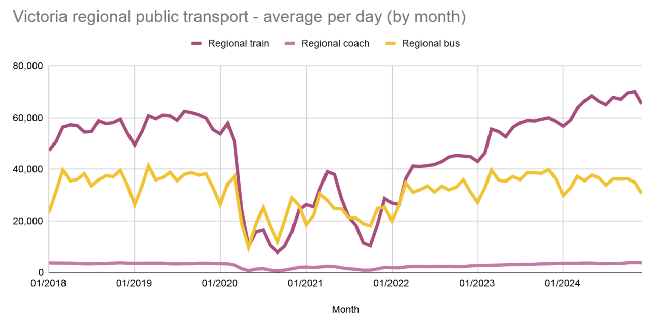
V/Line’s fare cap took effect in 2023, and during 2024 patronage boomed, with V/Line trains moving from about 55,000 per day in 2023 to around 68,000 per day in 2024.
Remember, that’s a flattened monthly average; we know from previous looks at patronage by day/day type that weekdays are higher than weekends, though weekends have shown the strongest growth.
Given regular reports of crowding, you’d have to assume that capacity (train lengths and service frequency) is now a significant barrier to more patronage growth.
The additional services to Geelong on weekends will help that line (it now runs every 20 minutes, and from what I saw a couple of weeks ago, is well used). They need similar upgrades on the other lines.

Metropolitan
Here’s a similar chart for the metropolitan modes. (Of course V/Line serves some suburban areas too.)
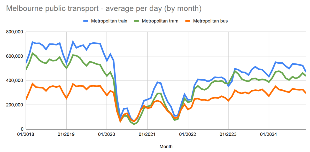
Again, I must emphasise that some days have much higher patronage than others; this is hidden by the averages.
Seeing it like this is a reminder that although buses fly under the radar (for attention and investment), they do carry a considerable number of people.
But patronage on buses – more than any other mode – is held back by poor frequency and operating hours. Contrary to what you might think, people will use buses if they’re good enough.
Imagine if bus services were funded as if they actually wanted people to use them instead of driving…

Recovery
Finally, here’s a comparison of the raw data from 2019 with 2024.
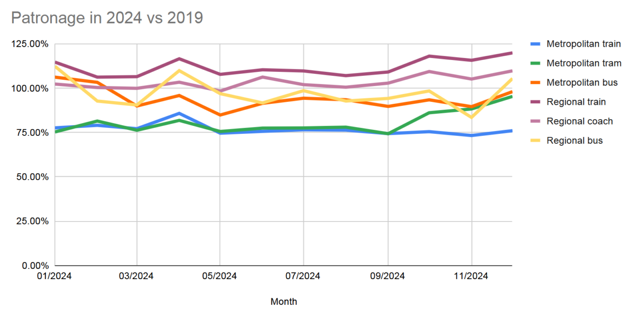
As noted above, V/Line patronage is now consistently higher than before the pandemic.
EDIT: There was a noticeable up-tick of tram patronage in Oct-Nov-Dec 2024 compared to 2019. I’m not sure I have an explanation for this.
Metropolitan and regional (town) buses are consistently around 85-95% of 2019 numbers, probably reflecting that they carry a large number of students and people to non-white-collar workplaces that can’t do Work From Home.
But as noted above, we can’t see the differences on different days of the week, and how that should guide future service investment. The biggest gains to be had are on weekends and evenings when there’s plenty of travel demand, but frequencies are mostly too low for a city of our size.
Hopefully the patronage by day type and mode data will get a refresh soon, and we see more investment in PT services in coming years to help grow patronage.
Updates: The initial interactive charts from Google Sheets didn’t work in the email, and were also unreadable on mobile. They’ve now been switched to static images.
9 replies on “Show me the data!”
A few years back Daniel you were analysing bus patronage in Melbourne and Sydney and I remember saying that the time that, as many major Sydney bus routes replicated former tram routes, we should really talk in terms of “street public transport” as a whole. (In Sydney I would include ferries in that.) We noted at the time that, while street PT patronage was pretty equal in both cities, Melbourne rail patronage was much lower than Sydney’s.
So it was with interest that I scanned your graphs here to see if anything had changed and it seems that it hasn’t. Street PT patronage as defined above is (very roughly-speaking average) around 25 million per month (300 million p.a.) in both cities, but rail (in Sydney suburban+metro) patronage is roughly 15 million per month in Melbourne and roughly 25 million a month in Sydney. Suburban rail and bus in Sydney are yet to fully recover pre-covid levels (which were about 30 and 25 million per month respectively), but other modes are generally fully recovered and even advanced. Considering the popualtions of both cities are the same, why does Melbourne fail to attract Sydney levels of rail patronage, even though imho Melbourne has a good network?
Interurban (regional) rail is much stronger in Victoria than NSW because of much faster journeys without the topographical and alignment constraints in NSW. In NSW, if the regional journey is slow, people drive.
Thanks Tony – I’ve been meaning to do some more NSW/Vic comparisons. Regional rail is one I hadn’t considered; will pull some data together.
@Tony – Melbourne’s rail network looks good on paper. Melbourne has more stations than Sydney. More of Melbourne’s inner suburbs are nearer stations than quite dense inner parts of Sydney.
There are two or three other factors that might work in Sydney’s favour.
1. Frequency. The average Sydney station has a frequent service of every 15 min or better from early morning to late at night 7 days. About half Melbourne’s lines only run frequently in peak hours. The other half with frequent service only do so between approx 10am and 7pm on weekends, so that for people making day trips there’s a high need to plan trips. Even on Melbourne’s busiest lines maximum waits can be 30 to 60 minutes at times when Sydney mostly has a 15 min service.
2. Melbourne’s rail network has all lines going to the CBD. There are no orbital suburban connection points. Sydney’s network is less radial and thus more versatile.
3. At any one time much of Melbourne’s rail network has been closed due to level crossing removals. You can’t make plans without the risk of replacement buses. That might deter casual users. There are also line closures in Sydney so am not sure how strong this point is.
@Peter Parker. Thank you, I agree with your analysis. On top of the good suburban frequencies in Sydney, there is now also the very popular metro with 4 to 5 minute headways throughout weekdays and no worse than 10 minutes at other times. It also provides faster journeys than the suburban network.
Melbourne is to get an orbital metro and I think that will transform the hitherto CBD-centric network. It puzzles me why so many oppose it, other than for political point scoring. It should be a bipartisan project.
Interesting that metro rail patronage is still well down on pre-covid.
I wonder what has happened to costs? If cost of running the system (less fare revenue) has increased, does that mean our PT system is not sustainable in the long-run?
Good analysis. Very interesting to see that buses, in fact, carry a lot more people than you might expect. Given anecdotal evidence of higher rates of fare evasion on buses, I wonder if passenger numbers might be underestimated, and the gap between them and trams/trains could be even smaller?
I should do a post of my own on it, but the data in V/Line’s annual reports tells an interesting story too:
– as of FY2023-24, overall patronage has finally recovered (22.50m vs 21.05m in 2018-19)
– the Geelong line has cracked the 10 million mark and is just ahead of where it was (10.22m vs 9.83m in 2018-19)
– the Ballarat line has surged forward (now 6.11m, up from 4.90m in 2018-19). If you take the pre-COVID trendline and extrapolate it forward, this is roughly where the Ballarat line is now. So we’ve not only recovered to pre-COVID levels, we’ve ‘recovered’ the growth that should’ve taken place in those lost years as well
– the Ballarat line now has patronage comparable to the Geelong line in 2015-16 (first year including Tarneit and Wyndham Vale). But Geelong had 20 minute services at that time, while Ballarat still has 40 (albeit supplemented by Melton short-starters).
@Ben Lever. Interesting. I might have to revise my assessment of NSW vs Victorian interurban. Newcastle line carried over 13 million in last 12 months. South Coast and Blue Mountains carried less, roughly 7 million each. Other NSW interurban lines carried less than 1 million each.
South Coast to Wollongong is about the same distance as Southern Cross-Geelong and the cities are comparable, but the latter trip is about 15-25 minutes faster, which would doubtless encourage more patronage.
The problem with SRL is purely price. We’re spending a lot of money on that project that could have been used elsewhere and arguably garnered more benefit.
It’s also stupid to sink so much effort into the SRL when a large benefit could be obtained simply by running very high train frequencies to obviate a lot of the travel time penalty from going into the city, changing at Richmond and going back out.
To me, at least, it just seems like there should be projects with better bang for buck
The other frustrating thing to me is it seems like there is a pretty poor level of additional service provided to new locations; it’s a lot of work for only two extra brand new stations.
I’d imagine the continued impacts on the rail network due to significant improvement work such a LXRA works would influence Metro Trains numbers.