PIDs are Passenger Information Displays, the screens you see around the public transport network with live information.
It’s good to see a lot more of these being installed at stops, on stations and on vehicles.
But sometimes I suspect they don’t really think about how passengers will use them. There’s an increasing trend of putting them in positions or orientations making them not as useful as they could be.
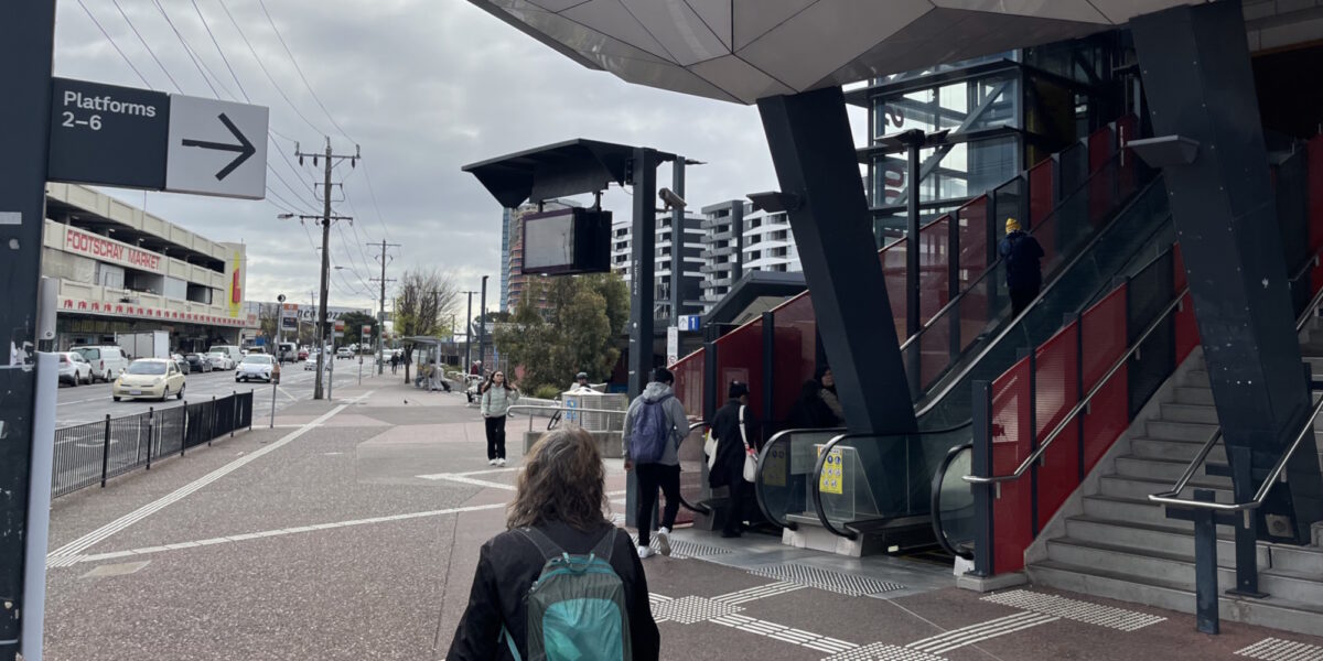
Footscray station: This screen is at the busy main entrance. Which platform do you need? It might be platforms 2-6 up the steps/escalator, or platform 1 beyond the sign. But the screen is angled so you have to be right in front of it to read it. It might be quicker for you to go up the stairs, but you probably won’t be able to read the screen until after you’ve passed them.

Lonsdale Street, an old favourite, where the automated Smartbus sign is far enough from the front of the bus stop (where most people wait) that you can’t read it. Even if your eyesight is great, there are other signs blocking it. What’s the point?

The brand new Parkdale station has the screens at an angle where you can’t read them when approaching from the street. To check the screen, you may end up walking past the stairs and Myki readers, then doubling back.

The recently opened Deer Park station: This is one of the silliest I’ve seen. You can approach from the south side or the north side. But the screens on each side only display trains for the closest platform. So if you enter from the south, you can only see outbound train info, and from the north you can only see citybound trains.


It’s a bit like desire lines – some of the station precincts seem to have been designed with little thought around pedestrian flows.

This photo is from outside the new(ish) Clayton station, but as with the screens, there are plenty of examples.
I think they can do better.
PS. Southern Cross is also worth mentioning – see this 2015 post for their poorly placed PIDs. A recent segment on 3AW also highlighted issues with this station.
18 replies on “Misplaced PIDs”
PIDs in Melbourne are so consistently terrible that I can’t help but think that they do it on purpose! Next Tram displays are often placed so awkwardly close to the tram stop shelters that you have to step out onto the road, or stand directly under them, to be able to see them. Train station platform displays are even worse, they’re always at odd angles so you have to jump off the train at major interchanges to be able to read them, or placed awkwardly at the bottom of stairs/escalators so people are forced to stop and read them in the worst possible spot.
At least the Deer Park situation could be improved by duplicating the monitor feed to the other side. i.e. Add an extra monitor/display on the north side that has the south side info and vice versa. Two extra monitors and two video feed cables, job done.
I’ve not thought about how the Footscray PID could be better placed but it is in a awkward place to read. It suits those alighting from buses I suppose but most come from the other direction.
Are they in the right place anywhere??? When Ormond station was rebuilt I got irrationally angry that I basically have to walk into the station to read the sign (plus the size of the screen at the south entry does match the resolution and it hurts my eyes). At Bentleigh they have those LED displays so you can see bus and train connections coming up. Ideally, we should be able to see the sign on approach to the station. Another bugbear is Caulfield station from Normanby Rd, you can’t see the signs to know if you should go to Platform 1 or 3 for the next citybound train unless you pass Platform 1, then have to double back if the next train is on Platform 1. Or the many other stations where the you have to stop in the middle of the flow of traffic to read the sign and work out where to go.
It’s always staggered me how many flatscreens are used for advertising in our stations and how poor the pids are. Not to mention the upfield line- brunswick, anstey and jewel have wonderful screens telling of the 19 tram line and no screens at all for the actual upfield train line! I see confused travellers every week.
I agree with your excellent analysis.
Can I also add the following issues:
* The screens are way too small in big stations.
* The text within the screen is too small due to a clutter of information: really just need Time, End Station/Line, Platform number, minutes to departure.
I think the planners/designers can learn a lot from the JR system in Japan. Their wayfinding is so much better and even first time visitors have no trouble.
@Brian, yes – Deer Park and the others would be easy fixes, but who knows if any of them will be altered.
@Andrew, it’s even awkward when approaching from the bus stops… and remember, most Footscray bus stops aren’t in that location anyway… a quick count indicates 2/3 of them are behind the camera somewhere.
@Liz, those Ormond south side screens just make me think of movies shown in the wrong aspect ratio on TVs.
ACCIONA/WSP were responsible for the design, the station building looks good unlike for example Bonbeach’s fortress station.
They could easily change the PID angles in most cases, if they’re on the station premises, but it skittle have been a basic consideration for the architects.
Is East Richmond (platform 2) the only Metro station with a non-screen PID (excluding the smartbus signs) remaining? When it’s finally replaced, I’ll miss it displaying 30 minutes until the next train as the next train is arriving..
@Gerry yes I’ve seen the same thing happen at Royal Park with the Route 58. Confused people seeing 2 and 7 mins to the next Toorak service, and then not understanding why 15 mins later there’s still been no train… I overheard two people once ‘Why is it going to Toorak?’ ‘Oh it must be going through the loop’
Another grip with the Carnegie/Murumbeena/Hughesdale/Clayton design is that there are two screens that are slightly angled outwards. This would be a great idea if it wasn’t for the fact that each screen only shows either inbound or outbound trains. This means that if you’re approaching from the south you only see the inbound train departures. The screens are big enough to put 2 in and 2 outbound trains on each screen.
Similarly, the set of display signs in the middle of the platforms on Richmond station were moved away from the platform-connecting underpasses to further along the platform. So you need to walk away from the underpass to read the sign (e.g. which platform has the next loop train) and then back to the underpass. I’m sure the Metro or PTV staff member got a bonus for this change.
One day Eaglement will have some form of PID, even dot matrix please :’)
Multi-modal PIDs are an absolute farce outside of the very few SmartBus signs that show the trains, and the odd TramTracker PID at train stations, which seem to be deliberately placed in the most annoying location in order to stop people from seeing them from the train or even the road where the tram runs. Hawthorn platform 1 is an outlier (forget it if your train is on platform 2 or 3 though), and if you know what part of the screen to look at you can see the next 75 departure time for both directions.
The TramTracker PID at Box Hill station faces the McDonald’s pedestrian “drive thru” window inside the paid area. How novel.
Jolimont hides its train PIDs underneath the verandah so you can’t see it from street level. Of course there are no train PIDs at street level or at the behemoth of a tram stop.
Camberwell’s train PIDs are hopeless too, it’s a curved platform as per prehistoric Victorian Railways practice, so of course it’s natural for Camberwell to only have one per platform right at the ramp where the old LED signs used to be. Camberwell also has a TramTracker PID hidden up the top on the northern end of the station footbridge, while the tram stop itself 100m away has just a regular paper timetable.
Last year I photographed a sideways TramTracker PID at Caulfield platform 3 showing route 70 to Wattle Park.
Lilydale is one of the rare locations to feature bus PIDs for non-SmartBus routes. Unfortunately the interchange was done in the worst possible way by scattering the bus stops all over the place in the open with no shelter (it rains in Melbourne, shock horror), with each stop having a single PID at the kerb, while the space under the new skyrail station has nothing aside from myki validators. So, in order to find out that your bus is 52 minutes away because Lilydale hasn’t seen public transport timetable reform in about a century, you have to know exactly where the bus stop is, walk right up to it and then squint because the fonts are so small you can only see them directly in front, never mind the monitor enclosures being reflective and preferencing clouds, the sun or street lights instead.
I wish the PIDs at Footscray are more similar to those at North Melbourne or Richmond. It seems they are trying to fit too much information into a regular 4 line display. Seeing that the recent entrance data shows that it has more tap ons compared to Richmond (though the data might be slightly skewed by the need to tap off and on to get between some platforms), I think this call might be justified.
Also, I would like Laverton to have one each at street level on both sides of the station. If Williams Landing and Aircraft can have one, I’m sure Laverton could have 1 or 2 more.
My normal desire line into Footscray station (from the bus stop on the opposite side outside Sunny Nguyen) is to the right of the doughnut shop and up the ramp – because I know I don’t need Platform 1, I don’t need that PID but agree the information on the PIDs at Footscray is woefully inadequate.
A good one is at Sunshine between the bus interchange and the entrance steps, under the road overpass.
West Footscray has two PIDs on the concourse, but the one outside Platform 1 really obscures the signage about which platform is which – I reckon I’ve seen people (probably occasional users) looking for City trains head down the ramp to Platforms 2 & 3 by mistake.
And of course there are still stations without any – Strathmore is one I use relatively often – at least you can’t see at night that your next train could be 30 minutes away!
I walked over the concourse at Footscray the other evening just before 7pm, and apparently the Sunbury line didn’t exist, as the next four trains on the PID were all Werribee, Williamstown and Frankston services (or variants thereof). Not a problem if you wanted an inbound train at that time (since both lines go the same way) but not good if you wanted an outbound Sunbury or in future an inbound Metro Tunnel.