Happy new year!
By request, here’s a follow-up of last year’s post comparing public transport patronage in Australia’s biggest capital cities: now ranked by boardings (trips) per capita.
See the previous post for notes on the data, including a mode breakdown. (Hopefully I’ve correctly matched population to the relevant service areas. Some of the data is a bit vague.)
Digging a bit deeper, here’s the different modes by city per capita:
| Boardings per capita 2022-23 | Suburban train | Bus | Light rail/tram | Sydney Metro or V/Line | Ferry | Total |
|---|---|---|---|---|---|---|
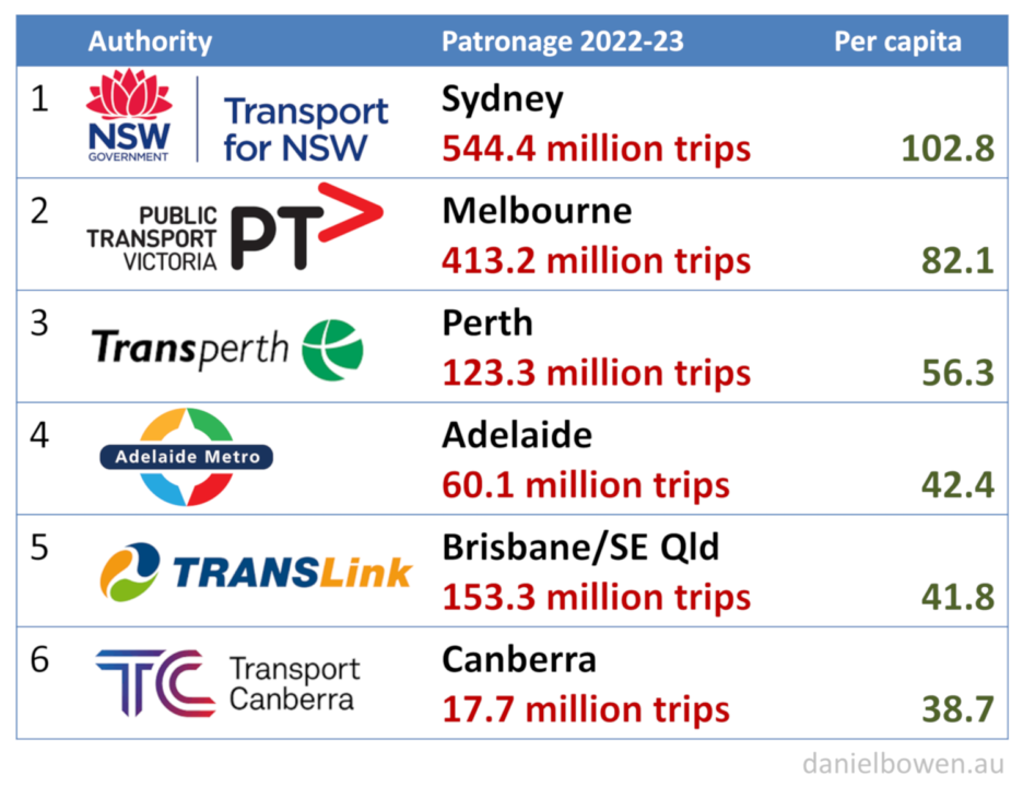
| Sydney | 49.9 | 39.1 | 7.1 | 4.0 | 2.7 | 102.8 |
| Melbourne | 31.2 | 19.8 | 29.3 | 1.8 | 82.1 | |
| Perth | 24.3 | 31.7 | 0.3 | 56.3 | ||
| Adelaide | 8.5 | 28.6 | 5.3 | 42.4 | ||
| Brisbane/SE Qld (Gold+Sunshine Coast) | 12.7 | 29.7 | 3.2 | 1.3 | 41.8 | |
| Canberra | 30.7 | 8.2 | 38.9 |
As noted previously, Sydney does particularly well with its train network, in part due to better frequencies, and in part thanks to the train network serving the busiest centres – which seems to be down to good long term urban planning.
Brisbane and Adelaide misfire on their suburban rail networks, probably due to mostly poor frequencies compared to the other cities. Even Perth does better than Brisbane at this.
Canberra’s tram line seems to be performing well, though I’m hesitant to draw too many comparisons because in Sydney, Gold Coast and Adelaide, trams only serve a tiny area of those cities.
I’ve lumped in V/Line with Sydney Metro purely for convenience. You could arguably add them both to the suburban rail column.
How many Australians catch buses?
I was particularly curious to see how often people use buses in the different cities. I’ll show this as a chart:
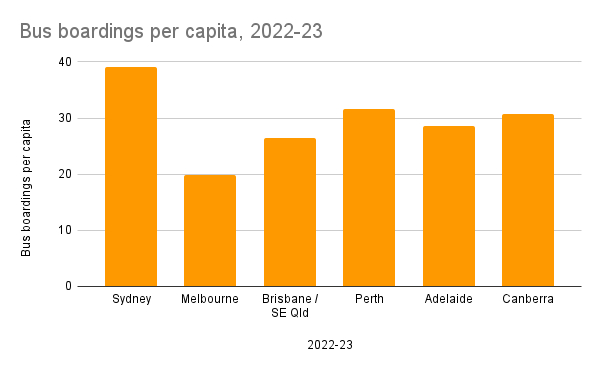
Sydney again does very well, with almost as many people using buses as trains. In part it’s perhaps thanks to their bus network having replaced heavily used trams – and unlike in other cities they’ve been serious about this, rather than water down service levels over time.
Leaving Sydney aside, what’s striking is how all the other cities (including those with trams) have around 30 boardings per capita for buses… except Melbourne, which sits at 19.8.
Obviously Melbourne kept its trams, which remain the dominant form of street-based public transport – both in ridership and in provision of frequent service – and those factors influence each other.
But trams only serve a portion of the metropolitan area.
We shouldn’t be fooled into thinking that Australians as a nation won’t use buses. It’s a Melbourne issue.
In fact the recent Infrastructure Victoria report on this highlighted that a third of Melburnians have never caught a bus.
As past experience repeatedly shows (for example Smartbus routes, and the 401 and 601 university shuttles), when buses are good enough, Melburnians will use them.
We have some catching up to do.
Updates:
- Revised Sydney buses number down – original number seems to have included some regional NSW trips, though the revised number now is probably too low, as it excludes non-Opal trips.
- Also revised Brisbane – the patronage numbers include not just Gold Coast, but also Sunshine Coast
13 replies on “PT patronage per capita”
I agree up to a point with you analysis but people will use buses if there isn’t a rail alternative.
We are fortunate in Melbourne to have an extensive tram system, somewhat superior to buses. However, while it was a bit of a case of which came first, when we had a bus service and a tram service to and from Prahran, we would choose the bus. Quieter, guaranteed a seat and guaranteed aircon. Not as smooth but that didn’t matter too much if you had a seat.
The stats and graphs are all very interesting, so thanks for the detail.
Was going to make a similar comment Andrew – I grew up in the Eastern suburbs of Adelaide, about 8kms from the CBD. The only option you have there is the bus and I caught it a lot. I now live in the east of Melbourne, about 8kms from the CBD, and I have two trams almost on my doorstop, two train stations in walking distance. There is very little need for a bus in the inner suburbs. I think this is why it is hard to compare bus patronage between cities. I’d suspect much of Sydney is geographically challenging for anything but a bus as well, so for many that would be the only reasonable option?
Not an argument though that they shouldn’t improve Melbourne bus frequency and routing though!
Thanks Daniel for this data analysis. Again it is very useful to demonstrate the state of the SEQ QR Citytrain network in terms of poor service frequency. See > https://railbotforum.org/mbs/index.php?msg=278997 Regards …
Good points on transport choices.
The other thing that’s been pointed out to me is that in the bigger cities, single boarding point-to-point journeys might be rarer, as networks are more often used with interchanges along the way. So the data shown above (which is boardings) might skew higher for the larger cities.
It’s interesting however that Sydney still does much better than Melbourne, even with fares that are not fully integrated, requiring additional cost for multi-modal journeys.
Good analysis again thank you Daniel. I presume you’ve also seen Chris Loader’s latest analysis and charts, just out:
https://chartingtransport.files.wordpress.com/2023/12/image-88.png
As I’ve mentioned before, I think it’s important to maintain a common basis for comparison between cities. In terms of trams vs buses, they’re both on-street transit and perform the same function, just that some cities have trams, some don’t. I think it’s a more realistic comparison when you add trams and buses together. Same with Sydney’s metro + suburban trains. They’re both part of Sydney’s overall rail system. Of course, it’s interesting to see the separate figures as well.
The other issue of commonality is that the larger cities include what we can call an interurban zone. Sydney and Brisbane train statistics include those services (also the northern and southern extents of the Perth system are effectively interurban, though they don’t call it that). The Melbourne interurban services are presumbaly what you refer to as V/Line and, to establish a common basis for inter-city comparison you’d have to include those in the Mebourne train figure. NSW also has “outer-metropolitan” Opal buses in the interurban area, with separate statistics. That’s another challenge when comparing bus figures. Do those for Brisbane and Melbourne include buses in the ïnterurban” area?
I’m curious about the data collection for boardings – is it based on tap-ons? And if so is estimated fare evasion taken into account? As someone who spends a fair amount of time in Sydney I definitely feel like fare evasion is way more common in Melbourne than it is up there (especially because it’s so hard to police on trams)
@Tony P, thanks for that, yes I saw Chris’s post, and it’s got some great nuggets of info in it.
In the case of Melbourne, I included a portion of V/Line patronage to allow for the western suburban stations served by V/Line. For Brisbane yes it includes Sunshine Coast and Gold Coast (eg the Translink SEQ service area) but for Melbourne the buses were from metropolitan buses patronage data.
@Niklas, certainly the Melbourne data (and I expect most or of the others too) include numbers from sources other than the ticketing system.
Would imagine Perth will shoot up on suburban rail and be catching up to Melbourne (which has traditionally had much better network coverage) within the next 12-18 months once all their new rail projects open up. Not only will there be new corridors and useful extensions, better frequency signalling, new rolling stock, higher speeds on the Armadale line, higher capacity signalling and level crossings removed, but there will also be orbital connections for the first time (between the Armadale and Mandurah lines in the South).
I think where Perth does so well compared to Adelaide & Brisbane apart from the better train frequencies you mentioned is alot of the Perth lines are quite fast with good top speeds and low dwell times (especially compared to Brisbane) and good interchange and integration with the bus network (as opposed to Adelaide).
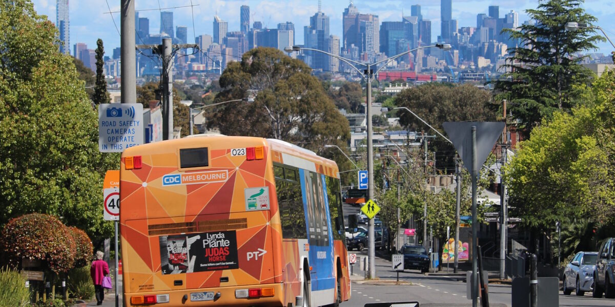
nice shot of the city from Prospect Hill Rd … took a while to figure out where that was taken from …
Hi Daniel,
Just a thing I’ve noticed.
Why is Sydney Metro in the same column as v/line? I’ve noticed this over a number of posts.
Sydney Metros equivalent is SRL when it’s done. It is for all intents and purposes a suburban system.
V/line equivalent in NSW is the intercity network bounded by Goulburn, Bathurst, Newcastle interchange, Bomaderry and Scone and Dungong.
Intercity network for NSW isn’t included but is included for Victoria and Queensland.
@Bob, you’re absolutely right, they are not equivalent. They’re sharing a column so I don’t have to add another column that no other city uses.
The V/Line numbers are an estimate of V/Line suburban patronage, to places like Tarneit and Caroline Springs that are within suburban Melbourne.
Well buses in Melbourne are very popular for fare evasion. If using myki data alone figures would be about 10% of actual on certain routes. As a current Footscray resident the 216 is well used but myki use is rare.
@Peter, as noted above, patronage data is not based purely on Myki touch-ons.