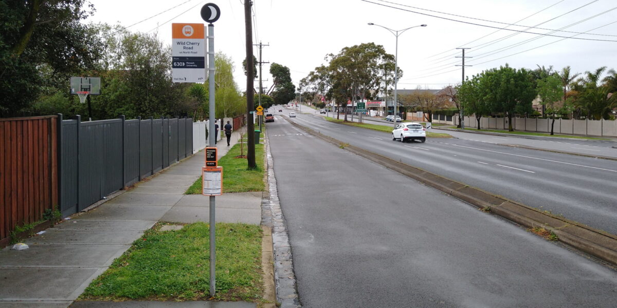
It’s only a little thing, but this has been spotted: the new design for bus stop signs.

This seems to be a minor revision of signs first seen in 2018 – the PTV logo is back!
Further down the pole, the timetable case and the information with the stop ID (including in Braille) remain – no changes visible there.
It would be a mistake to replace all the old signs unnecessarily, but I like this new design.
Good:
- Bus and hail icons instead of (or in addition to) text
- Clearer location info
- Bus operator logo removed
Not so good:
- I agree with those who reckon the moon logo is a little too close to the route number
The new signage has been triggered by the switch of most Night buses from confusing special night-only limited-stops routes to 24-hour (weekend) routes. This will make a big difference to network legibility, and patronage.
The Night Bus changes were originally planned for late-August, but are now expected later in September, alongside other service changes including a new route 202 university “shuttle” service from Victoria Park station to Melbourne Uni.
There are also service boosts to some routes, and (mostly evening) cutbacks on some others. As I understand it, it’s prioritising upgrades and funding where they’re likely to result in higher patronage, against some routes/times which have more services but have consistently shown a lack of patronage.
Fair enough – but the real problem here is that Melbourne’s mostly woeful buses are being starved of funding for large-scale improvements, while billions and billions get thrown at other transport projects, such as NELink.
Hopefully though, the attention being paid to the bus network is a sign of good things to come.
6 replies on “New signage, and other bus news”
I like a good old pictogram. I know a lot of thought went into Sydney’s wayfinding, but the T/L/F/B system seems too open to confusion for unfamiliar users.
A good sign that tells you what you need to know and timetable information below. All useful to those old people. Ah, that is nearly me. I will check apps on my phone for such information and live times. What is it with young people who are quite tech savvy but they can’t check such things using their phones? I just really don’t get why they need verbal communication and reassurance that the information they can see on their screens is correct.
Hang on, not all the new timetables are up there Sunday night
By and large, I like the current design, though I have not taken notice of the details as Daniel has done.
So many of them have faded to nothing. No doubt the Melbourne sun in summer.
I do agree that, the bus operator name is no longer relevant. I wonder if there is another reason for the removal of this, like the ability to quickly have a route swapped from one operator to another.
What would it take to bring back the local area maps? That and rolling out electronic timetables on all routes (and PIDs on all buses), similar to the tram network.
I agree it is a great new sign, the putting of company logo’s isn’t a bad idea, but it is when they change operators, such as here in Geelong, Mcharrys used to run route 19 to Bannockburn, now it is CDC that has taken over, and all the signs still have V/line and McHarrys logos, instead of the CDC.