As expected, fare rises have been announced to take place on January 1st.
It’s a rise of 4.7% — which is CPI+2.5%.
(At least, 4.7% is the claim. Some fares, such as a Zone 1 two-hour fare, are rising by more: $4.10 to $4.30 is almost 4.9%, thanks to the price being rounded to the nearest 10 cents… which makes no sense, because you can’t directly buy these fares with cash.)
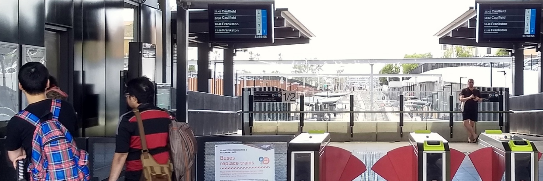
Just as this was emerging on Saturday, the Caulfield group of lines suffered major unplanned disruptions. Channel 9 was out for the fare rise story, but captured the train chaos as well:
Public transport users have vented their fury at the state government, as it quietly announced ticket prices will rise by almost 5% from next month. @andrew_lund #9News pic.twitter.com/RMYIE8ApJD
— Nine News Melbourne (@9NewsMelb) December 16, 2017
Here’s the official PTV price list (which oddly doesn’t list the Weekend/Public Holiday Daily Cap, believed to still be $6 adult/$3 concession, or the Seniors Weekday Cap, which in 2017 is $4.10).
Here’s the State Government press release (which tries to temper the anger by announcing minor reforms such as free rides for primary school groups at off-peak times).
So how much have fares gone up over the years?
I thought I’d do a quick graph of the last 20 years.
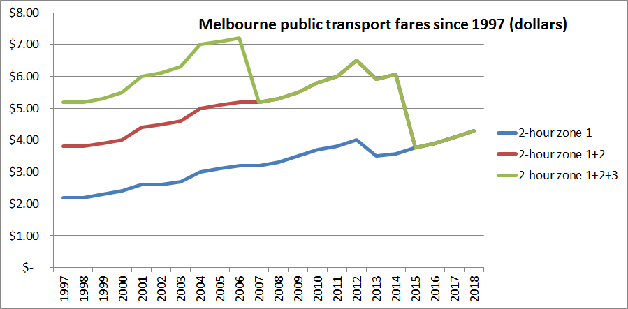
Notable:
- 1998 and 2010 saw no rise, as prices were frozen those years
- 2007: Zone 3 is merged with zone 2, resulting in 3-zone trips dropping in price
- 2013: single fares (on Metcard) were abolished, switching everyone to the slightly cheaper Myki fares, which were equivalent to 10×2 hour discounted fares under Myki
- 2015: Zone 1 and 2 fares were capped at zone 1 rates, resulting in 2-zone trips dropping in price to the nearly-flat fares we have now
What if we look at the rises in those fares, and compare them with CPI?
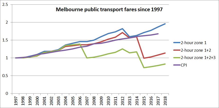
- 2004 saw a whopping 9.8% increase in fares, about three times CPI, the same year that Short Trip tickets were abolished, resulting in a huge jump for non-CBD short trips
- 2012 and 2013 saw rises of CPI+5%, budgeted by Labor, implemented by the Coalition
- 2015 to 2018 saw rises of CPI+2.5%, budgeted by the Coalition, implemented by Labor. What a team.
As you can see, for trips formerly covering three zones, these are still cheaper (just) than they were before 1997. Two zone trips are still relatively cheap, rising at well below CPI.
Zone one trips were tracking a bit above CPI until 2012, but when Metcard was abolished the switch to bulk rates brought it back down pretty much in line with CPI since 1997. Rises since have it well above.
There are still Ways to save. Options include Earlybird, and Myki Pass if travelling most/all days of the week. In fact you can buy a Myki Pass before January 1st and pay the pre-rise price, then use it later.
Additional fare revenue adds up to a lot of money, which can go into upgrades — we all understand that.
But the fare changes to a largely flat fare have resulted in some people benefitting enormously with fairly cheap fares for long trips, at the expense of others, who are paying a lot for short trips.
Upgrades to infrastructure and services are important to get more people using public transport. But affordable fares are also important — with repeated above CPI rises, for many people, this is going backwards.
With this fourth CPI+2.5% increase, Labor implemented the Coalition’s budgeted rises. They can argue that if they hadn’t, they’d have had to find the money elsewhere. Question is: what will happen next?
15 replies on “Melbourne’s fares rise above CPI again”
Don`t forget zone 2 and the former zone 2 + 3 fares!
Old and young, rich or poor, I see people who don’t pay when travelling for one or two stops on trams, and why would they at the current price of $4.10. Aside from taking a short one off trip, I think our public transport fares are quite cheap.
Oh yes, your graphs are terrific. Thanks for the effort.
@Tom, there are dozens, perhaps even hundreds of fare combinations when you take V/Line and concessions (which haven’t always been half of the full fare) into account. I aimed to do three of the most important ones, particularly to show the effect of the zone changes over the years.
https://i.redd.it/tyah5j4yf8401.png
Just found this on reddit.
They would make the graphs more complicated, zone 2+3 in particular.
The rise has also been steeper for journeys that were covered by short trip/rail plus 2. Ditto for trips where the return trips started between 2hours to 2:59 minutes after the start of the first trip and no other trips were taken that day. Squeeze the shorter trips has very much been a major fare strategy for years. Also off peak multi-zone travel has got more expensive with the end of off-peak fares on weekdays. I suspect these strategies have hurt people on some of the lowest incomes most and have not been well targeted at crowding (at least on trains).
I wonder if it’s worth charting registration and fuel excise growth on the same graph? It’d be interesting to see the growth in PT fares vs motoring costs. Hard to bundle those costs I guess, with tolls, parking costs etc.
When the price of stamps went from 60 cents to $1, you did a great piece and justified how it was reasonable and still very cheap. I think thats more than 4% price rise…
Where to start?
Zone 2 only fare – $2.94, so now not rounded (5% increase). Regional town fares (single zone) – no increase again. Regional V/Line fares continue to get out of whack – Geelong peak fare up 60 cents, but no increase for single Zone 4, and only 20 cent increase for the rest of the trip (Zone 1/2). If that makes sense!
Talking about CPI – CPI includes an index for urban transport fares, which includes taxis as well, and broadly takes into account changes in individual fares – i.e. it would be pricing individual fares to contribute to the index. Looking at year-on-year for the March Quarter, 2017 rose 3.8%, 2016 rose 1.4%, 2015 fell 15.4% (obviously the impact of the fare structure changes), 2014 rose 1.7%, 2013 rose 5.5%, 2012 rose 9.0%, 2011 and 2010 no rise (was 2011 the year of the delayed rise?) So in years where this increase is less than the standard fare increase, there would’ve been structural changes to the fare system somewhere (e.g. the full introduction of Myki).
There’s also a CPI index that covers registration and similar charges, including tolls, licencing, parking, RACV membership – these probably go up in July in the main, but if I take the same comparison, there have been some large increases – 2015 up 8.7%, 2013 up 13.1%, 2011 up 13.9%.
I liked the spin in the PTV news item comparing the Melbourne daily zone 1 & 2 fare of $8.60 with the so called Sydney daily fare of $15.40. It is total nonsense of course because the Sydney fare is a cap, most people would pay less than that, & covers locations that are as far from Sydney as Ballarat, Bendigo & Geelong are from Melbourne.
An interesting comparison, the off peak single fare from Sydney to Wollongong is $5.95 while the equivalent fare from Melbourne to Geelong, a similar distance, will be $9.24 from January.
The ill considered idea of making Melbourne a single large zone has badly distorted our fares. Look at the difference in fares once you cross the boundary from zone 2 to zone 3.
The Melbourne daily fare is a cap as well and the Opal cap is the only daily Sydney fare cap (as far as I can tell from their website) and thus the only cap that covers the equivalent of the Melbourne zone 1+2 cap. Melbourne also has a zone 2 cap as well ($5.88 from January). This means that making multiple trips in Sydney could cost up to $15.40 that would cost only $8.60 or (if entirely in zone 2) $5.88 in Melbourne.
The Melbourne-Geelong fare also includes Geelong bus travel and Melbourne suburban travel, on any mode (train, tram or bus), at each end of the journey (commencing within 2.5 hours of the start of the journey), whereas the Sydney-Wollongong fare does not include non-train travel (buses, light rail and ferries). A bus trip over 8km at each end of a Sydney-Wollongong trip would cost an extra $5.22 (2 x $4.61 – 2 x $2 transfer discounts), for a total of $10.17.
1.5 zones for Melbourne has distorted our fare network, especially for shorter trips.
Daily caps are also a problem when mixed with regional fares and non-standard travel patterns. The daily cap is, I assume, meant to equate to a return trip – you effectively pay half-price if you do the trip within 2 hours, and you pay no more if you make a third trip. But you can end up paying more than the daily cap for Zone 1/2 travel if adding a regional journey (e.g. Geelong, Zone 4). Zone 1-4 daily cap is currently $25.20 – which you will only pay if you’re making a peak return trip, or something a bit non-standard. Like this – Zone 1 (= $4.10), then change trains (go through the barriers first) and travel Zone 2-4 (=$4.80 contribution to the cap, but fare is $3.36). Return Zone 4-2 (=$4.80 contribution to the cap, but fare is $3.36), then change trains and travel Zone 1 (=$4.10). Make a third trip in Zone 1 more than 2 hours later (=$4.10), and make a fourth trip in Zone 1 more than 2 hours later again (=$3.30, to reach cap). So you’ve paid $15.60 to travel in Zone 1 across the day, and a total fare of $22.32, with no peak travel. Compare that to an off-peak return trip to Geelong, which costs $17.64. The PTV website lists off-peak daily fares – there is no such thing, as daily caps are worked out on peak fares. How would that compare to a similar trip pattern between Sydney and Wollongong?
After about 4 decades of wages generally rising every year in line with inflation, this has generally not been the case, during the present century.
So I don’t think the graph showing the fares adjusted for CPI is particularly relevant. Fares are still up more than 50%.
If I’m reading the new VLine fare guide correctly, they will now charge peak rates for any journey that includes Zone1 during the peaks, whereas it used to be just for people traveling to Melb in the morning and out of Melb in the afternoon.
[…] A post on this topic from last year, including a comparison with CPI since 1997 […]