At any station with multiple platforms, especially when they’re not adjacent (eg an island platform), you’re going to need to know which one your train leaves from. At many it’s easy — one platform is going towards the City, one is away.
Some stations have three platforms. The third track is often used for peak hour expresses, and the platforms used can vary across the day.
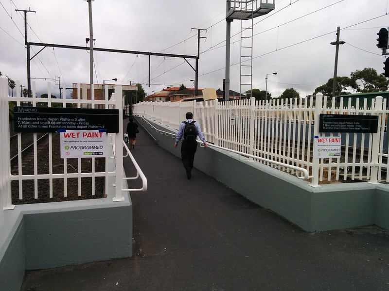
My local station used to have signs specifying which times the trains out of the City towards Frankston depart from platform 3. You really need to know if your train is on platform 3 before you enter the station, otherwise you’ll have to come all the way out again to its separate entrance — and you might miss your train in the process.
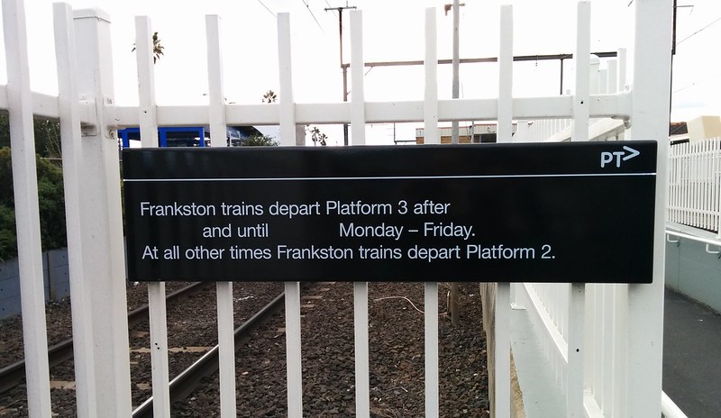
At some stage last year, the signs got messed up, and ended up with contradictory information:
As you can see from this lengthy Twitter conversation, sometime around the middle of last year, the times were removed at numerous stations, pending a new train timetable.
The new train timetable came and went, and for months the signs’ times remained blank.
Perhaps they were struggling with coming up with a message that reflected that sometimes platform 3 is in use until a specific time in the morning, but sometimes there are delays, and it goes later. (It’s good to switch from 3 to 2 so all passengers go to the one island platform, where there are better facilities, but I’ve suggested in the past they delay the switchover an extra 15-20 minutes after track 2 is clear, to have a more definite, fixed time that allows for delays.)
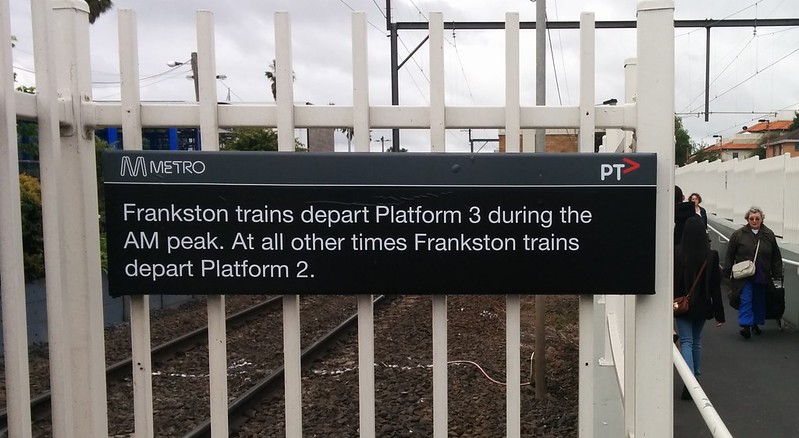
A couple of weeks ago they came up with an answer:
Umm… yes. AM peak. A bit vague, isn’t it? How are you meant to know when “AM peak” is?
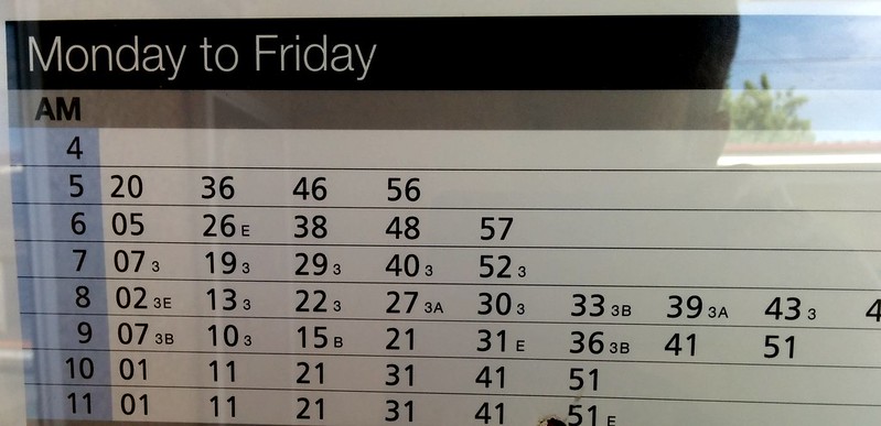
If you actually go up to the platform (which may not be the right platform, mind you) you’ll find in smallprint on the timetable poster that it indicates which trains use platform 3. Note how they are from platform 3 until 9:10, then there are a few that aren’t, then another one at 9:36. (These times are for Patterson, 2 minutes further down the line; I don’t seem to have a photo handy for the same sign at Bentleigh.)
None of this would be so much of a problem if the automated sign near the station entrance worked, but it hasn’t for almost four years — in fact, similar signs seem to have been de-activated at other stations too, and of course most stations don’t have these. Realtime information is available on the platforms (via green buttons on all, as well as displays currently being installed), but that’s too late to prevent backtracking if you’ve got the wrong platform.
But this is just signs, right? They’re not that important!
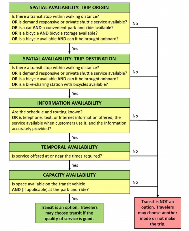
Not so. Information is a crucial factor in determining whether someone will choose to use public transport. Having the service available for your trip is one thing — knowing where and when it runs is also vital, as this diagram from the Transit Capacity and Quality of Service Manual (chapter 4, Exhibit 4-9) shows:
Timely, accurate, easily accessible information is important. It’s about making the system as simple as possible to navigate and use. As simple as hopping in your car.
Telling people heading towards Frankston that they need platform 3 “in AM peak” is better than nothing, but it’s a long way from the kind of precision information that people need to catch a train without delay, without risking missing a service, and without having to annoyingly backtrack if their platform guess is wrong.
Publications and signage around the system (both static and realtime) has improved a lot over the past few years, particularly with Metlink/PTV guiding driving standards across operators, but they’re not perfect yet.
6 replies on “Public transport system signage – mostly improving, but some is getting vaguer”
Interestingly, my local station Brighton Beach has just installed electronic signs on both platforms indicating the next train (arrival and destination). Much better than pushing a green button or asking (usually) dimwitted station attendant when the next train will arrive.
PS I’ve already noticed different commuter behaviours due to Zone 1/2 price merge. Have you?
Those new displays (PIDs) have been popping up all over the Frankston line over the last few months. Unfortunately they don’t help the situation Daniel is describing. If you head to Platform 3 at Glenhuntly, it can take a while to get back to 1&2. It down the side street and across two of the tracks at an intersection where the gates close a LONG time before the train arrives because it’s going so slowly. People often turn up on PL2 in the morning trying to get to Frankston to find the city-bound expresses using it. And they OFTEN miss their Frankston train.
This problem will effect significantly more people when Southland Station opens because they will be new passengers and a significant proportion of the total “AM Peak” patronage boarding from these platforms 3.
From one of those London Tube documentaries, it was interesting to learn how much effort and study goes into signage and its placement for Tube users and we certainly found it easy to follow. I think Melbourne has a long way to go yet. Just walk north up Swanston Street and see if you can see a sign indicating the entrance to Melbourne Central Station. There is one, but it is up high and hidden by shop canopies and not visible until you are at the entrance and the entrance hardly looks like it leads to a station. Inside signage directing people to the station could be better too.
I reckon at least at Bentleigh they could’ve kept the old blank signs, and issued the staff with a box of chalk (depending on the staff members’ attitude, of course…)
In the case of Caulfield to Moorabbin, I say the following;
All down services (To Frankston) should always be platform #3 anyway, that way there shall be no confusion. Just leave #2 as the bidirectional express track.
The only reason why it is platform #2 at whenever they can, is legacy of the older days when we had humans paid to work inside them ticket boxes. As #1 and #2 where always an island platform along that route, you needed only one person to staff both platforms. Today all three platforms are somewhat equal in respect to MyKi machines.
The other option is to always have electronic displays at each of these locations.