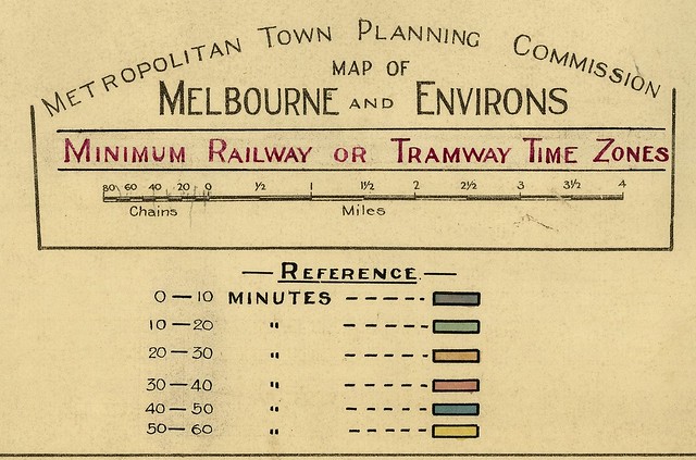
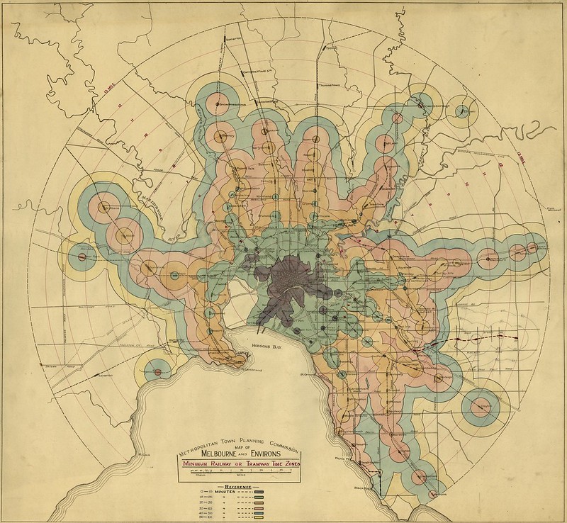
This is very cool. Similar to tools Jarrett Walker often talks about that show how far you can get in X minutes on public transport, here’s a map prepared around 1925 or so (I’m guessing) by the Melbourne Town Planning Commission showing how long it takes to get into central Melbourne from various suburbs by tram and train (and walking).
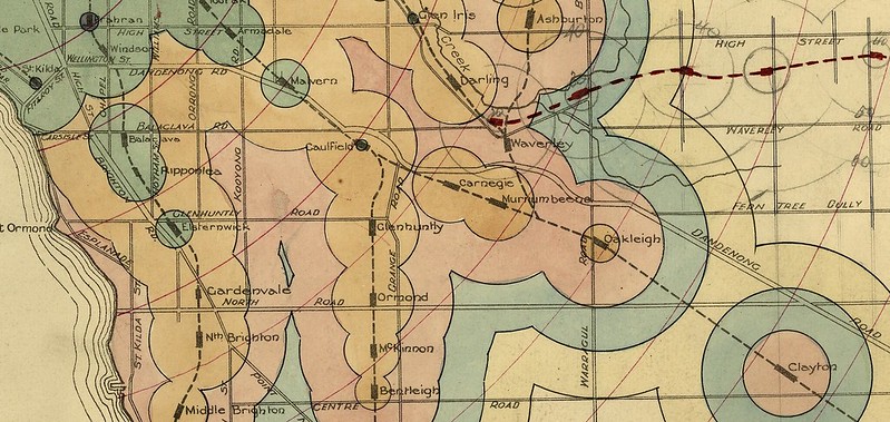
Here’s the area around St Kilda and Caulfield:
As you can see, the areas around railway stations have the quickest access into the city. Trams don’t reach as far in the same number of minutes.
As you get farther away from tram lines/railway stations, the city becomes less accessible.
Here’s the thing: in many ways the timings on this map haven’t changed much, because in terms of fixed-rail infrastructure, there’s not that much extra in 2014.
On the trains, the Glen Waverley line (a late addition, sketched onto this map) and the City Loop are the obvious new lines, the latter providing better access to more parts of the CBD, but not making much difference in terms of travel time, which remain roughly the same as they were. Bentleigh (my neighbourhood) to the City still takes about half-an-hour.
That travel time hasn’t deteriorated is important: as the city’s road traffic has increased markedly over those 90ish years, the train system has isolated those who use it (and the city at large) from growing traffic congestion.
Meanwhile some areas such as Kew have lost their trains, though areas further out such as Pakenham and Cranbourne, which once had only infrequent country trains, are now part of the metropolitan network.
Trams aren’t shown very clearly on this map, but extensions since the 1920s include the 75 out to Vermont South. But some areas such as Footscray have lost some of their trams, as has Elwood/Brighton, and Black Rock/Beaumaris. Travel times for the trams that remain also seem similar to today, though in peak hours they’re likely to be longer on routes sharing space with cars.
If you have a look at the whole map, many of the obvious gaps in the network are still there… only these days they’re filled with houses, not empty as they were when this map was prepared. As I’ve noted before, if a suburb got its public transport back in the 1930s when PT was still being expanded, it probably still has it now.
Some areas have Smartbuses, which help fill those gaps and get to the station with frequent (at least on weekdays) fast (well, faster than walking) services. But many suburbs miss out on frequent PT.
Not that accessibility to the CBD is necessarily what everyone needs nowadays — work places, education and other opportunities are now more widely dispersed throughout the metropolitan area.
But allowing people to get to those places, particularly without a car (eg being able to move independent of traffic congestion, and whether or not they are able to drive) is an ongoing challenge.
See the map nice and big, on Flickr (opens in a new window)
Source: State Library of Victoria — map 4. Other maps there include variations on this theme. I haven’t looked at everything yet — no doubt there are some other gems. Map 2 is similar to map 4, but is in black and white, but shows tram lines more clearly.
Update 19/2/2015: The Age found these maps via a Reddit post, and published this article: Is your train commute quicker than 90 years ago?
16 replies on “How long did it take to get into central Melbourne from your suburb… circa 1925”
An interesting exercise would be to add half the service frequency to those times to reflect random arrival travel times. In the network of 1925 this will probably make the likes of Williamstown, Essendon and Brighton look relatively better than Mentone, Mitcham etc.
Wow! What a map. Thanks for sharing this. My guess is that there was greater off-peak travel in the 1920s compared to today, but now there are more peak commuters.
A very interesting topic with thanks from me.
I have done myself a printout of the last image on your blog above.
** A view of irony ***
There is one location that was not part of the early electric train system being on that map. Deer Park.
How times ‘do not change’. Here in 2014, we still do not have any form of electric train services to Deer Park.
*** A Question about the rings ***
Looking in particular to Clayton, where there is clear time-zone rings orbiting around the Clayton station spot.
I guess this map includes ‘walking time’ from the station to points in any direction?
It is a really nice tool for exploring travel times not just from the CBD but other places as well. If you could get some GTFS data for Melbourne, Mapnificent can load it and then you can play with it, however there seems to be some issues with the GTFS bit…
I am guessing it is from before 1925 when Hughesdale opened. Huntingdale opened in 1927.
http://www.vicsig.net/infrastructure/line/Pakenham
That’s beautiful map; I would love to see an updated version of it, including the stats about percentage of population served etc.
@Peter, yeah the danger with these types of maps is they rarely consider service frequencies, only travel times. I need to check my references, but in the early days, trains beyond Oakleigh were very infrequent, for instances. Jim points out Deer Park – this still has very infrequent (but fast) services.
@Roger, another key difference is the trips tended to be shorter than nowadays.
@Jim, the rings are part of the overall map. The travel time increases as the stations get further out, then they’ve added walking time from the stations.
I don’t think the map really shows tram travel times very well despite the caption. Map 2 (see SLV link) shows this better I think.
@Tom, thanks, yes. Before Hughesdale, so 1925 at the latest. In fact it doesn’t have Seaholme either, which Vicsig says opened in 1920, so it may be the previous decade.
Some other stations such as Seddon and Willison are not marked on the map, but the time markings indicate they were included in the calculations. Hatherley station, closed 1897, is shown, but has no markings indicating it was included.
One example of where trips are faster today: in those days Thomastown and Epping were over an hour from the City. Today, Epping is about 40 minutes away on the train. This might be because prior to 1929, Thomastown/Epping trains ran via the Inner Circle: http://en.wikipedia.org/wiki/South_Morang_railway_line#History
I find it interesting that that the only non-railway ‘band’ visible on the entire map is the Lygon Street tramway (now route 1 and 8), located between what was then the Fawkner and Reseivor railway lines.
… is it just me, or does the shape of the graphic from the St Albans line to Greensborough look a lot like the heavy metal hand symbol (albeit from the back of the right hand, where St Albans is the thumb)?
An interesting find. The walking times were more important to note back then as far fewer people had a car at that time. I wonder if more people owned a bicycle back then that they could use for short trips or to get to the station. For people not driving today the walking/ biking time to a train station or the local tram/bus stop is still an important factor.
@marcus, don’t forget that in the early twenties the inner city tram network was still cable. Most long distance tram travel into the city would involve either i) a change to a slower cable tram at some point, or ii) an indirect route into the city ending in a fringe city terminus. A decade later, the travel times might have been different.
Actually, there seems to be a few mistakes on the map. Have a look at the area to the south and south east of St Kilda on Map 2 (which, as Daniel notes, shows the tram lines more clearly). On Map 2 the ‘green’ area extends much further south of St Kilda – into Elwood – because of the St Kilda – Brighton street railway. This is not shown on Map 4 at all.
And look at the neat circles around Elsternwick station – why aren’t travel times east and west along Glenhuntly road shortened by riding the tram to the station?
@Andrew – possibly the map creators didn’t consider walk > tram > train journeys because they required separate tickets for each leg? It took until much later for the first multi-tickets to become available:
http://www.robx1.net/victkt/pre1981/pre1981.htm
Thanks for posting this. It’s a beautiful image that I could spend a long time digging through.
I checked that there were no copyright restrictions and have now got a 60×60 cm canvas print of it on my living room wall. Here’s a photo. It turned out beautifully.
https://www.dropbox.com/s/e9347v0dk025s3s/20140514_093946.jpg
When did they stop spelling Warragul Road that way?
This may be much earlier than you think, it has Hatherley Station on the Geelong line, which was only open between 1890 and 1897.
http://www.railgeelong.com/location/hatherley
[…] Old railway map from the 1920s, it shows Hartwell Station but not it its current location. The map comes from an article by Daniel Bowen, which was rebroadcast in The Age, and the different colours show the time it takes to get from the […]