Parkiteer is a good programme… from my observations, more and more people are using it for secure bike parking at stations.
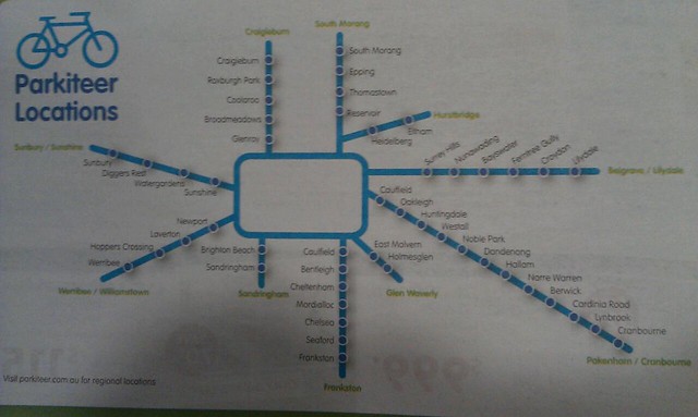
But how many errors can you spot in this bike cage map that has been appearing in MX for the past few weeks?
“Glen Waverly” spelt wrong
“Glen Waverly” in the wrong spot — it’s actually north of the Dandenong line
Cranbourne/Pakenham lines have been strung together
Ditto Belgrave/Lilydale lines
Leaving out the Williamstown, Upfield and Alamein lines presumably isn’t a mistake, but reflects that they have no bike cages
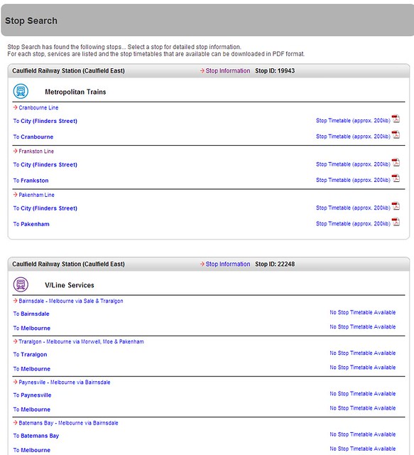
Two Caulfield stations! — however this is a problem that even Metlink/PTV has had for some time; if you use their station/stop search, you’ll find two Caulfields:
Any other errors?
Below the map the logos of the organisations running Parkiteer are shown. Bicycle Network Victoria runs the show, but the Metro logo is also listed… I’m surprised they didn’t check the map of their train network was accurate.


9 replies on “How many errors can you find in the Parkiteer map?”
I think we deserve a Caulfield station on the Sandringham line, too!
I think it shows that they did absolutely no proof-reading of the map. This kind of rubbish wouldn’t make it past the technical editor at my workplace, and we only write reports that will be read by the people who commissioned them – we don’t publish posters for millions to see! They may as well have put all the stations on one big circle. That map is useless.
I would’ve liked to have seen the “Frankston / Stony Point” line.
Have a bloody good weekend everyone.
Glen Waverley used to have a parkiteer cage, but hasn’t had one for about a year due to building works near the station. It might have one again in another year or two…
I love the way bicycle facilities are temporarily closed for 1-2 years. I’d love to see them temporarily close the station car park, or the Monash Freeway for 1-2 years :-)
That map is so piss-weak, I can only conclude that it was never intended to actually be a map at all, but merely some kind of figurative semblance of one.
Also they have combined stations on the Belgrave and Lilydale lines into one ‘line’ which is most confusing. Ditto Cranbourne and Pakenham. But notice that the Sunbury line (is ‘Sunbury/Sunshine’) even though this is one line. And the Werribee line is labelled ‘Werribee/Williamstown’ when there is no Parkiteers on the Williamstown line, and no mention of the Altona line.
As for Glen Waverley, the yellow text appears to be the line name, not that Glen Waverley has a Parkiteer (see how Frankston is duplicated). It would be clearer if the line names were ‘Frankston Line’ . At the moment it appears that Hurstbridge has a Parkiteer.
Sorry, Daniel, you’ve actually noted both my issues. Should reread the OP before I hit send!
The Belgrave/Lilydale and Crabourne/Pakenham line combinations is obviously deliberate, but you have to wonder if the person who made this map:
(a) has ever used the trains
(b) has ever seen a train map
(c) has ever seen anything graphically designed
It fails in about every way possible. Unless it’s part of a conspiracy to make cycling to the station look bad. Perhaps those parkiteers have been getting full up too soon ;)
Why aren’t parkiteer cages marked on the standard PTV maps, like bus/tram interchanges and car parking?