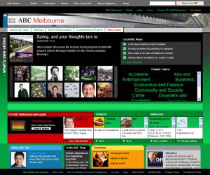
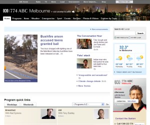
I noticed the other day that the ABC Local web sites were down for maintenance.
They got a revamp in mid-2008 that left it incredibly messy. Apart from the garish green and black colours, it was impossible to find things.
It’s like they forgot that they’re most often promoted via the ABC Local Radio stations; finding programme information and clips was really difficult, lost in a sea of links.
Happily they’ve given it another facelift, and not only are the colours a bit easier on the eyes, it’s a easier to find things again.


Progress, definitely progress.
7 replies on “ABC web site useable again”
oooh that’s much more user-friendly. The old one was a disgrace!
Oh no, the ABC websites were down! Isn’t that a sign of the Apocalypse!? That must have been devastating! How can society function!? Can’t wait for this new ALPBC, sorry, ABC 24 hour news channel- because half an hour of ABC news is never enough! Wonder if it’ll rate anything like Fox News Channel does:
http://www.mediaite.com/tv/still-rolling-fox-news-has-their-best-january-ever/
Uhh, no the ABC web sites weren’t down. ABC Local was.
Oh, claims of ABC bias from a right-winger? Yawn.
About time… the old design was unusable. The new design is a vast improvement, usability wise, however, still not what I’d consider attractive, despite Faine and Burns describing it as “gorgeous”. I mean… beige… really? What were they thinking?
I know!! The last 18 months or so have been a shocker. Had to really know my shit and search hard to find anything. Haven’t really gone through the new site yet but it has to be an improvement.
Anything had to be better than the last site design. Apart from the garishness and confusing layout, viewing the old site in Firefox used to send my CPU to 100%, even if I was doing nothing but viewing a page.
I have noticed job ads for the ABC recently related to their website.
Fox News really should be called “Where the FOX the NEWS?”