Someone’s been busy with stickers.
In their contract, Metro had until Monday to rid the train system of any mention of Connex.
The Franchisee will apply stickers to cover all references to Connex, both internally and externally, on all Rolling Stock. These works will be undertaken at the various depots and sidings where the Trains are stabled at night, while the Trains would not otherwise be in use.
In conjunction with the Rolling Stock Debranding, the Franchisee will apply stickers over all references to Connex at all Stations, depots, yards and offices of the Franchisee. The Franchisee will also remove the Connex brand from all light-boxes and existing signage.
Target project completion date: 14 December 2009
— MR3 Train Franchise Agreement, volume 2, pages 294-295
The contract notes it includes 993 train carriages, 10,000 signs at 211 stations, 675 signs at 45 depots and yards, and 60 signs at 6 offices. Pretty big job.
They seem to have come pretty close — the only ones I saw around the place yesterday were some of those big station signs (some of them are probably quite awkward to cover up, particularly when they’d require road closures to get a scissor lift up there to do it), and posters such as timetables (which is odd, because they should be dead easy to do).
Of course, in some spots it looks a little tacky. Particularly amusing was the censoring of posters for Connex for Cancer Day, which raises money for Peter Mac.
![[Censored] For Cancer](https://farm3.static.flickr.com/2577/4186781451_d846c676c6.jpg)
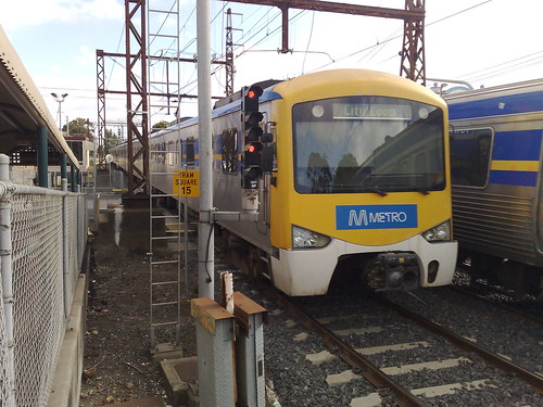
The stickers on the outside of the trains don’t look too bad for a rush job. Metro logos on the front, and tag cloud-like train line names above the doors.
Over the coming months they’ll properly replace/modify the signs, and put the trains in their new colour scheme. There’s a handful already in the new colours. They’ve got until November 2010 for that, and the whole lot will cost about $25 million — I’m personally not convinced it looks brilliant.
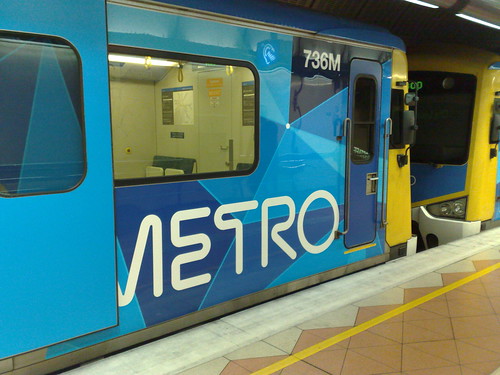
And what about the Metro name and logo itself?
I like it. It’s a good, strong brand, much moreso than the Connex logo was.
Actually I think it’s better than the Metlink logo, with its round globby @-like thing.
The surveys I did here on my blog in the last couple of days (perhaps skewed by the readership here) showed that about 60% of people correctly identified the Metlink logo, which has been around since 2003. The Metro trains logo got a slightly higher level of recognition at 68%, despite having been around only since September. (Mind you, maybe the rate should have been higher, given the game was given away by the post just below the survey form.)
Metro is a name that is common worldwide and recognisable worldwide, though what we have doesn’t quite live up to the name — we need more frequent train services 7-days-a-week for that… something notable in its absence from the government’s “Creating a metro system” web page.
I’ll be interested to see if they start using the M on its own on signs, as you see with the London Underground roundel, and the new T logo used in Vancouver (potentially confusing I suspect).
And I wonder if businesses that are near stations will start advertising their addresses with a little M logo and the name of the station, as happens in some cities.
Of course, new logos and colour scheme are only superficial. It’s extra service, line extensions, and upgrades to make infrastructure and fleets reliable that will make the real difference.
PS. With a forecast top temperature of 39 degrees today, we may see the first real test of how Metro performs in extreme heat, and perhaps proof that things don’t magically change when you put new logos on everything.
19 replies on “Stickers everywhere”
It took Connex years to remove the old The Met and Metropolitan Transit logos from the trains.
Actually they never finished the job. A month or two back I spotted an M>Train sticker, and yesterday I saw the Metro people had put one of their blue stickers over a door sticker that had a Met logo on it.
The Metro pattern reminds me of a cross between the new City of Melbourne logo and Federation Square. Which is not necessarily bad as it give a kind of uniform image to the city. But not very original – every time I see it I think that whoever designed the City of Melb logo must have flogged the same design to Metro cheap. But I do think the train livery looks nice, although I haven’t seen one in the flesh yet.
On the stickers, I’ve seen a train or two pull up with a very lopsided sticker on the front – doesn’t exactly enforce confidence…
I too was abit surprised at the lengths to which Metro went to wipe Connex from our Collective consciousness. I also noticed bits of insulation tape on those “Moving Gallery” posters, with the list of sponsors. All the others remain but now Connex is just a blue square.
Though it is only insulation tape… and if you are careful and inconspicuous, easily removed ;) Not that I would do that…
The silliest thing I’ve seen is an Xtrapolis that is half the brand new colours, and half an old train with stickers. Looks silly.
Liz beat me to it with her observation that the Metro visual branding reflects the new City of Melb corporate image. The font is completely different, but the colours and the fragmented geometry fit with other examples of “City Melb visual image.
I was on a train just yesterday that still had the Connex brand on the very front.
I don’t care what the trains look like or whether the signage is up-to-date or not. I just want them to work properly and give good service. Signage is just glitz.
I was about to say I got off the train yesterday and noticed a thin blue sticker on the ‘power operated doors’ sticker and later realised it was covering the old Connex logo …
Still not as wide spread as the old “This is a heavy product” stickers. They are so hard to remove a lot of them stayed where they were.
I wonder if they’ll remember to update the icon for the iPhone app…
“Metro logos on the front, and tag cloud-like train line names above the doors.”
The tag cloud-like logo has the train going to, amongst other suburbs, the lovely suburb of ‘Grave’. Wouldn’t want to be on that train!
Metro seems to have done a good job with applying the stickers. Now I would like to see how fast they can replace the absolutely filthy and grafitti scrawled seat covers on the Siemens trains that frequently run on the Sandringham line. I really have to be careful where I sit on some of these trains to avoid sitting in chewing gum and various spilled substances. The seats on many of the other trains seem to be newer and much cleaner.
I like the new Metro train design, it really is very Fed Sqaure, but the actuall M (or MM) logo looks pox!
Ditto Jed… the seats on the Siemens trains really are disgusting. I never sit down on them it’s probably worse to hold onto the hand rails.
Connex were farily quick to replace the M>Train blue on the EDI-rail-reburb-Comeng fleet but were glacially slow at doing it with the Siemens fleet.
There were a few Siemens trains with the seats recovered but most still have the M>Train blue which is now looking very grotty in most cases. One finds a spare seat with a shade of dark grey or black and you have to inspect to see if there is liquid there or not!
I assume the current lot will do something about this ??
I don’t think the non-Siemens seats are any cleaner, I just think they hide the stains better – perhaps they suck the dirt and god knows what right into the foam of the cushion?
^ No, it’s just something about the maintenance contract with the Siemens, and it costing some huge amount to have seats cleaned and it can only be done at one depot (Newport). That’s what I read on Whirlpool.
The Comeng trains with those seats until earlier in the year were never as bad!
I love the metro logo but how come on most trains on the side of the trains have a ladel with all the names of the lines?
Oh sorry I didnt make any sense. I was ment to say that on most trains on the sides they had the connex logo taken off them they had a sticker on the doors with mixture of names of all the lines in Melbourne. At trains stations I saw that the signs at stations had tape covering the connex sign.