Leader Newspapers have joined ABC Local Radio in redesigning their web site into a hideous, difficult to navigate mess.


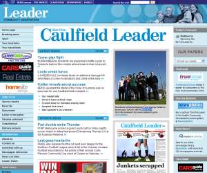
For instance, the Caulfield Leader, at www.caulfieldgleneiraleader.com.au, with a page showing the same news stories as the printed version of the paper, plus a few other links, apparently wasn’t good enough.
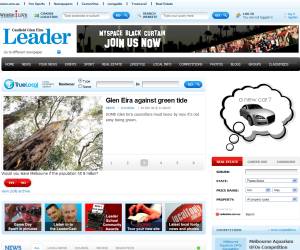
So now it’s the rather less memorable caulfield-glen-eira-leader.whereilive.com.au, with just a few news stories highlighted on the front page, and all the others hidden away behind a “News” (not to be confused with “Your News”) link — that’s if you can find it amongst the adverts, real estate tools, event calendars, “Local links” (more adverts), photo galleries and blogs.
And it’s got silly things, like a caption for an online poll being positioned so it looks like a photo caption. And lots of wasted whitespace in the middle, while other parts of the page are cramped.


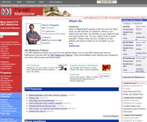
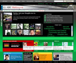
The ABC Local Radio web site is a mess after its revamp a few months ago. Unlike on the old site, almost anything to do with the programmes; eg the stuff you usually want to find; is hidden away.
They must know this, as an advert I heard on 774 the other day for one of Red Symons’ videos told you to go to the site, then click Radio Guide (which is not very prominent), then click Breakfast, then… click on… ummm… I can’t remember now.
The old ABC and Leader web sites were so much easier to navigate, with easy-to-find links along the side of the page. And in the ABC’s case, the old one was definitely easier on the eyes.
What about just putting on a web site the things people actually want to look at? Make them easy to find, don’t put irrelevant stuff all over the place, and use colours that are easy on the eyes. Was that too simple?
9 replies on “Messy web sites”
Have you also noticed Dick Smith Electronics site has had a rather horrific redesign as well, http://www.dse.com.au . not that i buy much stuff there as they are hideously overpriced, but it used to be a good reference for finding out info on gadgets and stuff.
It looks like web designers are beginning to subscribe to the more is less ideal. Less is definitely more.
check out:
http://www.webpagesthatsuck.com/
for truly awful web pages.
Can’t stand the ABC radio website, gives me headaches just to trawl through the waffle.
They’ve got an ad for finding Stubbs’ show too. Save the time wasted on ads and fix the useless thing already!
I too wrote about ABC Radio’s website. Clearly they realise how bad it is as they they now give such explicit directions on how to find a certain thing. Ms Hilary Harper stated some time ago they she was only responsible for adding content, not the website itself. In other words, she knows it is bad and wished to disassociate herself from it.
Good Evans – when are they going to realise that it is much more important for a website to work properly and be easy to search than for it to look *FUNKY!*
Whenever I find a *funky* site I groan inwardly….
(I blame the problem of Website Designers who are skilled graphic designers but know next to nothing about information architecture or website usability – plus the problem of folks who don’t know the difference between a ‘good-looking’ site and a ‘good’ site.)
Nothing is worst than the Leader. Nothing. Not even Mangoes.
Nathan, I don’t mind the new DSE site too much. At least it’s not too hard to navigate around. But it appears they haven’t fixed the worst thing about the old site – the unusable product detail URLs. The store availability list could do with reformatting, too.
The old ABC local radio site was a dog… and I looked forward to the revamp… based on what ABC had done with its News website, Triple J etc… but talk about disappointed… it was the biggest backward step a major website has EVER taken, without a doubt.