This went super viral, at least by my standards. It started off as a reply to a Tweet from Tosh Greenslade (from Mad As Hell) – he pointed out a similar slogan, then I realised the BBQ Shapes box design is near identical to the livery on the trams.
Someone suggested a look at the other modes… and it grew from there.
On Twitter it got plenty of Likes and Retweets, but the Facebook post in particular has gone gangbusters: in the first 24 hours, over 2000 likes, 2600 comments (many are people tagging others as a way of forwarding), and 4300 shares.
At some stage, V/Line shared it, asking: “Pizza shapes are everyone’s favourite, right? 🍕 🚆 “
Then the Premier’s Office asked if they could post it too, so it ended up on Facebook again, and Instagram.
That triggered articles from the Herald Sun, Pedestrian.tv and Broadsheet, and a spoof from the Watsonia Bugle. The PT Ombudsman had a go, and even the public transport professionals on Linked In seemed to like it.
Eventually Arnott’s responded… though I’m not sure they quite hit the mark.
I’m quite amused and astounded at how fast and far this spread. As of Sunday morning, five days after posting, Facebook reckons my post alone has been seen by 851,020 people.
I wish I understood the formula for viral posts. I guess some stuff just is, and some isn’t.
Who had it first?
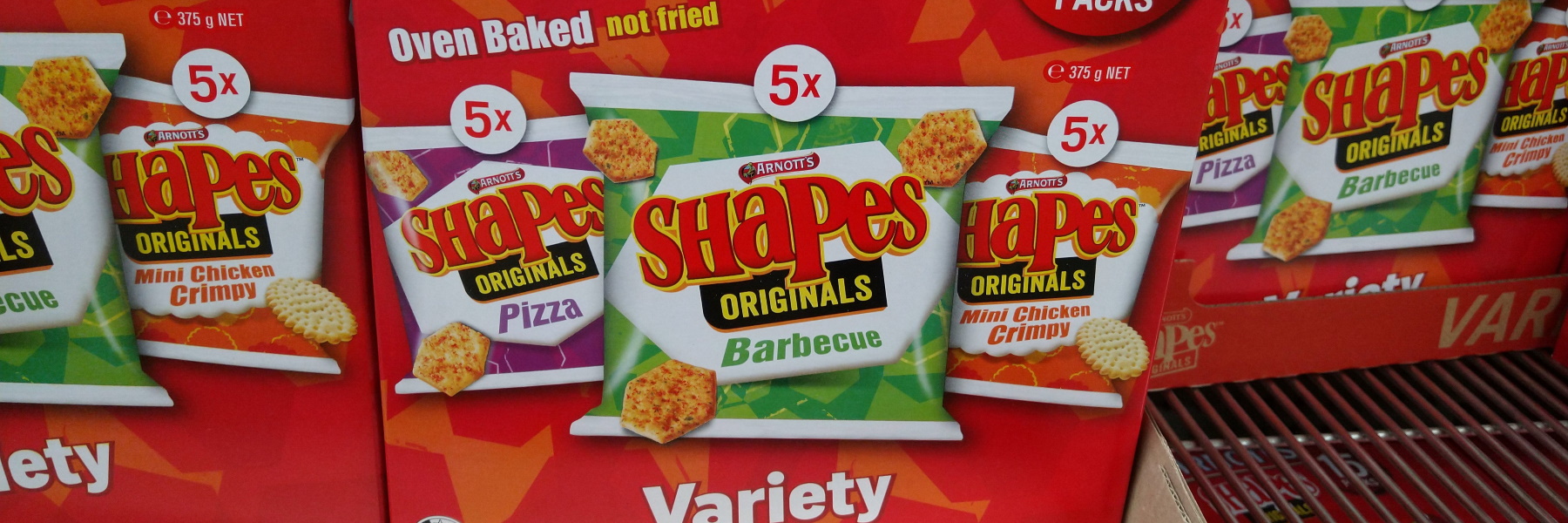
With at least some of the patterns being a close match, it’s pretty amusing that the colours also match up so well.
The Barbecue and Pizza flavours in particular really are similar to the PTV patterns for trams and V/Line. The others a little less so – the biscuit shapes shown on the boxes are less geometric.
How long has Arnott’s used this design? It looks like it’s less than five years old – the archived version of their web site from 2013 shows (as far as I can see from the low resolution images) that back then the boxes were plainer, without the patterns.
The PTV design originated with Metro in 2009, and was subsequently adopted for the other modes in 2012. I don’t know for sure, but it seems not unreasonable to assume that the geometric shapes were influenced by the design of Federation Square.
The colours had been first used by Metlink around 2004, but appear to have been inspired by colours used since early in the 20th century.

Multimodal branding
The Shapes viral image raised some chuckles, but has also got a few people thinking about the branding of public transport – and the importance of presenting a united network across separate modes.
One weakness of PTV’s branding is that the logo isn’t a great one, so the geometric pattern in different colours is what binds the modes together, which in turn makes it difficult to then use colours to distinguish major lines, for instance to match the train map.
Contrast this to say London where the TfL/Underground logo is incredibly strong, allowing the Tube lines to easily take different colours – shown not just on the map but also on the trains, platforms, interchange wayfinding signage, all over the place.
Of course good branding doesn’t mean good service – a lot more work needs to be done to bring poor services up to scratch.
On Thursday night I had a PTUA Committee meeting. So I went prepared.
I’m heading to a @ptua Committee meeting. And I’m bringing snacks!
— Daniel Bowen (@danielbowen) August 8, 2019
If you like better public transport as much as biscuits, please consider joining PTUA – we need all the help we can get!🚆🚇🚋🚌 https://t.co/nArsJ8xyaX pic.twitter.com/96MtwZ6A3G
4 replies on “Public transport Shapes”
Love the arnott’s instagram post, their logo clearly on display, any logo on the bus carefully hidden by the lawyers, PR people and social-media account managers
We already have Cheddar Yellow – it’s the taxis! Although I guess that’s not public transport.
That’s very funny Daniel and true too. The colours and pattern on both the shapes boxes and vehicles are a catchy design. The reason it probably went viral is because most people in Melbourne are familiar with both Arnott’s shapes and the local transportation. They probably thought “why didn’t I notice that before?”
Are PTV or Arnotts disputing the likeness of their logos here?
I did a similar post on Facebook in response to this. How many other Arnotts shapes are there, and, can we invent a mode for that color.
There is yellow, red, black, dark green too
Anyway that is enough from me for now.