Wednesday morning’s commute for me was one of those made easier via good quality real-time information.
My usual train was cancelled. I knew this before I left the house thanks to checking the PTV app.
The app also told me that other trains were delayed. It was going to be a messy commute. Bleugh.
Sometimes in morning peak when there is a cancellation, you can backtrack from Bentleigh to Moorabbin and pick up an express train that gets you into the City sooner than if you just waited at Bentleigh. (It’s a trick that probably applies at a few other places on the network, and incurs no fare penalty now that Zone 1+2 costs the same as Zone 1.)
The app lets you check departures at any station. Checking Moorabbin told me that no, this trickery wasn’t going to help today.
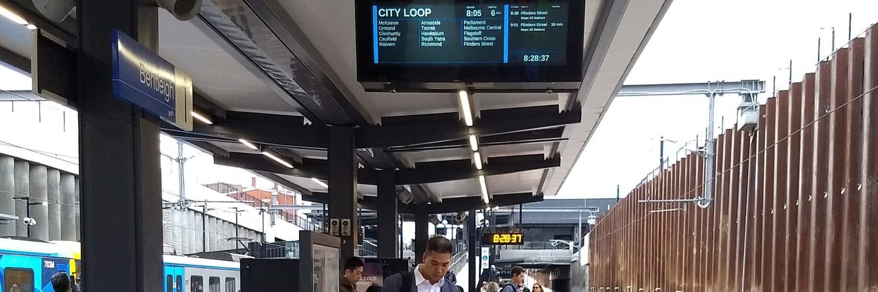
At Bentleigh station the screens and announcements confirmed the delays.
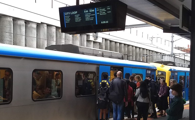
The next train arrived – heavily delayed, and crowded as expected. Completely packed? No. But with another six stops before the City (not served by other trains) it’s not hard to predict that there were sardine times ahead.
Crucially – the screens on the platform confirmed what the announcements were saying: another train was 4 minutes behind it.
Some of us on the platform used this information to decide to wait and catch the following train, which was near-empty as it had just started its trip. Scored a seat! Much better than being in a crush-loaded train a few minutes earlier.
This kind of real-time information can make a big difference to your trip. So why isn’t it provided more widely?

The good news is: there’s progress. The design seen last year at some stations is now appearing at more locations – recently at Parkdale, Moorabbin, Balaclava, Malvern, some of the platforms at Caulfield, and no doubt others.
The app is helpful too of course – for trams and buses as well. And apart from the official PTV app, a few others have real-time departure information fed from the same API.
But even if you’re not inclined to check an app, hopefully the improved screens are coming to your station soon!
Good information can’t fix delays or undo cancellations, but it can help passengers make the most of a bad situation.
9 replies on “More information = good”
Live information has made such a difference to the point where I seldom now check timetables.
Bummer that your train was cancelled. I am always nervous to skip a packed train and wait for the following one – it might end up cancelled too!
PS Do you know if the “infrastructure issues” at Elsternwick that allow train turnarounds will be fixed by the time the Sandy line is shut down later this month? Ta.
also useful is knowing when a service is running short – exiting a train/tram as soon as that is announced (or getting off at the new penultimate stop) … means that the next that turns up is as empty as it’s going to get before you board and before everyone thrown off the short-running service puts it back at crush level a few stops later … and you may score a seat as well … :)
as for the new PIDs – this design is a great improvement, especially at Burnely, since the screens on platform 2 are legible from within the carriage when stopped at platform 1 … with the old design, reflection glare made it very difficult to work out whether or not to attempt to jump service to the Loop train early or wait until Richmond …
With last month’s works, I was catching a bus to Gardenvale station, then taking the Sandy line to the city. This has got to be one of the worst stations around. Absolutely no display of when the next train is coming, only 2 Myki readers inbound (strangely more outbound), narrow and uneven platform and a big dropoff between the train and platform. Do you know if there are any plans for an upgrade?
Suburban stations usually have more Myki readers on the platform headed away from the city because the ‘peaky’ traffic is outbound in evening peak – a whole bunch of passengers will be deposited by a train and they all want to touch off when leaving the station. In morning peak passengers arrive on a random basis, so fewer lines.
Loving the new screens at Prahran, too. Small nit-pick though, that should be easy to fix.
The order of information for the next train is destination (with stopping pattern underneath), time of departure and minutes to departure, while the order of information for the train after is time to departure, destination, stopping pattern and minutes to departure.
Would prefer consistency in the ordering of this information.
Putting the current time in the bottom left instead of bottom right would also make it clear that it isn’t another departure time.
What’s frustrating is to get a train that runs to Flinders Street when you want to go to SX and having to get off the train to look at the board then (depending on the layover) getting back on or not. But I have noticed in recent weeks incoming drivers saying “This train will form the 9.32 to Glen Waverley via the City Loop” or “Southern Cross passengers, your next train is at platform one”. Hopefully this will become the new norm.
The value of those new screens is being wasted, by not showing a list of all the stations of which the next train is stopping at.
Surely this is why we ditched the brighter LED ones???
Many stations, like my own Narre Warren, are yet to get any form of PIDS. I do hope they roll out at least something, network wide.