(I’m hoping to blog about the Myki Mobile trial in the next few days, so hold those thoughts)
Some time in the last few days, a subtle addition appeared on the platform screens at Flinders Street Station: a countdown to departure. This has been on other displays around the network for decades, but some clever maths was needed to get this working here, as suburban services originate here.
So to provide an accurate time for an outbound service, they have to know whether the inbound service that forms it is on time.
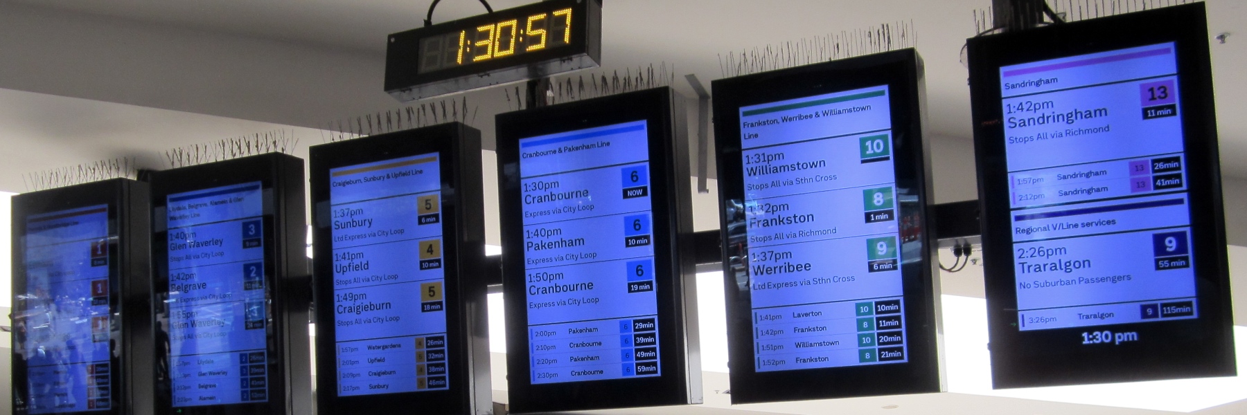
Then on Tuesday night, a far more obvious makeover: colour!
On the concourse and in the connecting subways, the sequence of the lines is now more logical – by group rather than platform – with the colours from the network map used to help find your line.

The sequencing is by group, then by departure time. I do wonder if this may cause issues when some infrequent lines may not display because the allotted space is all taken by more frequent services. Also note Alamein is missing below – the general advice outside peak hours is to take Belgrave/Lilydale to Camberwell and change there. (This is not very clear on the network map – it’s in a footnote only.)
At the escalators from the concourse to the platforms, these screens show the next departure on each platform

On the platforms they have the landscape version. Note the inconsistency in how skipped stations are shown. That seems odd.

One thorny issue: if all Sunbury/Watergardens skip South Kensington, then is South Kensington really even on that line? And should those trains be summarised as a Limited Express? (Some trains on the line are actual expresses, skipping stations between Sunshine and Footscray, so this is important to passengers.)

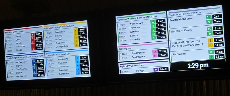
Also on the platforms are displays showing which platform to use for the next train to the other inner-city stations. This includes an animation of the City Loop, whose operations regularly confuse just about everyone.

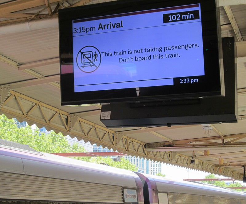
Curiously this screen declared the next arrival (presumably V/Line) was 102 minutes away… despite a V/Line train already being present.
You might expect some teething issues. There have been some reports that the new software doesn’t cope well with cancelled services.
New #FlindersSt displays & departure countdowns quickly get confused with the usual #GreenLine delays at #FlindersSt
— Craig (@craig_halsall) January 30, 2019
7:26pm #Cheltenham ultimately cancelled with 7:36pm #FrankstonLine leaving ontime off platform 8 with sporadic announcements to advise@metrotrains @aussiewongm pic.twitter.com/5fOjOik2pO
But overall these changes seem like a big improvement, and no doubt they’ll keep tweaking the design and fixing issues.
I should note that my photos from the small camera I had with me at the time may not do the new colours justice; go see them for yourself before judging the readability. Apparently they did do quite a bit of usability testing beforehand.
Hopefully we’ll see more of this – in particular more use of the line colours – and indeed more screens – spread across the network from here.
What will also help legibility around the train network is more consistent stopping patterns and Loop operation, in line with the train network map.
- Herald Sun: Are the new screens at Flinders St Station confusing or helpful? (Paywall)
- Peter Stevens (PTV): Designing a network map
- Alexandra Almond (Meld Studios, designers): Improving wayfinding at Melbourne’s busiest train station
22 replies on “Flinders Street Station goes Technicolour”
I’d really like to see a white-on-black version of the screens, but including all of the new changes. I really think it would be more readable.
Other than that, the new changes are great. The line with station ticks alongside the station names finally ends the confusion around whether to read the list across-then-down, or down-then-across, the skipped station names in grey rather than “—“, the line colour across the top of the screen, the high-contrast boxing of the departure minutes and separation from the scheduled time – all vast improvements.
One may well wonder whether South Kensington is on the Sunbury line! The new concourse displays at Sunshine showed every train towards the City as Limited Express, whether it ran express to Footscray or not – but that got fixed and now you can tell from the concourse.
Grouping Frankston, Werribee and Williamstown together means you can’t see at a glance the next train to Footscray or Caulfield, because you need to refer to Sunbury and/or Cranbourne/Pakenham as well.
Talking about limited space, on the concourse at Footscray you can’t always see the next train on the Sunbury line because the next two outbounds are on the Werribee and Williamstown lines.
The problem with these updates is now the landscape screens on each platform don’t show the next Southern Cross/Richmond/City Loop train. Fine if there is another screen on the platform with this information, but there isn’t one on platform 13…
Only some Dandenong trains don’t show the skipped stations. All skipped stations on all lines are otherwise shown in grey. Aside from Seaholme, Altona and Westona which show “Altona Loop Bypass” (which was an afterthought after the system originally showed Galvin and Paisley, which have been closed for 30 years).
For a day or two the new screens were showing direct Werribee trains with Paisley and Galvin stations greyed out – they have been closed for decades! But it has since been changed to show ‘Altona Loop Bypass’ instead.
Found a photo showing Galvin and Paisley:
https://twitter.com/Pepstar72/status/1090354781451735040
“Except South Kensington” has always perplexed me a bit. I suppose if you were looking at the old network map you mightn’t realise it would never stop there, but it is clearer on the new map.
I suppose the problem will be solved when the Metro Tunnel is built!
Sunbury trains do on occasion call at South Kensington: when there’s a disruption on the Werribee line. Happened a few weeks ago when Newport station was flooded.
I’ve said it before but the ETA can be rather shocking sometimes when it shows a 30 minutes wait! Luckily this gets revised to a more punctual number when another train has been reassigned to that service. I noticed that at Footscray, when a VLine service is indeterminate, they’ll just put a dash instead of a number. Perhaps the algorithm at FSS will be changed eventually to not appear like Microsoft Windows’ file copy estimate.
@Ben Lever
The Sunbury / Watergardens service almost never stops there but it is capable of doing so. I remember once the Werribee line went into meltdown last month so I had to go on a Sunbury train to get to Footscray for a replacement bus. The train actually had to stop at South Kensington before getting to Footscray for the sake of commuters who need to get there without the Werribee / Williamstown operating.
Nice and pretty perhaps, but now no information on the next train to Southern Cross, or Richmond, or Parliament. So you have to scan every screen and try to decipher which was the train will go. The design of the City Loop is bad enough, but at least the old screens at Flinders St helped you navigate it. For me this is a massive step backwards, I’m now pushed to the slow rammed trams on Collins/Bourke…
@fnarrfnarr maybe you missed the “Trains from Flinders Street to…” screens?
(Though if as Sam says there aren’t any on platform 13, this seems to be an obvious shortcoming.)
Daniel
thanks for your pictures and commentary. Well done PTV.
The colour screens were a nice surprise when I saw them last night. Not very complicated for the Sandy line as all trains stop all stations.
My understanding is that not all the screens have been installed yet. And if more need to be added then that’s obviously possible.
It can’t be took long before the MATH stations are no longer considered to be on the Cran/Pak lines or Sth Ken on Sunbury. So at that point hopefully they come off the screens for those lines.
Also, PTV built a fake station to test the new designs. They literally mocked it up and tested, refined and rested. Again and again. I don’t think we’ve ever seen such advanced testing in Australia. But of course, when you have hundreds of thousands of people per week then you’ll pick up stuff you didn’t see in testing.
https://www.slideshare.net/mobile/CarolinaGaitan3/flinders-st-station-usability-test-in-a-mock-up-station
While I know it was tested extensively in the mock up station, I find it interesting that it was rolled out at Flinder St first and not at a smaller station, then scaled up. A station on a single line, then a smaller interchange station like Footscray, then North Melbourne or South Yarra, and finally a larger roll out.
I can assure you the original 1980s platform display system did calculate the actual departure times at Flinders St., because I wrote the code that did it.
It knew from the timetable what up train was to form that down service. Knowing the required dwell at FSS, it could display the “Departs” time at FSS on all the platforms down from there. If there was a transposition such that no train now formed the down service, the “Departs” number was cleared from the platforms at FSS and down, leaving the timetabled time only. If a transposition meant the service arriving at FSS formed no down service, it displayed “Train not taking passengers” at FSS.
The time a running service was ahead of or behind the timetable was known from what block (fixed block signalling) the train was in.
And my observation as a passenger of the modern system which replaced ours several years ago is that it works the same way. I’m sure I’ve seen “Departs” at FSS many times.
@Francis E, that’s fascinating. They must have switched it off at some stage. I’ve checked a bunch of old pics, and they all show only the scheduled time: 2003, 2006, 2008, 2018.
Other stations of course are a different matter.
Will they also be rolled out at other major stations such as the Southern Cross, The City Loop Stations, Richmond and North Melbourne?
@Daniel: having slept on it, I think you’re right and the feature was removed before the acceptance test. The problem of course was, if the train was running late into FSS, what minimum dwell time to use there. I remember discussions settling on 2 minutes, to cover driver changeover or walking the length of the train, but in the poisonous industrial relations climate of the time whatever number they chose could have been the trigger for a dispute. So I think it was at least removed for late-running trains, and probably all trains into FSS. It was never implemented for the ends of the lines because there were no screens there.
Does the new system round to the nearest minute instead of up? Our tender for the original system said it had to round up so that’s what it did. This led to the infuriating behaviour where you’d be standing on the platform watching the train pull in but the display would say “1 min”. This must have caused a few people over the years to miss their train by stopping to buy a chocolate bar, or to choose the wrong platform at Richmond. Sometime around the turn of the century I thought someone had found and enabled the rounding code I’d left commented out, but later it reverted to rounding up.
So if Galvin and Paisley appeared on the screens does that mean they’ve been rolling around lost somewhere in the ageing computer system for 30 years?
Reopening a station on the Werribee line at Millers Rd would help the 232 bus!
I think it’s reasonable while trains have the ability to stop at a station but don’t usually (e.g. South Kensington on the Sunbury line) to be represented in the stopping pattern, but ‘not stopping at…’ rather than ‘limited express’ is a more accurate description. Inbound trains on the Sunbury line coming into Footscray advise to change at Footscray for Werribee, Williamstown and South Kensington (but thankfully not Galvin or Paisley!).
The old orange displays on the concourse were replaced at West Footscray yesterday. White on blue for minutes to departure is very hard to read from the end of the concourse.
It’s an improvement, but not much of one.
One thing that is needed, when a train comes into Flinders Street, is an announcement on the train about where it is going next.
It’s ridiculous that you have to try and ask people who are scrambling onto the train as soon as the doors open, where it is going to.
Just experienced this again after catching train from Southern Cross to swap to a Frankston train at Flinders. Previously there used to be a sign at the Elizabeth St end showing which platforms to go to for each line but these are gone. How am I meant to know which platform to go to next without going back out to the concourse???
As a Vision impaired and colorblind user they’re a step backwards. For me the black background offered much better contrast. Having the departure time on the top left also puts the destination in the middle – I used to be able to determine my train by the length of the word without having to read it (I may adapt to this, time will tell). If I come up the Elizabeth St ramps I now need to get all the way to the display to see which train is next, which may result in me missing a train already on the platform….
The big info display on the concourse (and at Elizabeth St entrance) is now useless – I used to be able to stand under where I knew my train would be and squint and usually be able to work out which platform it’d be at. Now I need to go to the top of the platforms in turn (luckily only a choice of 2 to get home)
I’m an infrequent user of Flinders St so the new displays have made things much more difficult.