I quite liked the old blog template, but I know there were a few issues with it on mobile devices, and I didn’t have the time/energy to fix it.
So as part of trying out new web hosting, and making sure WordPress is all updated, I’m trying out a new template. Again, I don’t have the time to write a template myself, so I’ve downloaded a few that looked okay, and am testing this one (“Clean Journal“).
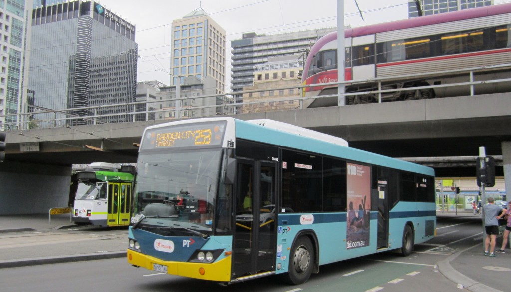
Let’s chuck in a picture here. Obligatory transport theme.
If you have an opinion on the new design, or see any issues, including on mobile devices, please leave a comment.
Update 6:30pm: The image at full size was not scaling down on some small screens (eg phones), making the total width go large, and everything else smaller. I’ve tried changing it to a smaller size, but I’m a bit irritated that the theme doesn’t do that itself, and allow it to scale up on bigger screens.
Update 7pm: That’s not working either. I’ve switched back to the old template for now. One of the major problems in the old template was that the ads didn’t resize properly — I’ve updated to the Google Adsense plugin, and configured it to do its thing on mobile screens. I’ve also trimmed the menu, which was (weirdly) blocking things below it on small screens, so hopefully it all looks a bit better now.
Update Sunday morning: I’m going to stick to the old template (which I actually prefer), which seems to look okay on large screens, iPads, and Android. The only problem I’m having is with Safari on iPhone, which is scaling things down because it thinks something (invisible, apparently) is too wide. Odd.


8 replies on “New blog template”
Well, straight away on Mobile, it seems that pictures don’t re-size down to the mobile width and break the template. https://drive.google.com/file/d/0ByW4tQAw9kBVaThUU1RHbk1rd00/view?usp=sharing
I like it.
Reading on Android tablet and it’s a great improvement. Blog entry no longer displaying in tiny font with stretched images.
Works well on my Nexus 10 tablet.
The new template no longer displays correctly in Safari on an iPhone. It’s not reformatting the width of your blog posts to suit the width of a mobile display.
Oh, it is bad as I see it now. Unless I intend making a comment, I don’t see your blog as it is, just in the Old Reader. Ah, interesting, this individual post after clicking comment looks ok.
@Dan, iPhone Safari seems to be causing some trouble. The ads were an issue, but should now be rendering in a size suitable for iPhone. Can you see something else that is causing the width to be funny? (It works fine on my iPad Mini on Safari, and also on Chrome on Android.)
@Andrew, what device are you using, and what looked bad? (Full RSS feeds are still turned on, so people using Old Reader or other RSS readers can keep reading from there.)
[…] the mess of the last attempt, and noting the large number of people reading on mobile devices (phones 39%, tablet 10%), […]