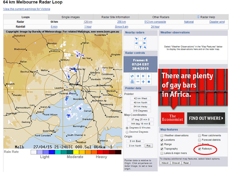
At a conceptual level, I navigate this city by rail more than by road. For instance, if I’m trying to focus on rain around home, the proximity to railways is far more useful to me than the proximity to major roads.
So to make the Bureau of Meteorology’s rain radar map more useful to me, I switch off roads, and switch on railways instead.
If only more digital maps were customisable like this.
As others have remarked:
When will mapmakers realise that public transport should feature prominently when displaying maps at urban scale? pic.twitter.com/mUjHTTHseT
— Michael Bell (@Xtrackka) April 27, 2015
The technology exists now to have these options. It’s a shame BoM is one of the few that offers it.
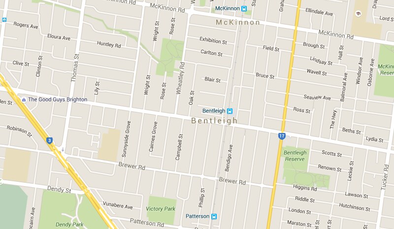
Extra brickbats for the otherwise wonderful Google Maps — when zooming in to see road/street detail, their algorithm seems often reluctant to tell me the name of major roads — instead telling me all about the minor streets surrounding them. It might be because it likes showing State Route numbers (which almost nobody uses) — in this example, it’s not just Centre Road (state route 16) which is unlabelled, but also Jasper Road (state route 17, but it’s not even showing that).
In any case, the core point is this: Most maps are digital these days. Why don’t they have the options to show and/or highlight what I want them to show?


14 replies on “Digital maps: sometimes I want to see railways, not roads”
I’ve had the same issue with Google Maps masking major road names. In one case, despite various zoom levels, the only way it would tell me the name of the road I wanted was to click on a property along the road, giving the address.
In terms of public transport info, you can select the “Transit” overlay in Google Maps, but alas, this only highlights tram lines currently. No idea what’s taking them so long to release Melbourne’s transit data.
Yep, very annoying and very car centric.
I photocopy a relevant page from Melway when commuting on PT, walking or cycling. The hard copy Melway continues to have more features (such as parks, bike trails, BBQs, toilets, geological features) than anything digital or online
But where are all the gay bars in Africa?
But back to the topic, Google Maps bugs me because it only gives my address as a state route, which absolutely no one recognises. They’ve just taken the US model of route numbers being more prominent than names and applied it to Australia.
I agree about major road names not being shown. At times you have to drag the map such a distance to find the name of the road. Locally, I think the electric Melways does a better job of showing train lines and stations.
As mentioned by James above, Google Maps does offer the Transit layer. Which depending on the city can be quite useful.
I’ve taken some screenshots as examples: https://goo.gl/photos/afz4J3VG9Gf1fTKY6
– Sydney features only rail (heavy and light).
– Adelaide shows rail (heavy and light), and bus also.
– London is particularly good, showing underground, overground, and DLR, with icons (but not bold lines) for other rail stations
– Melbourne is essentially missing its data (despite having been released by PTV), only showing the out-of-date tram information
It’s also of note that the lines appear to very in thickness to show (approximately) the level of service – a pretty good idea, and analogous to the prominence of different types of road (laneways thru freeways).
@Evan, thanks, that’s some really interesting info/maps. It’ll be interesting to see if it’s decided to use different colours for different train/tram/bus lines in Melbourne. Of course, PTV are starting to use different colours for different lines, but it hasn’t really caught on or been widely implemented yet: http://ptv.vic.gov.au/live-travel-updates
Most people simply associate trains with blue, trams with green and buses with orange (and V/Line with purple, of course). But if that colour scheme was used, it would be fairly difficult to clearly see where individual lines/routes went without clicking on them.
While a little clunky to use, the Lands Victoria interactive map (http://services.land.vic.gov.au/maps/interactive.jsp) does allow you to turn layers off and on.
(I just had an entertaining half hour teaching Patrick about contours using the map of the local area and 1 metre contours.)
While I agree that Google maps could be better, and it would certainly be nice if they were, let’s not lose sight of the fact they’re free (although of course Google is making money in other ways).
You can watch a visualization of Melbournes transport on this map. It is built by a student at the University of Freiburg, Germany, by using timetable data by Public Transport Victoria.
http://tracker.geops.ch/?z=14&s=1&x=16136123.9593&y=-4552573.7239&l=transport
Melways does not seem to have these problems but they were never that good on web services.
@wxtre Thanks for that amazing link! I could watch this all day (and probably will, haha).
Melway Online is interesting – Melway overlaying Google Maps. http://online.melway.com.au/melway/.
Speaking of Melway, I’ve recently been given permission to include their maps in my BusFinder app. You can use it to show only the routes you want, on the map you want. I don’t currently highlight train tracks, but I like the way Melway shows them already, with the stylised red ovals for stations.
https://play.google.com/store/apps/details?id=com.rockgecko.busfinder
I want to see a non-digital printed map to show public transport in the fore.
Reverse of the line sizes. Have all roads marked only as very thin lines, and have railways done in bold lines.
The same could be done with bold lines for rivers on the railway maps too.