I was passed this infographic on public transport from some mob from Ireland called HoogleIt. They seem to be sending it around to various bloggers to get it posted around the place as a promotional tool.
Fair enough. It has some interesting factoids on it.
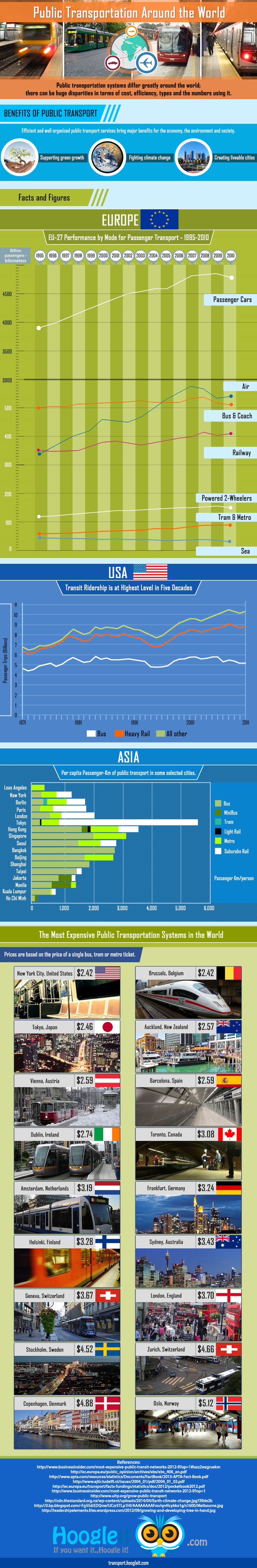
Anything about Melbourne in here? Indirectly. The photo illustrating “liveable cities” is Melbourne, snapped from the Arts Centre on St Kilda Road.
There are a few typos here and there, but some good information.
Some notes from me:
- In Europe, overall travel seems to be down in 2009-10, including bus and coach, but railway travel is up, and metro is steady. Perhaps this is an effect of the Global Financial Crisis?
- The GFC might also account for the blip in 2010, but it does appear that in the USA, rail travel is up. It’d be nice to know what “all other” means here — presumably it includes light rail (trams), and ferries, but what about subway systems?
- The Asia bit isn’t really about Asia; it includes some western cities. It is interesting though to see that very dense cities like Tokyo and Hong Kong are way ahead of cities in Europe that we think of as having pretty good (and well used) public transport such as Berlin. LA’s figure unfortunately leaves out buses, which are a major part of their system.
- It appears Oslo has the most expensive fares of the cities surveyed, though their ticket includes transfers for an hour (unlike, say, Sydney where the train fare doesn’t let you board a connecting bus). And there was me thinking London might take the Most Expensive gong. Of course, regular users often get discounts, via smartcards or periodical tickets — but these are hard to compare, as all cities have different systems. Oslo’s 30 day ticket, for instance, costs about the same as 21 single tickets, or 10 days of travel if you make two trips per day. That’s about half the comparative cost for a 30 day ticket in Melbourne.
- The fares data is from Business Insider which in turn sources it from a report from Swiss bank UBS. Hopefully UBS fixed their methodology — in the 2009 of the same study, they incorrectly claimed Sydney was second-highest in the world — seemingly equating the then A$3.80 fare with US$3.82 due to a currency mix-up, despite the Aussie dollar being nowhere near parity at the time. I guess it just shows you should always check the source data when presented with a surprising “fact”.
It makes me ponder what Melbourne-specific transport facts might be good to present in similar graphical form to make them clearer.
3 replies on “International public transport infographic”
Those Asian/western city comparisons are of course on distance travelled, not number of journeys or mode share. The lower figures for the European cities likely reflect a greater degree of urban self-containment than in the Asian cities. Tokyo in particular has an established pattern of long-distance commuting in large numbers from a huge regional hinterland – the equivalent would be people commuting daily in large numbers to London from Manchester or to Berlin from Hanover.
So it’s true that on some measures Asian cities are ‘ahead’ of European cities in the intensity of public transport use, but I’d be cautious in drawing any conclusions from that about the relative sustainability of transport habits in European and Asian cities.
Are there minimum distances attached to the “single trip” prices? Tokyo’s cheaper single distance tickets start at US$1.25 – US$1.50 depending on the mode of transport, so well below $2.46.
The price of living in Norway is through the roof, don’t think those costs have been normalized.