Each time I travel (which isn’t often enough), I note the things that are different, and the things we can learn from.
From my most recent short trip to Sydney, here are some notes — not an exhaustive study, but just some observations.
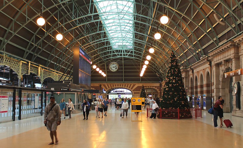
Central Station is a rabbit warren compared to Flinders Street Station, though FSS may veer that way when the new underground platforms are built as part of the metro rail tunnel. What was really striking was that the Central Station “grand concourse” looked so much nicer — less chaotically laid out, and tidier.
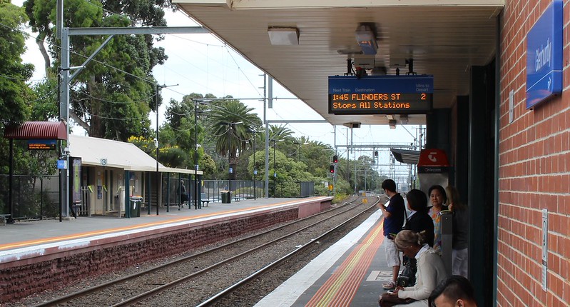
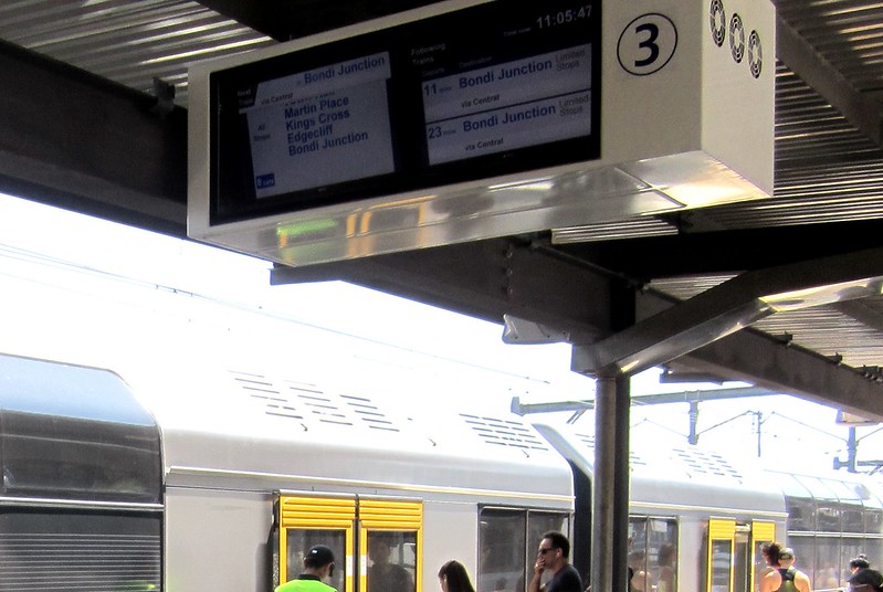
Suburban stations in Sydney have colourful screens on the platforms. In Melbourne if you’re lucky your local station has a two-line LED display, which won’t tell you any more than the basics — and these are common even at major interchanges like Caulfield and South Yarra.
The screens in Sydney, which seem to be universal, can tell you the next three trains, the precise stopping pattern of the next one, and also give a warning (accompanied by an automatic announcement) when a train approaching is running express through the station.
(Melbourne is currently getting colour screens in stations showing tram departures. This is a great idea, but ironically means at most stations the information provided for trams will actually be better than for trains. Lift your game, Melbourne!)
It took us two days to find a Sydney train with any litter. Stations and trains very tidy. pic.twitter.com/4tYfuF7wiN
— Daniel Bowen (@danielbowen) November 23, 2015
Sydney Trains are spotless. It took us 2 days to spot any litter (a banana peel on a seat). I don’t recall any tags or other litter on the trains (though there was plenty of tagging along the rail corridors). The stations were similarly spotless, even those that are unstaffed most of the time. All stations had bins, even in the CBD.
- Interesting article on Sydney trains security and customer service: Sydney Trains gets smarter and more secure
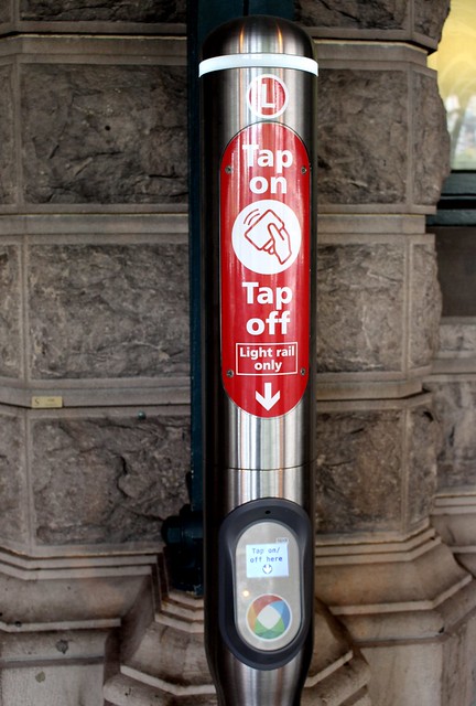
Opal beats Myki in most respects. The readers are fast and much clearer. You can check your balance on an NFC-equipped Android phone (very helpful if you can’t remember how much money is left). Card and top-up availability was a problem last year, but this is being addressed — it was easy to find both this time.
It’s unclear to me what the long-term strategy is, but so far they seem to be phasing out most non-single-use tickets, but keeping a few single use paper tickets as an option alongside the Opal cards.
But the Sydney fare structure is broken. It’s bad enough having to transfer modes; separate fares for train/bus/light-rail and ferry are just twisting the knife — particularly as the new bus route structure encourages people to switch to trains in the CBD.
And even the pricing is crazy — a $15 cap Monday to Saturday, but only $2.50 on Sundays? Why not even it out a bit, say $5 on weekend days?
In fact a NSW Audit Office report released last week says 25% of trips on Opal are free (eg the user has hit a cap), including 47% of ferry trips! Discounts are great, but someone has to pay for them — the revenue stream needs to be sustainable such that the money coming in increases as ridership increases, to help pay for upgrades.
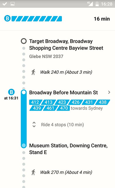
Google Transit is great, but not perfect. As noted previously, our bus ride took as to an unexpected (but not inconvenient) location, so something apparently didn’t quite work. Even so, it was a boon being able to easily navigate around, particularly on the bus network with its myriad of route, without first loading up some unfamiliar clunky city-specific app as visitors to Melbourne must.
Sydney still has train guards. Perhaps there’s a benefit from safety, though so many cities manage this with door sensors, mirrors and CCTV that I doubt it. The Sydney guards seem to have little to do other than make announcements (some excellent, some unintelligible — I think I’d prefer auto). They help load wheelchairs (but their position in the train varies from the middle to the end, which must make things challenging for wheelchair users.)
The problem with having two staff on board every single train is it doubles the wage cost when adding extra services. Melbourne and Perth have solved this, with Single Person Operated Trains (SPOT for short, in Melbourne!). Sydney’s new north-west metro line is set to be driverless to get around it.
(Virtually) no level crossings in Sydney. And if it seems natural, that’s because it is — as can be seen in old maps, it turns out Sydney never had the huge number of crossings Melbourne has, partly through good planning, and partly because the topography (lots of hills) made it easier to avoid. But they also made a point of removing (almost) all the ones they did have. (They have about five left, on minor lines.)
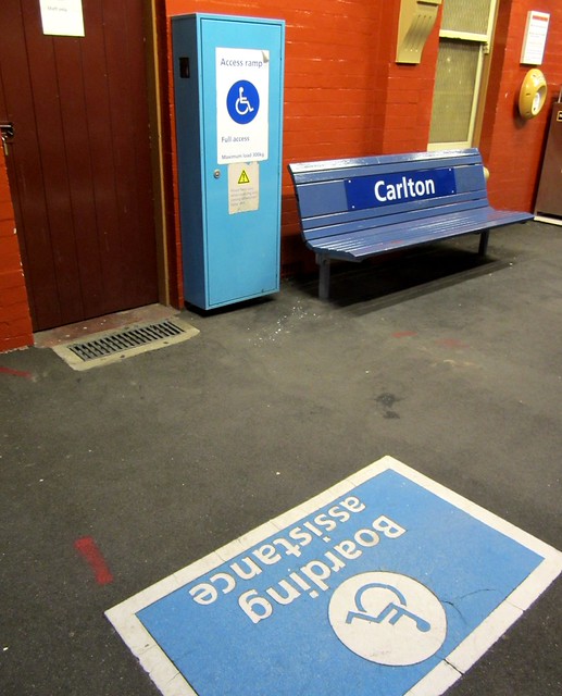
Lots of lifts are being installed at Sydney stations. Historically most Sydney stations had stairs but not ramps or lifts, and were thus not accessible. They seem to have made great progress in retro-fitting lifts in many stations.
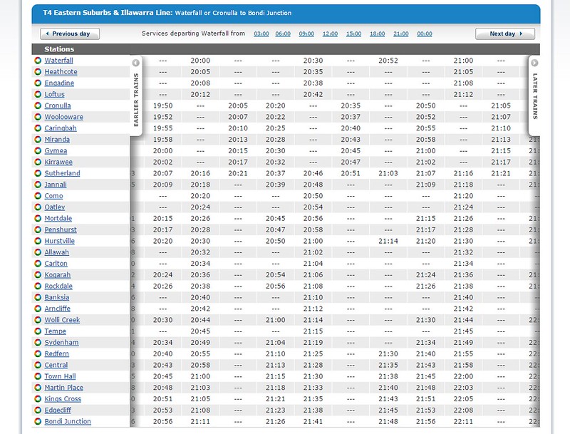
Train stopping patterns are all over the place. Even at 8pm on a Saturday night, on the T4 line there seemed to be at least three stopping patterns in use: Stopping all stations, Express Sutherland to Hurstville to Redfern, and another more complicated pattern that would stop at a few, skip a few, stop at a few, skip a few more.
This resulted in the station we were waiting at (Carlton) having only trains serving it every 30 minutes, with lots of expresses passing by. I suppose it makes the patterns more consistent, or at least more consistently confusing. I wonder if less than ideal acceleration on the big double-deck trains means they are keen to keep express running at all times of day?
The train line numbering is very easy to understand for tourists, but inconsistently used. Perhaps that’s a work in progress.
Pedestrian crossings in Sydney CBD are a mess, partly because of the many one way streets, but mostly because the traffic engineers have clearly prioritised car movements. The waits to cross the street are often really long, because they have complicated cycles allowing for lots of turning traffic. In Melbourne the basic grid pattern means a smaller number of cars get to turn each green cycle, and tough luck if they have to queue — traffic going straight, and pedestrians are (mostly) more important.
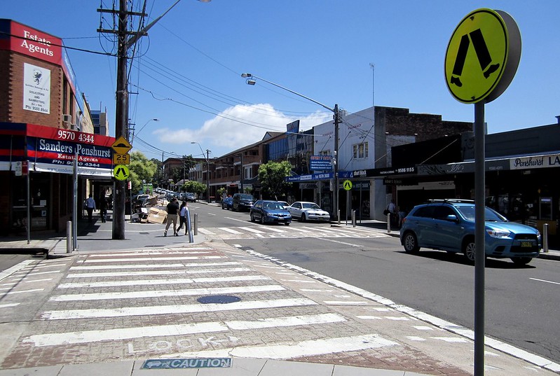
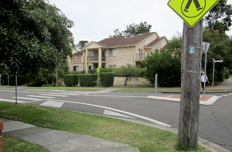
Zebra crossings seem prominent in Sydney suburban shopping centres, much moreso than in the CBD, and moreso than in Melbourne suburbs. It was good to see; it made walking around much easier.
That said, they do sometimes fall into the trap of providing crossings at roundabouts that are in no way placed so that people are likely to use them.
Suburban density was clearly higher in Sydney. Apart from big centres like Hurstville, it was common in otherwise quiet suburbs like Penshurst to see 3-4 storey buildings in the areas close to the railway station and shops which would probably have Melbourne NIMBYs up in arms. But what I saw didn’t seem to intrude on the shopping strip, nor on the overall neighbourhood. It’s the sort of thing we need to see more of in Melbourne to help sustainably grow our population.
Obviously, we can learn a lot from Sydney. I dare say they can learn some things from us too.

17 replies on “Comparing Sydney to Melbourne in transport and urban planning”
The weird fare structure in Sydney, added to the weekly caps for Opal, means that an amazingly high number of people – city workers, mostly – “hack” the system by doing multiple cheap trips early in the week and then travelling for free on their more expensive trips the rest of the time. This is why, for example, the most common trip in the light rail network is the 150m between the Pyrmont Bay and Star Casino stations: on Mondays you’ll see hundreds of people tapping on at one station and walking or running to tap off at the other to get a $2.10 trip that will offset a more expensive trip later on. It’s also good exercise.
(that also explains why such a high percentage of trips are free, I think)
I figure the software for the Melbourne displays (at least the LCD ones at major stations) will be updated to be more colourful when PTV start officially colour coding the lines, starting with the new map
I suspect that one reason that there are so few level crossings in Sydney is that they have a far greater proportion of the network that is 4 or more tracks and that tends to be too much for a level crossing to handle. It would be interesting to see what proportion of crossings were abolished as part of track amplification.
I suspect that the topography causing fewer level crossings and the track amplifications causing there to be many stations with separate express and stopping track pairs (Melbourne has only South Kensington and East Richmond and East Richmond is different to Sydney stations in that its stopping tracks are not together but both on the outside) were major contributors to there being far fewer platform to street level crossings that are so common in Melbourne. This may also have contributed to the preference for stairs over ramps, although that was probably mostly an engineering or similar decision.
It’s worth noting that IPART are currently in the process of a wholesale review of the opal fare structures. There’s a draft report due out this month, final report end Q1 next year and new fares based on the report in July 2016.
The discussion paper leaned pretty heavily towards partial or full fare integration, so the somewhat bizarre structure is likely to be eliminated, or at least moderated somewhat.
Well I have to say in regard to stopping patterns and there all over the place stopping patterns. We have been moving lately since the 2013 timetable change to more or less a skip stop pattern particularly in the peaks. It distrubutes the customers more evenly and also allows for even spacing once getting into the core sections for certain lines e.g. Wolli Creek to Central via Airport & Sydenham and Chatswood to Central.
The reason for skipping stations is a lot of our trains stop at all stations after a certain junction It probably allows for more average journey times.
As a seasoned expert I pretty much get the hang of it well on my line the T2 Airport Line since in the morning peak there are 5 in the afternoon 3 .
One thing we also have that is real handy is the large flying junctions entering Central allows more flexibility and also superior to flat junctions. This is really handy particularly during trackwork this minimises bus replacement services and delays. In the case of the City Circle and now with CBD SELR construction going on in central Sydney.
I can’t see any pros to a numbered line system expect if you’re not an English speaker.
Say T3 and that has no meaning. Say Western line or Bondi Junction line and it gives information about that line. A tourist unfamiliar with the city may not know the location, but either system still provides as much clarity.
As for the stopping pattern, that is because they’re three separate lines working over that common area: Sutherland, Cronulla, and Hurstville. If the question was more about why they don’t switch to all stops at off peak frequencies, the length of the trip still makes that unpleasant and unappealing for those at the ends of those other lines. The only all stops is the nearest location, Hurstville. And there isn’t the demand at those inner locations to warrant an increased service so it would just be benefiting the service for those at nearer stations, above those on further stations which also have the half hour service of the inner stations, but now would have a much longer trip as well if made all stops.
So all up, that’s pretty well balanced.
@MH in terms difference in all stations and limited stops there is 9:06am Bondi Junction to Cronulla Limted stops train taking exactly 1 hour calling at 17 stations while the all stations departing at 9:09 is timetable to arrive at 10:21 it calls at 28 stations essentially another 12 mins.
It reminds me it also allows time to catch up for lost time it’s easier to do in comparison if the train stopped at all stations instead the delay will snowball just ask anuser of the L90 in the Northern Beaches. Sydney’s longest route.
It probably allows for more runs and reduces the rolling stock requirement in particular standby sets. It gives more time to sit at the terminus to maybe make up for lost time, cleaning, random problems that may occur to be resolved without delaying the next journey. In the off-peak a train sits at Bondi Junction for 12 mins meanwhile in the peak it’s just 5 mins at best often more like 3 or 4.
At the end of the day fast running may help puncuality and reliability.
Sydney’s train lines are not numbered well.
A T1 train can take you to any of 5 different branches:
Hornsby via Gordon.
Hornsby via Macquarie Park.
Hornsby via Strathfield.
Richmond.
Penrith.
A T2 can take you to Campbelltown/Macarthur via the following ways:
Via Airport
Via Sydenham
Via Granville
That’ll soon double when Leppington gets integrated into the line (though most trips are expected to run via Granville)
Stopping patterns:
Pros – express running almost from first till last train.
Cons – stopping patterns that are confusing, inconsistent, and often don’t make sense.
They need to find a happy balance between the two.
Sydney and Melbourne have swapped places for cleanliness. 5 years ago an average Sydney train was filthier (rubbish, grime, vandalism) than the worst train in Melbourne. Now they are spotless, and we have gone so far backwards. They have done an amazing job and in this regard, Melbourne is a disgrace.
Although it doesn’t affect me personally (as I have a Zone 1 yearly Myki pass), the savings gap for a full fare Zone 1 & 2 Myki money traveller has gone from $8.34 in 2013 to $1.52 in 2015. So Melbourne has gone to other extreme of Sydney.
Don’t get me wrong, I can see both the positives and negatives when it comes to the capping of Z1&2 travel at Z1 fares, but given that there’s not much difference in $7.52 VS $6.00, I won’t be the slightest bit surprised if PTV announces that the weekend daily cap is being scrapped effective 1 January 2016.
For the most part I love Sydney transport.
I travelled there with a friend in a wheelchair recently – the physical infrastructure was easy enough, but the simple logistics seemed far too complicated. Figuring out where to board was only the first problem. On one occasion a train was right there, but we had to board the next one because the guard was too busy doing other things to go and get the ramp (stored somewhere on the platform, not the train). Boarded, and the guard assured us they’d ring ahead to our destination station – seemed all a bit over the top. Upon arriving there, it was left up to me to find the guard who’d forgotten about him. And if I wasn’t there? He’d have had to send another passenger out or hit the driver intercom button – but probably would have moved on to the next station by the time that was all sorted.
Thanks all for the great feedback. (I also had a reply via Twitter, unfortunately not on here, that noted good density isn’t universal in Sydney; the planning system is a mess, and only some areas have got it right.)
@Michael, whether the screens are colourful or not isn’t really the point. The fact that they are much more informative than two-line LED displays is what’s important.
@Matt, thanks – it’ll be interesting to see what IPART come up with. I found it funny that they moved towards modal fare integration with MyZone, then back from it again with Opal
@MH and @Driver, the numbering of the lines is really numbering of a group of lines. I found it useful to help guide me to which platform at the CBD/City Circle stations I needed to be on. Then I’d use the screens to see which actual train I needed to board. T4 was much easier to memorise than “Eastern Suburbs and Illawara”, given I wasn’t going to the Eastern Suburbs or to Illawara.
@MH, express vs stopping is always a balancing act. To have three different stopping patterns, and to have one of them only skipping a handful of stops, with a resultant 30 minute wait at some stations, doesn’t seem to be quite the right balance. (As in Melbourne, it appears from the timetables that in Sydney an extra stop adds about 1 minute to the travel time.)
Notably the weekday evening service is much better than the Saturday night service, with most (but not all) stations getting a 15ish minute inbound service on that line until midnight.
@Matt Furlong, that seems a bit disorganised, and I’d imagine concerning to someone in a wheelchair travelling by themselves.
Thanks to Matt F, I was the wheelchair person traveling with him at the time. Finding the lifts from the street level at Central to access the platforms was a nightmare as well I might add. Having used Sydney’s public transport extensively for many years before my accident I knew my way around but with the change in circumstances the small area in the carriage for wheel chairs in your double decker carriages is awkward & luckily I wasn’t traveling at peak times.,I can imagine a wheel chair(s) at peak times would create havoc or have to wait.
It’s often my experience that at peak times despite the designated areas in Melbourne’s (where I live) train carriages for wheelchairs are often crowded out with passengers staring blankly at you as you try to get in.
@Daniel the Moore Park Busway is sometimes slower than the Anzac Pde services since Anzac Pde gets prioritisation over the busway and surrounding roads/intersections it being a vital main arterial road. The traffic light cycles tend be very long in the Moore Park due to the high numbers of cars turning left and right.
I guess the skipping stops is more of like a placebo and political thing. SInce its a political football having more limited and express services even though the benefits of reliability and frequency may be more important on certain lines.
It could be worse in terms of stopping patterns on my line the T2 Airport Line. In the off peak there are usually 4 stopping patterns. All stations to Revesby, then Semi-Fast to Macarthur, then Fast to Kingsgrove all stations through the AIrport Line tunnel then Kingsgrove only. the Fast to Campelltown/Macarthur skipping most stations between Glenfield and Wolli Creek.
This pattern is simplified on the weekend to just all stations to Revesby (intermediate terminus) and semi fast to Macarthur. But only 4tph compared to 8tph in the off-peak.
One important thing Sydney has a complex bus network particularly within the CBD area it some aspects it even worse post October 4 George St closures making a nightmare for certain regions/suburbs.
I’m guessing if u noticed on the Grand Concourse at Central the large departure screens those are different to the other styles they are being trailed at various stations.
One good comparison between the two cities might be between interurban trains – NSW TrainLink Intercity vs V/Line’s interurban services. The latter would win big time for speed compared to the twisty steam-era alignments climbing the hills out of Sydney, but I think the former would generally win for frequency and operating hours (close to 24/7!) of services.
@M H
Having lines named after termini (like we do) doesn’t really provide much more information either, except for where the last station will be. That’s not to mention the confusion many due to the different names for short stopping services. Essentially all that’s key is to have a name that is easily identifiable and remains the same.
@David.
Frankly I’d be happy to merely have those LED displays at all stations. As it stands I still have to press that green button every time I need to check for the next service.
I found the Sydney trains to be quieter and smoother than Melbourne’s trains. Just like South West trains in London (and possibly others – I’ve only tried South West). It’s as though they’ve paid attention to isolating the cabin from the vibration and noise of the suspension. Why isn’t the same done with the X-Trapolis?
[…] Daniel Bowen compared trains in Melbourne and Sydney […]